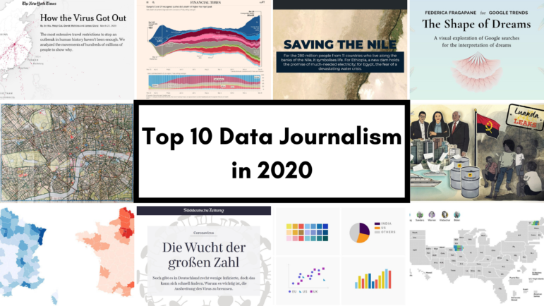
Register for #GIJC25
November 20, 2025 • 09:00
-
day
days
-
hour
hours
-
min
mins
-
sec
secs

Accessibility Settings

color options

monochrome muted color dark

reading tools

isolation ruler

Topic

Data Journalism

655 posts

Data Journalism

Data Journalism Top 10: March Madness, Trafficking Tigers and Fish, Color Palettes, Vaccine Inequality, Domestic Work

A lack of comprehensive data can seriously hinder efforts to track illicit activities. But persistent reporters will always find a way to get a glimpse of the real picture. Our NodeXL #ddj mapping from March 15 to 21 found Oxpeckers investigating the trafficking of tigers in Europe and journalist Ben Heubl offering advice on investigating illegal fishing. We also feature an analysis of the global aviation crisis by the Financial Times, a guide to color scales by visual storytelling expert Lisa Charlotte Rost, and a look into the burden of unpaid domestic work by data analyst Hassel Fallas.

Structuring visual narratives, by Gurman Bhatia

Data Journalism

Data Journalism Top 10: Women’s Careers, Vitamin D, Visual Stories, Electric Cars, Japan’s Ghost Towns

On the one-year anniversary of the COVID-19 crisis being declared a global pandemic, outlets around the world looked back on how the coronavirus has transformed our lives. Our NodeXL #ddj mapping from March 8 to 14 found a comprehensive summary of how the health crisis unfolded in the United States by The Washington Post, and a look at the COVID-19 crisis in Hungary. In this edition, we also feature The Economist’s interactive tool estimating the risk posed by COVID-19 based on a person’s health, a story about the ghost towns in Fukushima by NPR, and an analysis of the future of electric cars by The New York Times.

Data Journalism

Data Journalism Top 10: Pandemic Cocktails, Pricey Food, Zoonotic Diseases, the World’s Top Songs

If you have tried to mix cocktails at home lately, you’re not alone. Tired of waiting for bars and restaurants to reopen, more consumers have started buying premium alcohol, according to data published by the Financial Times. Our NodeXL #ddj mapping from March 1 to 7, which tracks the most popular data journalism stories on Twitter, also found an analysis by Bloomberg showing that global food prices have hit their highest level in six years, an explainer of the connection between bats and virus outbreaks by Reuters, an interactive piece on Atlantic currents by The New York Times, and a musical map by The Pudding.

Data Journalism

Data Journalism Top 10: Solar-Powered Batmobile, Hungarian Money Abroad, Migrants Dying in Qatar, Open Windows & COVID-19

For decades, environmentalists have been dreaming about climate-friendly transportation. The arrival of hybrid and electric cars has brought us one step closer to travelling without damaging the planet. And this year, a California start-up promises to push the technology even further by rolling out the first mass-produced solar-powered car. Our NodeXL #ddj mapping from February 22 to 28 features this story alongside an investigation by the Guardian into deaths of migrant workers in Qatar, a cross-border project revealing Hungarian money flowing overseas, and a creative infographic about animals in space.

Data Journalism

Data Journalism Top 10: Mission to Mars, Myanmar’s Protesters, Sand Mining, Journalism in Russia

After going through “seven minutes of terror,” NASA’s Perseverance rover managed to successfully touch down on Mars last week. Our NodeXL #ddj mapping from February 15 to 21 found reporting by The Wall Street Journal and Al Jazeera, which offers more insight into the rover’s journey to the red planet. In this edition, we also feature a story about the boom in independent journalism in Russia, an analysis of the future of South Africa’s coal mining industry, and a critique of data visualization’s ability to fully convey the realities of large-scale tragedies.

Data Journalism

Data Journalism Top 10: Back to School, Australian Open Underdog, Amazon Oxygen Shortage, Big Tech & Green Energy

How can we get students and teachers safely back into classrooms? For many months, this has been a key question for public authorities, school leaders, and parents around the world. This topic and others topped the data journalism stories on Twitter from February 8 to 14. Check out #ddj stories from The New York Times, NPR, the Financial Times, FiveThirtyEight, and The Pudding.

Data Journalism

Data Journalism Top 10: Biometric IDs, Data Spaghetti, Eviction Avalanche, Remote Working

With countries around the world considering the safest ways to ease lockdown measures, alongside the deployment of COVID-19 vaccines in many places, some are finding reasons to be optimistic about the end of the coronavirus crisis. But returning to once conventional daily activities, such as going to restaurants and sports stadiums, is still a distant prospect. Our NodeXL #ddj mapping from February 1 to 7 found Voxeurop covering the dangers of adopting biometric IDs and health passports, a look at Europe’s COVID-19 divide by Reuters, an analysis of leaked smartphone data by The New York Times, and a Twitter thread collection of archived data visualizations in various languages.

Data Journalism My Favorite Tools

My Favorite Tools with Al Jazeera’s Mohammed Haddad

In this edition of our “My Favorite Tools” series, GIJN spoke with Mohammed Haddad, who leads Al Jazeera’s interactive team, AJLabs, where he uses data to create compelling visual stories. Haddad explains why he is a fan of RStudio, Nivo, Mapbox, and more.

Data Journalism

Data Journalism Top 10: Polarized America, Australia’s Pandemic, Poland’s Toxic Air, the Arab Spring, Life as Lego

Our NodeXL #ddj mapping from January 25 to 31 found interactive projects by the Australian Broadcasting Corporation and The Guardian analyzing these events. In this edition, we also feature environmental reporting by The New York Times and The Economist, a Wall Street Journal story on the GameStop Reddit mania that shook stock markets, and a visual representation of 2020 using Lego bricks.

Data Journalism

GIJN Toolbox: Satellite Data, Tracking Usernames, and Facial Recognition

In this edition of The GIJN Toolbox — which surveys the latest tips and tools for investigative journalists — we’ll take a look at the process of analyzing satellite imagery derived from infrared radiation, a technique The New York Times used to cover a West Coast wildfire. We’ll also explore the controversial practice of using facial recognition technology, how to request NASA satellite data, a new document search tool from Google, and more.

Data Journalism

Data Journalism Top 10: A New President, Trump’s Twitter Insults, Germany’s Elections, Flying Green

As Joe Biden was sworn in as the 46th president of the United States, much of the international media coverage was focused on an inauguration like no other. Our NodeXL #ddj mapping from January 18 to 24 found a Washington Post analysis of the president’s first address to the nation and a Bloomberg project visualizing the enhanced measures put in place to deal with concerns about security and the coronavirus.

Data Journalism

Data Journalism Top 10: From Newsroom to Netflix, Inside the Capitol Riot, Vaccine Data, Facebook for News

As governments around the world continue vaccination efforts and extend lockdowns, some experts argue that more data is needed to evaluate the effectiveness of immunization campaigns and mobility restrictions. Our NodeXL #ddj mapping from January 11 to 18 found outlets in Germany and the United Kingdom analyzing government measures to reduce the impact of the COVID-19 pandemic. In this edition, we also feature an insightful interview with former Washington Post journalist Aaron Williams, an interactive timeline of the US Capitol riot by ProPublica, and a refreshing data visualization project by The Pudding.

Data Journalism

Data Journalism Top 10: National Geographic Maps, Capitol Riots, Flu vs. Coronavirus, Happiness Index, Black Market Data

Scenes of supporters of outgoing President Donald Trump storming the US Capitol building dominated news headlines and filled social media feeds last week. Our NodeXL #ddj mapping from January 4 to 10 found Reuters producing a play-by-play summary of what happened, and FiveThirtyEight examining the stark difference in reaction by the authorities to the Capitol mob compared to Black Lives Matter protesters. Also in this edition, we feature National Geographic’s cartography archive, Data Crítica’s investigation into under-counting of Indigenous COVID-19 infections, and The Markup’s analysis of the impact of Facebook’s political ads.

Data Journalism

GIJN Toolbox: CrowdTangle, Echosec, and Searching Social Media

In this second edition of the revamped “Toolbox” series, GIJN walks readers through how to use Echosec and CrowdTangle to discover content posted to social media sites like Twitter and Facebook. We also discuss the now-defunct Facebook graph search and ways to still crack the case regardless.

Data Journalism

Data Journalism Top 10: Hawaii’s Disappearing Beaches, Stolen Paintings, Investigating Disappearances, Herd Immunity Calculator

Hawaii’s scenery can be breathtaking, with cliff-rimmed white-sand beaches and surf-worthy waves. But our NodeXL #ddj mapping (Dec. 28-Jan. 3) found ProPublica highlighting dramatic erosion of the island state’s beaches over the past century. Also in this edition, we feature an interactive graphic to calculate the time to achieve COVID-19 herd immunity based on the US vaccination rate, a global vaccine distribution tracker, Federica Fragapane’s visualization of stolen paintings, and a compilation of 2020’s best data visualization lists.

Data Journalism

Data Journalism Top 10 for 2020: COVID-19, Saving the Nile, Shape of Dreams, Visualizations for the Colorblind

For those unfamiliar with GIJN’s Top 10 Data Journalism roundup, each week we select the most popular data journalism items on Twitter. We do this by using NodeXL to map use of the terms #ddj and data journalism, and then add a bit of old-fashioned human curation to highlight the most compelling items. At the end of the year, we survey the entire period and pick the best from hundreds of tweets. This year — the year of the pandemic — in which the coronavirus dominated public conversation and news headlines, our mapping reflects that reality.

Data Journalism

Why Web Scraping Is Vital to Democracy

Journalists have used scrapers to collect data that rooted out extremist cops, tracked lobbyists, and uncovered an underground market for adopted children. The Markup recently made the case for web scraping in an amicus brief before the United States Supreme Court that threatens to make the practice illegal. Here’s why they did it.

Data Journalism

Data Journalism Top 10: Chocolate Box Audit, Vaccine Lineup, COVID-19 Antigen Testing, Scraping Is Not a Crime

As the United Kingdom begins its rollout of the first COVID-19 vaccine this week, the world is watching with bated breath. Our NodeXL #ddj mapping from November 30 to December 6 found Bloomberg tracking the development of nine of the most promising vaccines around the world, The New York Times creating an interactive for Americans to establish where they are in the line before they can get vaccinated, and Spain’s El Pais examining the advantages of using antigen testing for COVID-19 infections. Meanwhile, ITV News’ Stephen Hull did a fun data analysis of the assorted chocolates in a Quality Street tin.

Data Journalism

Data Journalism Top 10: Scented Candles, COVID Risk Simulator, Trump’s Final Regs, Sigma Awards

Are scented candles a casualty of the coronavirus crisis? Our NodeXL #ddj mapping from November 23 to 29 found researcher Kate Petrova’s data analysis revealing that scented candles have suffered a blow in online reviews and a decrease in ratings, possibly linked to the coronavirus’ ability to affect people’s sense of smell. Elsewhere, Germany’s Zeit Online created a COVID-19 infection risk calculator, the COVID Tracking Project explained how holidays and weekends disrupt the recording and publishing of virus data, and Reuters analyzed the shortcomings of the coronavirus contact tracing system in England. Meanwhile, the Sigma Awards, which celebrate the world’s best data journalism, have opened for entries.

Data Journalism

Data Journalism Top 10: Thanksgiving Dangers, Vaccine Tracker, Crosswords Diversity, Golf Swings, Facebook Fact-checks

Around the world, people are toning down their celebrations in a bid to mitigate spread of the coronavirus. The latest casualty: Thanksgiving. Our NodeXL #ddj mapping from November 16 to 22 found FiveThirtyEight’s timely piece explaining the risk of COVID-19 transmission from even small Thanksgiving dinner gatherings. Also popular: The New York Times tracking the status of all vaccine trials in progress, and The Pudding analysis of race and gender in crossword puzzles from five major US news publications.

Data Journalism My Favorite Tools

My Favorite Tools: Alberto Cairo on Data Visualization

For our series on journalists’ favorite tools, we spoke to Alberto Cairo, head of visualization at the University of Miami’s Institute for Data Science and Computing. Cairo shared several user-friendly tools and core principles to help investigative reporters shape their data visually to create new insights for audiences.

Data Journalism

Data Journalism Top 10: Simple Google Searches, COVID Contracts, Mining Indigenous Land, Nashville Hot Spots, Blackstone in Berlin

Have you ever noticed how your Google search results now appear with boxes of information extracted from the websites by the search engine? Our NodeXL #ddj mapping from November 9 to 15 found The Markup’s new “Simple Search” browser extension, which allows you to view the best results in the “traditional” Google search format. We also discovered a visualization of the connection between members of the ruling British Conservative Party and COVID-19 contracts, InfoAmazonia’s investigation into mining requests in protected Indigenous land in the Amazon, and German daily Der Tagesspiegel showing that the American private equity group Blackstone is a major private property owner in the German capital, Berlin.

Data Journalism

Data Journalism Top 10: Musical Taste by Politics, Podcasts, Polling Problems, COVID Tweet Analysis

The US presidential election dominated the Twitter chat waves last week. Our NodeXL #ddj mapping from November 2 to 8 found data journalists sharing live election results trackers by Bloomberg, The Washington Post, and The New York Times, while The Atlantic and Slate weighed in on the problems of polling. Elsewhere open source platform Mapbox is organizing an election mapping contest, and Lazer Lab created a dashboard to explore 29 million tweets related to COVID-19 shared by over half a million Americans.

Data Journalism

AI in Journalism: With Power Come Responsibilities

Media organizations worldwide are increasingly using artificial intelligence for information gathering, storytelling, and news distribution. Journalist Bennie Mols writes that given the potential transformative power of AI in journalism media organizations must consider how best to use it to fulfill their mission while reflecting on the impacts that AI has on democracy, diversity, and public values.

Data Journalism

Data Journalism Top 10: Animating COVID Masks, Mapping US Campaign Cash, Homeless Arrests, Berlin Protests

Research shows that masks are an essential defense against the coronavirus. Our NodeXL #ddj mapping from October 26 to November 1 finds The New York Times using animation and augmented reality to show just how masks work to filter and trap air particles that may carry the virus. This edition also includes several pieces on the United States presidential election: FiveThirtyEight founder Nate Silver talks to Vox about polling errors and uncertainties, freelance journalist Betsy Mason explains common shortcomings of US election maps, and NYT analyzed more than 25 million donations to Trump and Biden’s presidential campaigns.

Data Journalism My Favorite Tools

My Favorite Tools with Russia’s Roman Anin

In the newest post of GIJN’s series “My Favorite Tools,” French-British journalist Olivier Holmey interviews Roman Anin, the 33-year-old founder and editor-in-chief of IStories, a nonprofit Russian investigative news site. Anin discusses how he has used import/export data from the UN, as well as encryption software and data cleaning applications, in his investigations.