
Twitter’s #ddj Hashtag and the Evolution of the Data Journalism Community
Read this article in
Editor’s note: The following excerpt is drawn from “The Data Journalism Handbook: Towards a Critical Data Practice,” edited by Liliana Bounegru and Jonathan Gray and published by Amsterdam University Press. The chapter “The #ddj Hashtag on Twitter,” written by GIJN’s Eunice Au and sociologist Marc Smith, is republished here with permission.
Picking a single term to track the data journalism field is not easy. Data journalists use a myriad of hashtags in connection with their work, such as #datajournalism, #ddj, #dataviz, #infographics, and #data. When the Global Investigative Journalism Network (GIJN) — an international association of investigative journalism organizations that supports the training and sharing of information among investigative journalists — first started to report on conversations around data journalism on Twitter six years ago, the most popular hashtag appeared to be #ddj (data-driven journalism).
The term data-driven journalism itself is controversial, as it can be argued that journalism is not driven by data; data merely informs, or is a tool used for journalism. Data consists of structured facts and statistics that require journalists to filter, analyze, and discover patterns in order to produce stories. Just as one would not call a profile piece “interview-driven journalism,” or an article based on public documents “document-driven journalism,” great data journalism stories use data as only one of their components.
The Role of #ddj
Aside from these considerations, the widespread use of the #ddj hashtag among data journalism communities has made it a prominent resource for sharing projects and activities around the world. Data journalists use the hashtag to promote their work and broadcast it to wider international audiences. The hashtag also helps facilitate discussions on social media, where members of the data journalism community can search, discover, and share content using the hashtag. Discussions embracing the #ddj hashtag range from election forecasting and misinterpretation of probability graphs, to data ethics and holding artificial intelligence to account.

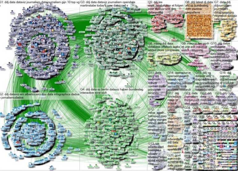
The NodeXL social network analysis tracks the #ddj hashtag on Twitter each week for GIJN’s Top 10 in Data Journalism series. Screenshot
The Birth of Top 10 #ddj
GIJN’s weekly Top 10 #ddj series started in January 2014 when one of us first tweeted a #ddj network graph. The graph, which mapped tweets mentioning the hashtag #ddj, including replies to those tweets, was created using NodeXL, a social network analysis and visualization package that builds on the Excel spreadsheet software. These network graphs reveal the patterns of interconnection that emerge from activities such as replying, @mentioning, and retweeting. These patterns highlight key people, groups, and topics being discussed.
As an international investigative journalism organization, GIJN is always looking for ways to raise awareness about what is happening in the fields of investigative and data journalism. When GIJN’s executive director David Kaplan saw Smith’s network graph, he proposed to use the map to produce a weekly Top 10 #ddj to showcase popular and interesting examples of data journalism. (He and Smith also tried a weekly roundup of investigative journalism, but no single hashtag came close to doing the job that #ddj does for data journalism.)
Although GIJN follows the network graph’s suggested findings closely, some human curation is necessary to eliminate duplicates and to highlight the most interesting items.
Since the birth of the series, we have assembled more than 250 snapshots of the data journalism community’s discussions featuring the #ddj hashtag over the past six years.
The series now serves as a good, quick summary for interested parties who cannot follow every #ddj tweet.
Our use of the term “snapshot” is not simply a metaphor. This analysis gives us a picture of the data journalism Twitter community, in the same way that photojournalism depicts real crowds on the front pages of major news outlets.
The Evolution of #ddj Twitter Traffic
To get a sense of how Twitter traffic using #ddj has evolved, we did a very basic and rough analysis of the #ddj data we have collected from 2014 to 2019. We selected a small sample of eight weeks in February and March from each of the six years, or 48 weeks. There was a variety of content being shared and engaged with and the most popular items included analysis and think pieces, awards, grants, events, courses, jobs, tools, resources and investigations. The types of content shared remained consistent over the years.
In 2014, we saw articles that discussed a burgeoning data journalism field. This included pieces arguing that data journalism is needed because it fuels accountability and insights, and predicting that analyzing data is the future for journalists. In later years, we observed new topics being discussed such as artificial intelligence, massive data leaks, and collaborative data investigations. There were also in-depth how-to pieces, where data journalists started offering insights into their data journalism processes, and sharing how to best utilize databases, rather than debating whether the media industry should incorporate data journalism into its newsrooms. We also noticed that among the investigations shared there were often analyses of elections, immigration, pollution, climate, and football.
GIJN’s weekly #ddj roundup not only highlights the most popular tweets and URLs, but also lists the central participants of the #ddj discussion.
Some of the usual suspects at the center of #ddj discussions include data journalism experts Edward Tufte, Alberto Cairo, Martin Stabe, Nate Silver and Nathan Yau, as are data teams from Europe and North America, including Le Telegramme, Tages-Anzeiger, Berliner Morgenpost, FiveThirtyEight, Financial Times, and The Upshot from The New York Times. Their work can at times be educational, inspiring, and trigger further debate. The data journalism community can also take advantage and network with these influencers.
A number of other hashtags often accompany #ddj, as Connected Action’s mapping reveals, allowing members of the community to seek out similar stories.
By far, the most common hashtags to appear alongside #ddj were #dataviz, #visualization, #datajournalism, #opendata, #data, and #infographics. This signals to us that those who are in this field particularly care not just about the availability of public data, but also the way in which data is creatively presented and visualized for readers.
However, the NodeXL #ddj mapping is by no means representative of the entire field, as it analyses only people who tweet. Furthermore, those who generally have more followers on Twitter and garner more retweets tend to feature more prominently in our roundup.
We have also noticed that the majority of the top tweets usually come from Europe and the Americas, particularly Germany and the United States, with some smatterings of tweets from Asia and Africa. This could be due to the skew of the user base on Twitter, because other regions have relatively less robust data journalism communities, or because data journalism communities in other regions do not organize through the same Twitter hashtags, or do not organize on Twitter at all.
Over the past year, we observed that some work by prominent data journalism organizations that was widely shared on Twitter did not appear in our network graph. This could possibly be due to people not using the hashtag #ddj when tweeting the story, or using other hashtags, or none at all. We suspect that Twitter’s expansion of the tweet character count from 140 to 280 in November 2017 might also have helped people to choose lengthier hashtags, such as #datajournalism.
Fun #ddj Discoveries
While what we find is often powerful journalism and beautiful visualizations, sometimes it is also just plain funny.
By way of conclusion, we briefly discuss some of the more entertaining items we have discovered using the #ddj hashtag in the past year.
In an adorable and clever visual essay, Xaquìn G.V. showed what people in different countries tend to search for most when they want to fix something. In many warmer countries, it is fridges; for North Americans and East Asians it is toilets; while people in northern and eastern Europe seem to need information on how to fix lightbulbs.
Next, a chart, found among the Smithsonian’s Sally L. Steinberg Collection of Doughnut Ephemera, argues that the size of the doughnut hole has gradually shrunk over the years. In a different piece, graphic designer Nigel Holmes illustrated and explained oddly wonderful competitions around the world, from racing snails to carrying wives, in a book called Crazy Competitions.
In another piece in our collection, women worldwide already know that the pockets on women’s jeans are impractically tiny, and Puddingviz has provided the unequivocal data and analysis to prove it.
Finally, is there such a thing as peak baby-making seasons? An analysis by Visme of United Nations’ data on live births seems to suggest so. They found a correlation between three different variables: the top birth months, seasons of the year, and the latitude of the country (distance from the equator) that may have an influence on “mating rhythms” in different countries.
Additional Reading
The GIJN Resource Center: Data Journalism
Data Journalism: Getting Started
GIJN’s Top Ten in Data Journalism
 Eunice Au is program manager at the Global Investigative Journalism Network, where she produces the weekly Top 10 #ddj roundup of the most popular tweets on data journalism. A native of Malaysia, she worked for the New Straits Times and served as a Malaysia correspondent for Singapore’s The Straits Times.
 Marc Smith is a sociologist and the founder and leader of the Connected Action consulting group, which applies social network analysis techniques to enterprise and internet social media usage. GIJN extends a special thanks to Marc and his colleagues for their extraordinary support of the weekly Top 10 #ddj since its inception.


