
Data Journalism Top 10: Polarized America, Australia’s Pandemic, Poland’s Toxic Air, the Arab Spring, Life as Lego
Read this article in
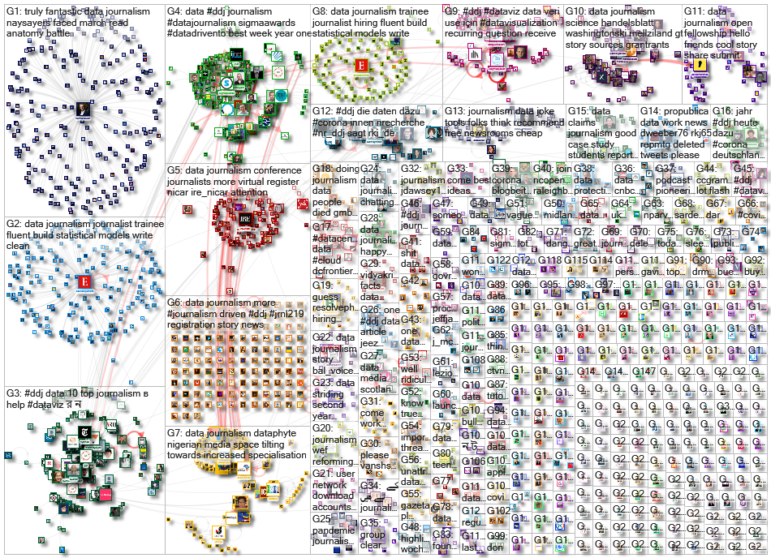
The end of January saw news outlets marking two important anniversaries. In Australia, reporters examined what has happened since the country recorded its first cases of the coronavirus. Meanwhile, countries in North Africa and the Middle East reflected on how the Arab Spring changed the world a decade after the first wave of pro-democratic protests in the region. Our NodeXL #ddj mapping from January 25 to 31 found interactive projects by the Australian Broadcasting Corporation and The Guardian analyzing these events. In this edition, we also feature environmental reporting by The New York Times and The Economist, a Wall Street Journal story on the GameStop Reddit mania that shook stock markets, and a visual representation of 2020 using Lego bricks.
A Radicalized Republic
The last few years have been among the most polarized periods in US history. This analysis by FiveThirtyEight dives into several concerning trends — including racial discrimination, income inequality, and growing political division — which grew more evident during the Trump years, and which pose serious challenges for US democracy.
Australia’s COVID-19 Battle
Toward the end of January 2020, Australia confirmed that four travelers who had flown back into the country tested positive for the coronavirus. A year later, ABC News published a comprehensive data-driven project that illustrates how the virus spread through the population and changed the lives of its people. The visualization covers those first cases through to clusters of infections linked to hotels and cruise ships, then the more concerning periods of community transmission, before snaking down to the lower infection rates seen at the end of the year.
The Arab Spring, Remembered
A decade ago, a wave of pro-democracy protests enveloped Tunisia, Egypt, Libya, and other Arabic-speaking countries in North Africa and the Middle East, in what became known as the Arab Spring. The Guardian’s interactive timeline uses photographs, maps, and key parts of the story to trace how the protests unfolded, unleashing consequences that “still shape the world a decade later.”
Poland’s Toxic Air
On cold days, identifying Poland from space is not as difficult as it may sound. Although by some metrics other European nations experience higher levels of air pollution, from the skies, Poland stands out with its nationwide sheet of smog. The Economist illustrates the extent of the country’s problem, which is largely due to reliance on coal for heating the nation’s homes.
Global Climate Change Threats
Should you need a reminder about the dangers of climate change, The New York Times created an interactive map to highlight which areas could be at risk unless greenhouse-gas emissions are cut drastically. You can use the map to explore your part of the world and match it to its likely climate change-related emergency — from cyclones and flooding to drought and wildfires.
Financing Fossil Fuels
While European institutions and public banks have introduced policies to help countries move away from fossil fuels, the private sector has not been as keen to limit funding for the industry. An analysis by Osservatorio Balcani Caucaso Transeuropa, a think tank based in Italy, shows that European private banks are still investing billions of euros in fossil fuel companies.
How the Vaccine Was Made
Despite cautious optimism that a COVID-19 vaccine could be approved in the first year of the pandemic, many people were truly surprised when not one, but several companies achieved this feat in 2020. This piece by USA Today tells the remarkable story of Moderna’s COVID-19 vaccine, and how a team of scientists developed it in record time.
Had this virus come 10 years earlier — or even five — science would not have been ready. https://t.co/bEnZyEWxWk
— USA TODAY (@USATODAY) January 31, 2021
Reddit and Wall Street
The story about the astonishing surge of GameStop’s shares was all over the news last week. But for many, it wasn’t immediately clear how communities on platforms like Reddit and Discord could stun veteran traders and influence the power dynamics on Wall Street. An analysis by The Wall Street Journal explains what happened.
Data Visualization Tools
Interested in creating data visualizations? There are plenty of tools you can use to produce beautiful and informative charts and graphics. In an Instagram post, ace designer Federica Fragapane gives 10 examples of her work for BBC Science Focus, Scientific American, and other publications, and shows how she made them.
Life Inside the Box
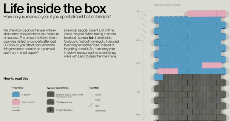
Do you remember how you spent your time in 2020? In such a unique year, tracking your activities could prove especially challenging given how many hours we were trapped in our homes. But data viz creator Sam Shannon found an innovative way to reconstruct her experiences by using Lego bricks. Of the 264 days she spent in London last year, her visualization shows, 55% of them were spent “in some sort of quarantine.”
Thanks again to Marc Smith and Harald Meier of Connected Action for gathering the links and graphing them. The Top Ten #ddj list is curated weekly.
 Peter Georgiev is GIJN’s social media and engagement editor. Previously, he was part of NBC News’ investigative unit in New York. He also worked as a correspondent for Bulgarian National Television, and his reporting has been published by the Guardian, Deutsche Welle, and other international outlets.

