Data Journalism Top 10: Atlas of Emotions, Carbon Recyclers, Football Long Shots, COVID-19 Endgame, Mister Rogers’ Cardigans
Read this article in
To fight climate change, we need to protect sea life. Whales, plankton, and seagrasses have a key impact on the Earth’s carbon cycle. Our NodeXL #ddj mapping from April 5 to April 11, which tracks the most popular data journalism stories on Twitter each week, found a piece by Reuters Graphics explaining how these species interact underwater as well as capture and transform carbon. In this edition, we also feature an atlas of emotions by Google Arts & Culture, a look at the COVID-19 endgame by the Financial Times, and some great board games to inspire data visualization enthusiasts.
Data Journalism Communities
The coronavirus pandemic has prompted a surge in data-driven stories and visualizations. And data reporters have found new platforms to share online learning resources, tips, and opportunities. DataJournalism.com’s data coordinator Andrea Abellán highlighted some useful educational communities on platforms such as Discord, Twitch, and TikTok.
An Atlas of Emotions
How do you feel when you look at a painting? How many different emotions can visual art create in us? Google Arts & Culture and scientists from the University of California, Berkeley wanted to answer these questions in a new experiment. The researchers asked 1,300 people to describe how 1,500 paintings by artists like Rubens and Chagall made them feel by choosing from different words. The study resulted in this remarkable atlas of emotions, which revealed how participants felt everything from “dread” and “distaste” to “wonder” and “serenity” while looking at art.
Long Shots
In soccer, shooting from a distance is often seen as a last resort. Goalkeepers are rarely beaten from 25 yards. So, many players would only consider trying their luck if they can’t break down the opposition or there are a few minutes left on the clock. But Maaike Van Roy, a Ph.D. student at the Belgian university KU Leuven, found that long shots may not be such a bad idea. Van Roy was the lead author of this analysis, which inspired this article by FiveThirtyEight.
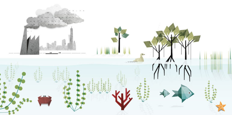
Carbon Recyclers
Nature has kept carbon levels balanced in the Earth’s environment for millennia. But industrial activities and fossil fuels have put ocean ecosystems under threat. To explain the crucial part these ecosystems play in fighting climate change, Reuters Graphics produced this visual story shedding light on the planet’s carbon cycle. The story focuses on the role of fish, mollusks, plants, and other forms of sea life in trapping carbon.
Mister Rogers’ Cardigans
It’s a beautiful day for a nice cardigan. For those unfamiliar with beloved US television host Fred Rogers, who was famous for his knitwear, perhaps Tom Hanks’ recent role has helped you learn more about his long-running educational children’s television series. In honor of Rogers’ birthday in March, Brooklyn-based data journalist Owen Phillips created this chart exploring the many colors of the cardigans the host wore on his program between 1969 and 2001.
Speed Cameras
In the Australian capital of Canberra, mobile speed cameras have been used on the roads for two decades. A recent survey found that more than half of locals believe the technology’s main purpose is to raise revenue. But this investigation by Markus Mannheim from the Australian Broadcasting Corporation found evidence that’s not actually the government’s goal.
Privacy Concerns
Most people are well aware that mobile devices are constantly tracking our activity. But if you have an iPhone, you might have been getting unexpected pop-ups from apps like The Sim or Merriam-Webster. A new software release by Apple will require apps gathering data for advertising purposes to ask you for permission. This is supposed to give you more control over your privacy. The Wall Street Journal explains what’s happening behind the scenes and why the choice is not as simple as it seems.
American Prisons
Worldwide, about two in every 100 people are known to have had the coronavirus. But in US prisons, the rate is an astounding 34 in 100. At the beginning of the pandemic, New York Times reporters started tracking every known COVID-19 case in correctional facilities around the country. Their analysis explores how the virus tore through the US prison system.
COVID-19’s Endgame
How will we know when the pandemic is coming to an end? For months, we have been tracking various statistics indicating the seriousness of different waves of the coronavirus. Now, the Financial Times’ John Burn-Murdoch has created a new chart, which gives some ideas about which countries are on their way out of the pandemic. The green target zone shows that Israel has been most successful in opening up while also keeping COVID-19 cases to a minimum.
Board Games
Board games excel in conveying information through visual elements. And for many of them, such as Ticket to Ride and Pandemic Legacy, maps are a fundamental tool. It’s no surprise then that storytellers often use these games as a source of ideas and inspiration. Data visualization enthusiast Andy Cotgreave started a Twitter thread to collect some of the best examples.
Thanks again to Marc Smith and Harald Meier of Connected Action for gathering the links and graphing them. The Top Ten #ddj list is curated weekly.
 Peter Georgiev is GIJN’s social media and engagement editor. Previously, he was part of NBC News’ investigative unit in New York. He also worked as a correspondent for Bulgarian National Television and his reporting has been published by the Guardian, Deutsche Welle, and other international outlets.
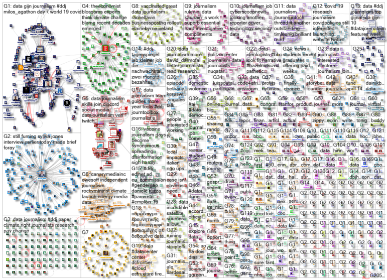
For a look at NodeXL’s mapping on #ddj and data journalism on Twitter, check out this map.

Basic Data Journalism Tips for Editors

My Favorite Tools: Venezuela’s Lisseth Boon on Design and Data Visualization

Document of the Day: Visual Vocabulary

Tipsheet on Partnering with Civil Society Organizations and Non-Governmental Organizations

Turning the Threat to a Distant Glacier into a Local Story Through Data Visualization

Making Trillions Make Sense: How Reuters Visualized the AI Economy

Summer Reading List for Data Journalists: For Those Who Believe in the Power of Storytelling with Numbers

From Data to Storytelling: Concept and Design Tips from the Financial Times’ John Burn-Murdoch

This work is licensed under a Creative Commons Attribution-NoDerivatives 4.0 International License
Republish our articles for free, online or in print, under a Creative Commons license.
Republish this article
This work is licensed under a Creative Commons Attribution-NoDerivatives 4.0 International License
Read Next
Climate Data Journalism
Turning the Threat to a Distant Glacier into a Local Story Through Data Visualization
New York Times climate and environmental graphics reporter Mira Rojanasakul discusses how her team visualized the sea level rise threat from the melting Thwaites Glacier in Antarctica.
Data Journalism
Making Trillions Make Sense: How Reuters Visualized the AI Economy
How do you make a trillion dollars feel real to someone who has never seen that much money? Vineet Khare and Mayank Bhatt faced that very challenge for their data-driven investigation into AI investment.
Data Journalism
Summer Reading List for Data Journalists: For Those Who Believe in the Power of Storytelling with Numbers
Featuring books spanning four continents, these recommended reads provide a global perspective on data journalism.
Data Journalism
From Data to Storytelling: Concept and Design Tips from the Financial Times’ John Burn-Murdoch
The chief data reporter for the Financial Times discusses how he considers the use of text, color, and annotation to aid visual storytelling through charts and graphics.