
Data Journalism Top 10: Pandemic Cocktails, Pricey Food, Zoonotic Diseases, the World’s Top Songs
Read this article in
An illustration by Laila Milevski for ProPublica. Image: ScreenshotIf you have tried to mix cocktails at home lately, you’re not alone. Tired of waiting for bars and restaurants to reopen, more consumers have started buying premium alcohol, according to data published by the Financial Times. Our NodeXL #ddj mapping from March 1 to 7, which tracks the most popular data journalism stories on Twitter, also found an analysis by Bloomberg showing that global food prices have hit their highest level in six years, an explainer of the connection between bats and virus outbreaks by Reuters, an interactive piece on Atlantic currents by The New York Times, and a musical map by The Pudding.
High Spirits
For most of us, going out for a drink may seem like a distant memory. But with bars and restaurants closed as governments try to restrict COVID-19 transmission, many consumers have started bringing premium alcohol into their living rooms. The Financial Times notes that high-end spirits like tequila, vodka, and liqueurs have outperformed the broader alcohol market. Among the reasons: people are mixing their own cocktails at home.
Soaring Food Prices
Demand from China, vulnerable supply chains, and adverse weather have pushed global food prices to their highest level in six years, according to Bloomberg. But food inflation is affecting countries unevenly. The team’s analysis puts the spotlight on Brazil, Russia, Nigeria, Turkey, and India where factors like inflation and political mismanagement have contributed to basic products becoming much more expensive.
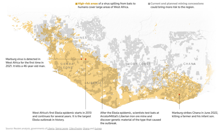
Bats and Zoonotic Diseases
From the start of the pandemic, scientists have speculated that the coronavirus outbreak began with bats. With the World Health Organization due to report on its findings on the zoonotic origins of the virus, a graphics team at Reuters explored what makes these flying mammals the ideal hosts for viruses. To find out, explore the comprehensive visual explainer.
Warning Signs in the Atlantic
New research indicates that Atlantic Ocean currents may be slowing, which could affect the climate around the world. If this were to happen, the weakening of the currents could result in faster sea-level rise, stronger hurricanes, and reduced rainfall in northern Africa. The New York Times published an interactive piece to explain how scientists study currents and why the Gulf Stream is influencing weather patterns on four continents.
Job Crisis in Tourism Hotspots
Areas with seasonal employment in the UK have been hardest hit by the COVID-19 jobs crisis, according to an analysis by the BBC’s Shared Data Unit. The figures suggest that popular tourism hotspots such as London, Scotland, and parts of Wales are more likely to have furloughed workers. Says one economist: “The pandemic has exposed a number of underlying inequalities in the labor market.”
Vaccine Roadblocks
In the US, getting a coronavirus vaccine can be difficult even if you are eligible for a shot. ProPublica has collected and illustrated stories from Americans around the country who have had difficulties trying to reserve appointments or reach vaccination sites. Common challenges include accessibility issues, language barriers, and confusing information.
Living on Minimal Wages
In the 1960s, Americans saw the height of the minimum wage’s buying power with the bar at $1.58 an hour, or around $12 an hour in today’s money. Back then, minimum-wage workers paid less for almost every type of living expense, according to an analysis by the Wall Street Journal. The newspaper compared the current cost of various products such as a gallon of gasoline, a dozen eggs, and a monthly mortgage payment to their prices a half-century ago. Overall, the comparison illustrates that today’s minimum wage has less purchasing power.
Race and Education
US universities are trying to predict how likely their students are to drop out of school based on their race, according to an investigation by The Markup. After reviewing documents obtained through public records requests, the outlet found risk algorithms deeming Black students a “high risk” at a significantly higher rate than their white peers, a practice experts worry could be pushing Black and other minority students into “easier” classes and majors.
Understand Your Audience
Data has become crucial to news organizations that seek to better understand the preferences of different audiences and, in turn, improve their relationship with them. But journalists often forget that an analysis based on metrics merely results in educated guesses about what their readers need. And these educated guesses often don’t come close to reality. In this article for Slate, Jacob Nelson explains that newsrooms should use data to find out not just how their audiences behave, but why.
Top Songs Around the World
Wondering what was the most popular song in your country in February? What about the favorite tune of people living in Latvia or Uruguay? Check out this musical map of the world by The Pudding. By scrolling around the graphic, you can stream the top songs in each place, and find out which ones dominate across the globe.
Thanks again to Marc Smith and Harald Meier of Connected Action for gathering the links and graphing them. The Top Ten #ddj list is curated weekly.
 Peter Georgiev is GIJN’s social media and engagement editor. Previously, he was part of NBC News’ investigative unit in New York. He also worked as a correspondent for Bulgarian National Television and his reporting has been published by The Guardian, Deutsche Welle, and other international outlets.
For a look at NodeXL’s mapping on #ddj and data journalism on Twitter, check out this map.

Tipsheet on Partnering with Civil Society Organizations and Non-Governmental Organizations

AI Accountability Reporting Guide

Guide to Mapping Analysis Using QGIS

Open Source Databases by Country
Data Journalism Top 10: Bats and the Next Pandemic, China’s Electric Battery Dominance, and Brazil’s Healthcare ‘Holes’

Data Journalism Top Ten: Turkey’s Toxic Rubble, Eurovision History, and a Rare Climate Victory

Data Journalism Top 10: Queen Elizabeth’s Reign, Arctic Fires, Taiwan Street Food, Brain Drain
Data Journalism Top 10: Vehicle Data Privacy, Formula One History, India’s Extrajudicial Killings, Losing Your Cool

This work is licensed under a Creative Commons Attribution-NoDerivatives 4.0 International License
Republish our articles for free, online or in print, under a Creative Commons license.
Republish this article
This work is licensed under a Creative Commons Attribution-NoDerivatives 4.0 International License
Read Next
Data Journalism Data Journalism Top 10
Data Journalism Top 10: Bats and the Next Pandemic, China’s Electric Battery Dominance, and Brazil’s Healthcare ‘Holes’
GIJN’s weekly, curated look at the Top 10 in Data Journalism highlights bats and predicting the location of the next pandemic, China’s electric battery dominance, and mapping out Brazil’s healthcare “holes.”
Data Journalism Data Journalism Top 10 News & Analysis
Data Journalism Top Ten: Turkey’s Toxic Rubble, Eurovision History, and a Rare Climate Victory
This week’s Top 10 Data Journalism stories curated by GIJN includes projects on Turkey’s toxic earthquake rubble, Eurovision song metrics, US migration from coastal cities, and world leaders’ heights.
Data Journalism Data Journalism Top 10
Data Journalism Top 10: Queen Elizabeth’s Reign, Arctic Fires, Taiwan Street Food, Brain Drain
Our weekly NodeXL and human curation of the most popular data journalism stories on Twitter features The Financial Times’ 10 charts visualizing developments in the United Kingdom during Elizabeth’s reign, The Marshall Project’s look at how government Covid-19 relief funds were used, and Taiwan Data Stories’ scrollytelling project about Taiwan’s iconic street food.
Data Journalism Research
Data Journalism Top 10: Vehicle Data Privacy, Formula One History, India’s Extrajudicial Killings, Losing Your Cool
This week’s Data Journalism Top 10 features a dive into the murky market for vehicle data, an analysis of the deteriorating quality of education in poorer countries, a piece on how higher temperatures affect our lives, and fact-checking India’s encounter killings.