Data Journalism Top 10: Biometric IDs, Data Spaghetti, Eviction Avalanche, Remote Working
Read this article in
As countries deploy COVID-19 vaccines and consider the safest ways to ease lockdowns, some are finding reasons for optimism about the end of the pandemic. But returning to once conventional daily activities, such as going to restaurants and sports stadiums, is still a distant prospect. Our NodeXL #ddj mapping from February 1 to 7 found Voxeurop covering the dangers of adopting biometric IDs and health passports, a look at Europe’s COVID-19 divide by Reuters, an analysis of leaked smartphone data by The New York Times, and a Twitter thread collection of archived data visualizations in various languages.
Biometric IDs and COVID
Do we need digital IDs and health passports to get back to normal? Some governments and companies have argued that biometric identification records offer our best shot at reviving the hard-hit travel and entertainment industries. But an analysis by online media outlet Voxeurop highlights the potential threat to personal autonomy that could result if countries — or regions — opt for large-scale digital identity systems.
Europe’s COVID-19 Divide
The coronavirus has claimed hundreds of thousands of lives in Europe, which remains one of the regions worst-affected by the pandemic. But the health crisis has not played out in a uniform way. Countries in Eastern Europe adopted different approaches to combating the virus when compared to their neighbors. The Reuters graphics team showed how this led to a stark divide, with one region experiencing a “devastating spring, the other a tragic autumn.”
Portugal’s Immunization Campaign
The European Union wants health authorities in member states to vaccinate at least 70% of the adult population against COVID-19 by the end of the summer. But how many countries are on track to achieve this objective? The Portuguese newspaper Público evaluated the success of the country’s immunization efforts and compared its vaccine rollout to other nations around the world.
Tracking a Pandemic
In March 2020, two journalists from US-based Atlantic magazine partnered with a researcher to launch The COVID Tracking Project. Since then, hundreds of contributors have joined the team to gather and publish “the most complete testing data available for US states and territories.” Last week, the project leaders said that the initiative will come to an end this May. The reason: US public health officials are finally doing what the feds should have done a year ago — providing comprehensive data on the pandemic’s impact.
Mountains of Data Spaghetti
Page views. Retention rates. Returning visitors. In the modern media landscape, there are countless metrics that digital publications and broadcasting companies track to inform their editorial strategy. But merely gathering web analytics doesn’t guarantee success. When newsrooms are overwhelmed with a mountain of “data spaghetti,” journalists can get lost in the numbers. This article by Journalism.co.uk offers some advice on how to make use of data to better understand the needs of your audience.
Tracing the Capitol Rioters
More than a month after a political rally evolved into a violent attack on the US Capitol, journalists are still investigating the actions of protesters who stormed the building in Washington, DC. For this story, The New York Times analyzed leaked smartphone location data to identify some of the rioters and create a time-lapse animation of their movements, reminiscent of something from “The Matrix.”
Chicago’s Eviction Avalanche
The economic impact of the pandemic has left many US renters on the brink of losing their homes. In the Midwestern city of Chicago, experts are worried about “an eviction avalanche” as jobless residents fail to reach agreements with their landlords. Reporters from City Bureau, a local nonprofit, interviewed seven of those affected to tell the story of an ongoing housing crisis.
Tech-Powered Investigations
Last year, The Guardian embedded a small group of engineers in its newsroom to create a new investigative and reporting team. In this blogpost, the newspaper takes readers behind the scenes to explain how developers worked with journalists to examine the UK government’s response to the pandemic. This approach suggests how tech can empower the editorial desk in an effort to hold institutions to account.
Remote Working
Working from home has become standard practice in various industries over the past year. And many people don’t expect to drop Zoom and go back to the office anytime soon. But what does this change mean in the long run? The Conversation, which publishes stories written by academics and researchers, created five charts that illustrate how remote working has affected businesses, commutes, daily habits, and other aspects of social life in the UK.
Data Viz Around the World
Looking through the data visualization archives, it can be difficult to find non-English charts and graphics. But this Twitter thread has plenty of fascinating data viz representations from around the world, with examples that date back to the 19th century. The collection includes old maps from China, Germany, Greece, and many other countries.
Thanks again to Marc Smith and Harald Meier of Connected Action for gathering the links and graphing them. The Top Ten #ddj list is curated weekly.
 Peter Georgiev is GIJN’s social media and engagement editor. Previously, he was part of NBC News’ investigative unit in New York. He also worked as a correspondent for Bulgarian National Television and his reporting has been published by the Guardian, Deutsche Welle, and other international outlets.
For a look at NodeXL’s mapping on #ddj and data journalism on Twitter, check out this map.

Tipsheet on Partnering with Civil Society Organizations and Non-Governmental Organizations

AI Accountability Reporting Guide

Guide to Mapping Analysis Using QGIS

Open Source Databases by Country
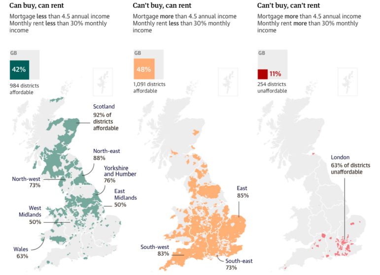
Data Journalism Top 10: UK Housing Affordability, Russian Casualty Count, US Book Bans, and Redefining Poverty
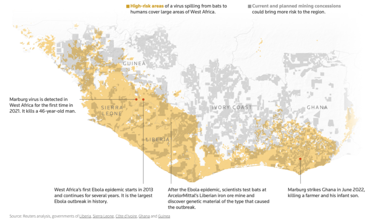
Data Journalism Top 10: Bats and the Next Pandemic, China’s Electric Battery Dominance, and Brazil’s Healthcare ‘Holes’

Data Journalism Top 10: How COVID-19 Changed the US, Race for the North Pole, and Visualizing Coronation in the UK
Data Journalism Top 10: Sweltering Cities, Digital Inequity, Climate & Sleep, COVID & Schools

This work is licensed under a Creative Commons Attribution-NoDerivatives 4.0 International License
Republish our articles for free, online or in print, under a Creative Commons license.
Republish this article
This work is licensed under a Creative Commons Attribution-NoDerivatives 4.0 International License
Read Next
Data Journalism Data Journalism Top 10
Data Journalism Top 10: UK Housing Affordability, Russian Casualty Count, US Book Bans, and Redefining Poverty
In this week’s Top 10 in Data Journalism, GIJN looks at the perilous state of UK housing affordability, tabulating a true Russia casualty count, and the common traits among US banned books.
Data Journalism Data Journalism Top 10
Data Journalism Top 10: Bats and the Next Pandemic, China’s Electric Battery Dominance, and Brazil’s Healthcare ‘Holes’
GIJN’s weekly, curated look at the Top 10 in Data Journalism highlights bats and predicting the location of the next pandemic, China’s electric battery dominance, and mapping out Brazil’s healthcare “holes.”
Data Journalism Data Journalism Top 10
Data Journalism Top 10: How COVID-19 Changed the US, Race for the North Pole, and Visualizing Coronation in the UK
This week GIJN’s Top 10 in Data Journalism features the Wall Street Journal’s dive into how COVID-19 changed the daily lives of Americans, the Straits Times on Singapore’s gold medal history at the Southeast Asian Games, and how data journalists visualized the coronation of King Charles III.
Data Journalism
Data Journalism Top 10: Sweltering Cities, Digital Inequity, Climate & Sleep, COVID & Schools
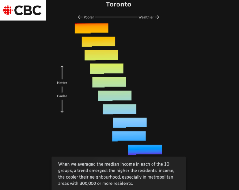
As parts of the world endure record-breaking temperatures, a highlight from the world of data journalism this week involves an analysis of how “heat islands” in Canadian cities vary based on economic strata. Our weekly Top Ten in Data Journalism also looks at the global spread of Pegasus spyware, digital inequity in the US, and how the COVID-19 pandemic affects school children in Latin America.