
Credit: Al Jazeera Screenshot
Data Journalism Top 10: Global Protests, Baseball Returns, 17-Year Bugs, High-Tech COVID Masks, Vaccine Inequality
Read this article in
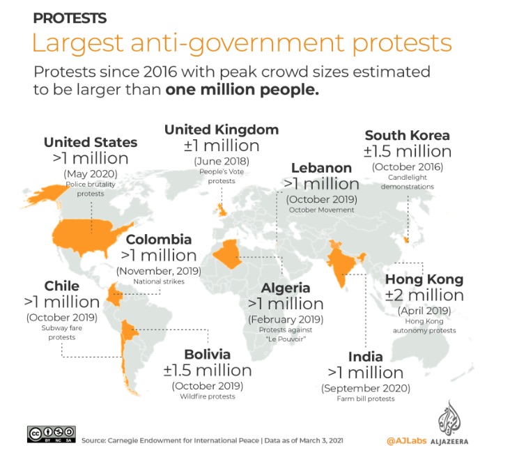
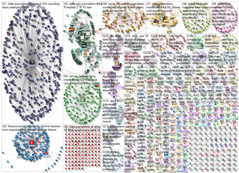
The consequences of the global pandemic, including job crises and deepening inequality, have ignited a new wave of protest movements over the past year. But over the past decade, there were at least 900 protest events that each drew more than 10,000 participants, according to a project by Al Jazeera’s graphics team. Our NodeXL #ddj mapping from March 29 to April 4, which tracks the most popular data journalism stories on Twitter each week, also features an analysis of migration trends by the Financial Times, a story about the next generation of face masks by The Wall Street Journal, and a remarkable sound visualization of COVID-19’s impact in Switzerland, using a music box.
Flying Bugs
There are many reasons to love spring. Flying bugs is probably not one of them. For 17 years, billions of cicadas have been underground. In several weeks, they will emerge en masse, blanketing parts of the eastern United States. The Washington Post produced this visual story to explain the so-called “Brood X” and what makes these cicadas special.
High-tech Masks
Face masks are believed to be one of the most efficient ways to prevent the spread of the coronavirus. But a new technology promises to make them even more useful. The Wall Street Journal illustrated how the next generation of face coverings, equipped with diagnostics and sensors, could soon be able to test for COVID-19 and even kill viruses.
Mapping Major Protests
The world has seen nearly 7,000 protests in 153 countries over the past 10 years, according to the Mass Mobilization data project, which tracks demonstrations outside the US. Al Jazeera produced five graphics to map and explain some of the biggest protests around the globe, including movements in India, Lebanon, Hong Kong, and other nations.
Reverse Migration
For years, citizens of Eastern European countries such as Poland, Romania, and Bulgaria have left their homelands and migrated to the UK in search of better opportunities. But after Britain exited the European Union, and the pandemic hit the continent, uncertainty has prompted tens of thousands of foreign workers to return to their home countries. This investigation by the Financial Times (paywalled) dives deep to explain the major shift in UK migration patterns.
A Song of Crowns and Tears
We have seen plenty of illustrations telling stories about the pandemic. But journalist Simon Huwiler made a unique sound visualization of two COVID-19 waves in Switzerland using a music box and a 4-meter-long (13 foot) punch card. You can listen to Huwiler’s entire “Song of Crowns and Tears” on YouTube.
Fading Homeownership in Britain
Lower paid key workers — including nurses, bus drivers, school teachers, senior caregivers, and postal workers — have been on the frontline of the pandemic in the UK. An analysis by The Guardian found that many of them cannot afford to buy a home after years of rising prices have locked them out of the market in all but a tiny sliver of council areas.
Power-Hungry Data Centers
Huge data centers are springing up in Zurich, the largest city in Switzerland. And they can be ravenous consumers of electricity. Swiss newspaper Tages-Anzeiger did the math and found that some centers use almost as much electricity as a small town.
Baseball is Back
It’s been a long time since athletes last performed in packed stadiums. Baseball was one of the sports hit the hardest by the pandemic in the US. But the new season begins with hopes for restoring the traditional atmosphere at the country’s ballparks, with some fans being allowed back in the stadium. Reuters Graphics illustrated the attendance limits each team set for Opening Day.
Counting Days in the Canal
How much time did it take to free the Suez Canal? Five? Six? Seven? The Guardian, The New York Times, and The Wall Street Journal can’t seem to agree on the timeline. The Washington Post’s Peter Andringa highlighted a curious misunderstanding in his colleagues’ coverage of this story.
Cutting the Vaccine Line
More than half a billion vaccines have been administered around the world since the immunization campaign began, with the vast bulk of those being doled out in wealthier countries. According to this piece by The New York Times, the imbalance arises from the different dates that nations and regions struck deals with vaccine manufacturers.
Thanks again to Marc Smith and Harald Meier of Connected Action for gathering the links and graphing them. The Top Ten #ddj list is curated weekly.
 Peter Georgiev is GIJN’s social media and engagement editor. Previously, he was part of NBC News’ investigative unit in New York. He also worked as a correspondent for Bulgarian National Television and his reporting has been published by The Guardian, Deutsche Welle, and other international outlets.


