Data Journalism Top 10: Women’s Careers, Vitamin D, Visual Stories, Electric Cars, Japan’s Ghost Towns
Read this article in
On the one-year anniversary of the COVID-19 crisis being declared a global pandemic, the news media around the world looked back on how the coronavirus has transformed our lives. Our NodeXL #ddj mapping from March 8 to 14, which tracks the most popular data journalism stories on Twitter, found a comprehensive summary of how the health crisis unfolded in the US by The Washington Post, and a look at how COVID-19 has affected Hungary. In this edition, we also feature The Economist’s interactive tool which shows the risk posed by COVID-19 based on a person’s health, a story about the ghost towns in Fukushima by NPR, and a look at the future of electric cars by The New York Times.
A Year of the Pandemic
When the World Health Organization declared COVID-19 a pandemic on March 11, 2020, the official global death count was 4,291. Twelve months on, the US alone has seen more than 525,000 people die with the virus, and millions more fall sick. The Washington Post published an interactive timeline of a year like no other, experienced through the eyes of Americans.
The “She-Cession”
For working women, the past year has been taxing. The Wall Street Journal notes that women have lost a disproportionate number of jobs. With schools closed, there has also been a “caregiving crunch,” while single mothers have faced additional expenses such as hiring a babysitter or paying for online classes. On the positive side, female leaders have made their mark in the business world with a record 40 women running Fortune 500 companies. The Journal’s by-the-number analysis also focused on what the pandemic could mean for the future of women’s careers.
Pandemic Mortality
At the start of the pandemic, medical experts were keenly trying to establish if COVID-19 posed a more serious threat to particular groups of people. Now researchers around the world have gathered enough data to better assess the risk of dying from the virus. Using records from 425,000 people in the US who tested positive, The Economist built a statistical model estimating chances of death and hospitalization based on age, sex, and comorbidities, such as having two or more diseases or health conditions that may make a patient more vulnerable.
Debunking the Myth of Vitamin D
If you have read that vitamin D can protect you from contracting COVID-19 or increase your chances of recovery, you might be disappointed about the lack of scientific evidence supporting these claims. The Guardian highlighted two studies encompassing large European datasets, which show no significant correlation between vitamin D and coronavirus infections, recovery, or mortality.
Hungary’s COVID-19 Battle
With just over 1,700 coronavirus deaths per million people, Hungary ranks among the top 10 nations hit hardest by the pandemic, just behind Belgium and the UK, according to Statista. The data team of Budapest-based investigative center Atlatszo built this interactive platform to visualize the epidemiological developments of the past year and show how Hungary has compared to the rest of Europe and elsewhere.
Electric Cars
With both startups and established manufacturers racing to build the best and most affordable electric vehicle, many car enthusiasts thought these eco-friendly vehicles would be widespread by now. But the revolution is happening slowly; it could take years before it has a noticeable impact on climate change. This New York Times’ graphics will help you understand why gasoline-powered cars will continue to rule the road for the foreseeable future.
Japan’s Ghost Towns
A decade ago, an offshore earthquake — the strongest ever recorded in Japan — triggered a tsunami that hit the country’s northern coast. After the waves crashed into the Fukushima Daiichi Nuclear Power Plant, three reactors overheated and exploded, devastating the area. The Japanese government has since invested billions of dollars into recovery efforts. NPR’s team produced a remarkable visual story to show the long-term consequences of the biggest nuclear accident since Chernobyl in 1986.
A Crisis of Representation
Black and Asian teachers are vastly underrepresented in England’s state schools, according to a HuffPost UK analysis of data published by the UK Department of Education. The outlet found that Black and Asian pupils are almost three times as likely to have a white teacher than a Black or Asian teacher. Even though the share of Black teachers has slowly increased throughout the past decade, at this rate of change it would take another 40 years for the country’s teacher workforce to match the current diversity of the nation’s pupils.
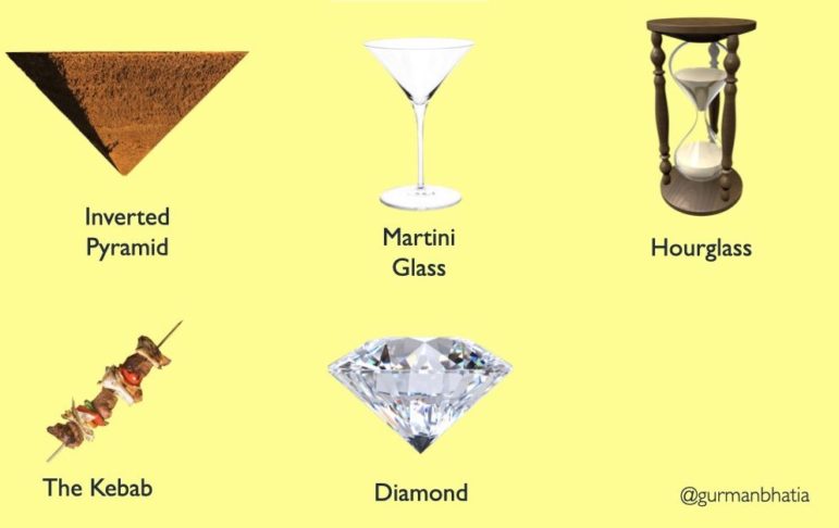
Telling Visual Stories
Inverted pyramid. Martini glass. Diamond. Journalists have invented many creative terms to describe different frameworks in their news coverage. But in addition to broadcast and print stories, these frameworks are also often incorporated into interactive projects. Graphics and data journalist Gurman Bhatia wrote this blog post to demonstrate useful approaches to structuring visual narratives.
Long-Form Journalism
The digital era has underscored that there are numerous ways to tell a story. Around the world, newsrooms as well as independent creators have experimented with documentaries, newsletters, podcasts, and other tools to produce unique journalism projects. In harnessing those techniques to tell long-form stories, Sara Fischer from US news site Axios writes about how long-form journalism has become stronger than ever.
Thanks again to Marc Smith and Harald Meier of Connected Action for gathering the links and graphing them. The Top Ten #ddj list is curated weekly.
 Peter Georgiev is GIJN’s social media and engagement editor. Previously, he was part of NBC News’ investigative unit in New York. He also worked as a correspondent for Bulgarian National Television and his reporting has been published by The Guardian, Deutsche Welle, and other international outlets.
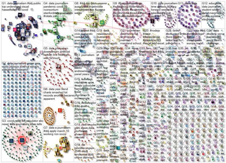
For a look at NodeXL’s mapping on #ddj and data journalism on Twitter, check out this map.

Tipsheet on Partnering with Civil Society Organizations and Non-Governmental Organizations

AI Accountability Reporting Guide

Guide to Mapping Analysis Using QGIS

Open Source Databases by Country
Data Journalism Top 10: Bats and the Next Pandemic, China’s Electric Battery Dominance, and Brazil’s Healthcare ‘Holes’

Data Journalism Top 10: How COVID-19 Changed the US, Race for the North Pole, and Visualizing Coronation in the UK
Data Journalism Top 10: Kids’ Fashion Stereotypes, Economic Sandwich Index, Immigration Profits, and Florence Nightingale’s Graphics
Data Journalism Top 10: Sweltering Cities, Digital Inequity, Climate & Sleep, COVID & Schools

This work is licensed under a Creative Commons Attribution-NoDerivatives 4.0 International License
Republish our articles for free, online or in print, under a Creative Commons license.
Republish this article
This work is licensed under a Creative Commons Attribution-NoDerivatives 4.0 International License
Read Next
Data Journalism Data Journalism Top 10
Data Journalism Top 10: Bats and the Next Pandemic, China’s Electric Battery Dominance, and Brazil’s Healthcare ‘Holes’
GIJN’s weekly, curated look at the Top 10 in Data Journalism highlights bats and predicting the location of the next pandemic, China’s electric battery dominance, and mapping out Brazil’s healthcare “holes.”
Data Journalism Data Journalism Top 10
Data Journalism Top 10: How COVID-19 Changed the US, Race for the North Pole, and Visualizing Coronation in the UK
This week GIJN’s Top 10 in Data Journalism features the Wall Street Journal’s dive into how COVID-19 changed the daily lives of Americans, the Straits Times on Singapore’s gold medal history at the Southeast Asian Games, and how data journalists visualized the coronation of King Charles III.
Data Journalism
Data Journalism Top 10: Kids’ Fashion Stereotypes, Economic Sandwich Index, Immigration Profits, and Florence Nightingale’s Graphics
Children’s fashion is riddled with gender stereotypes, according to an analysis by German newspaper Süddeutsche Zeitung, which found that popular children’s clothing tended to be more revealing for girls, but comfortable and functional for boys. Also this week, analysis of the big earners in the healthcare industry, the tracking of post-pandemic recovery through sandwich sales, and Florence Nightingale’s contribution to graphic storytelling.
Data Journalism
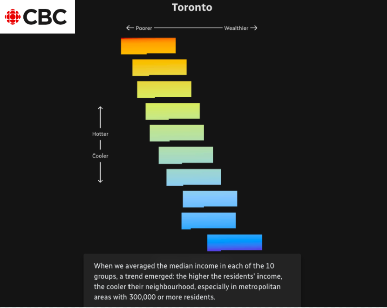
Data Journalism Top 10: Sweltering Cities, Digital Inequity, Climate & Sleep, COVID & Schools
As parts of the world endure record-breaking temperatures, a highlight from the world of data journalism this week involves an analysis of how “heat islands” in Canadian cities vary based on economic strata. Our weekly Top Ten in Data Journalism also looks at the global spread of Pegasus spyware, digital inequity in the US, and how the COVID-19 pandemic affects school children in Latin America.