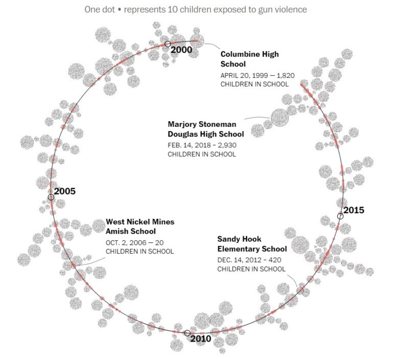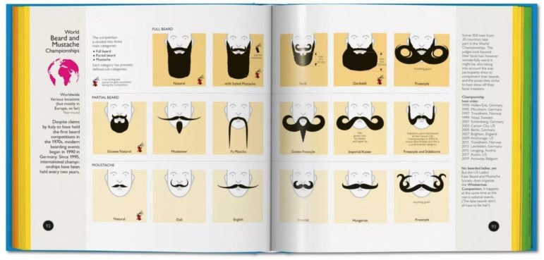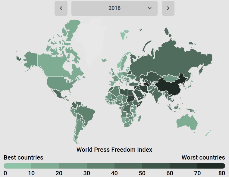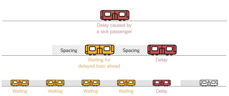
Data Journalism
GIJN’s Data Journalism Top 10: Useful Chatbots, Less-Is-More Tables and Data Mapping Billions of Birds
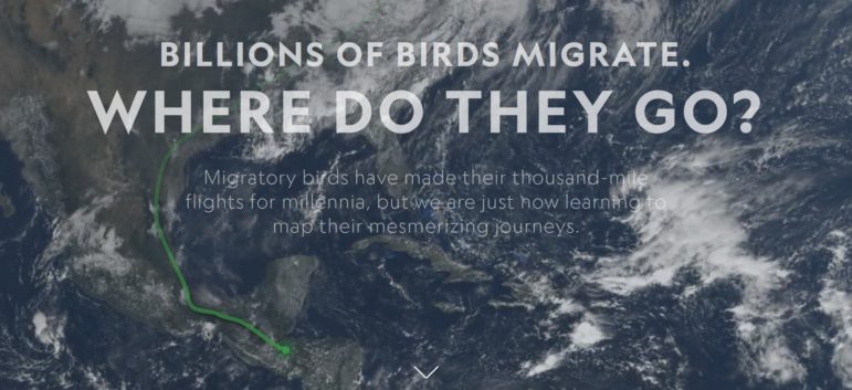
What’s the global data journalism community tweeting about this week? Our NodeXL #ddj mapping from Sept 17 to 23 finds numerous data to map, from @NatGeo’s migration of billions of birds to @morgenpost’s Berlin schools and @A24COM’s internet access in Argentina. There’s also @dhanalytics’ tips on improving data tables and @mcrosasb on two useful chatbots.