
GIJN’s Data Journalism Top 10: Innovative Visualization, Data Fellowships and the Dark Side
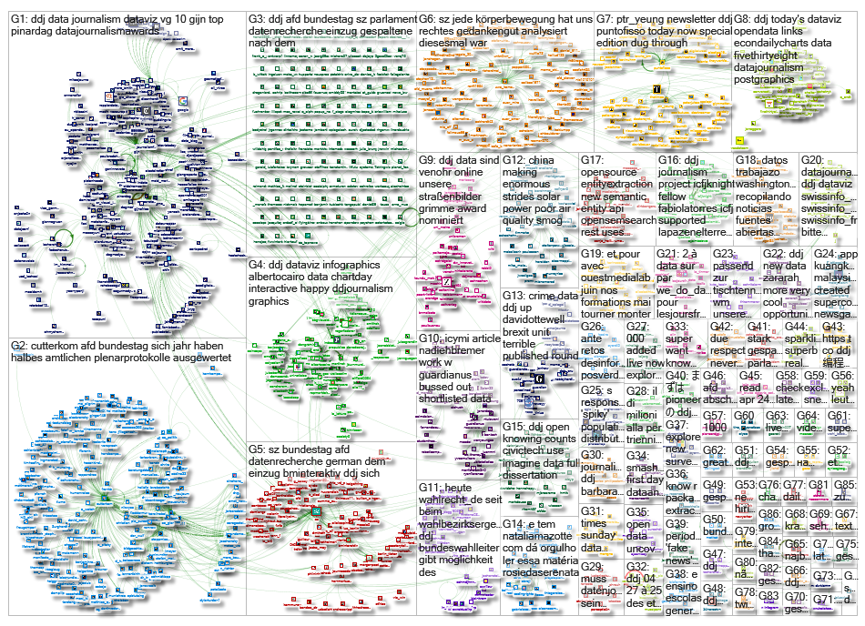
 What’s the global data journalism community tweeting about this week? Our NodeXL #ddj mapping from April 23 to 29 finds @thetimes‘ interactive determining whether you’ll join the dark side, @albertocairo discussing precedents to innovative visualizations and @srendgen talking about the tech revolution encouraging data journalism.
Will You Join the Dark Side?
Will you go against the puritanical Jedi code and be like Vader? Or will you uphold ethics and be like Luke Skywalker? The Times created a short quiz to find out what’s the force within you.
Hey interactive/#ddj/#dataviz folks. I’m after examples of news games.
Like these:
1) https://t.co/m1J0QsFcl9
2) https://t.co/YVW8RSdtjN
3) https://t.co/KFGoDAGMC8
4) https://t.co/bCb8fXiwpCWhat have you got?
— Peter Yeung (@ptr_yeung) April 24, 2018
Visualization Precedents
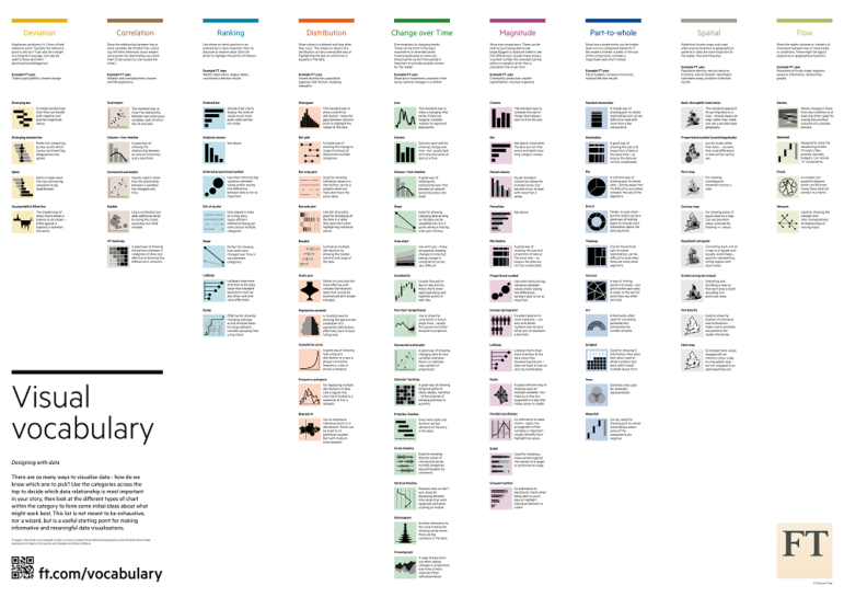
“Most visualizations that look very innovative have precedents,” writes data visualization expert Alberto Cairo in his discussion on how Henry Beck’s landmark 1933 London Underground map was likely inspired by George Dow, an employee of the London & North Eastern Railway.
(vía @albertocairo) Para los gráfico-mapa-adictos: Visualization myths: Henry Beck and the London Underground map {← sobre el origen del mapa de Henry Beck} https://t.co/R3cim8XHnP pic.twitter.com/XsdE8bkDxQ
— Ingeniería en la Red (@ingenieriared) April 26, 2018
School of Data Fellowships
School of Data is offering a nine-month fellowships to advance data literacy. There are eight spots, one in each of the following countries: Bolivia, Guatemala, Ghana, Indonesia, Kenya, Malawi, Tanzania and the Philippines. Apply soon — the deadline is this Sunday, May 6.
Final week to apply for the @SchoolOfData ’s 2018 Fellowship Programme: https://t.co/2FhBKKRniF #scoda #dataliteracy #training #schoolofdata #ddj pic.twitter.com/wDiSTp1Ab9
— Open Knowledge Intl (@OKFN) May 2, 2018
Discussing the Data Revolution
What came first? The data or the demand for it? That’s what Sanra Rendgen, author of two books on data visualization and infographics, asks about the technological revolution which triggered news outlets to tap complex statistics as an independent source for news stories.
https://t.co/Cy9S3ExToN “It is hard to know what came first: the data or the demand for it.” On our blog, @srendgen looks at datajournalism, and at why it took a digital revolution for journalists to pick up on statistics #ddj #datascience pic.twitter.com/qrrZDpbPOX
— idalab GmbH (@idalab_de) April 24, 2018
Peace in Colombia
ICFJ Knight Fellow for Latin America Fabiola Torres and her partners at Rutas del Conflicto launched an investigation into Colombia’s efforts to secure a lasting peace. They combined journalism and technology to track the murders of social leaders and the reintegration of former FARC combatants into civic life.
.@ICFJKnight Fellow @fabiolatorres supported #LaPazenelTerreno, a #ddj investigative journalism project by our partners @rutasconflicto + @eecolombia2020. It combines in-depth journalism + technology to track results of the Colombia peace agreement. https://t.co/MSNIiq66GW pic.twitter.com/LxyT9znWlg
— ICFJ (@ICFJ) April 23, 2018
How the Census Influences Congress
Univision Noticias shows in four graphs how responses to a US state’s census corresponds to political power. Congressional representation depends on a state’s population, so when the population of a state increases, so will its representatives.
?@UniGraficos nos explica la importancia de responder al censo en cuatro gráficos https://t.co/s8Qlg0f3fq Por @asincopado @jpgarnham @Mariano_Zafra @figue8 (vía @UniNoticias) #InternationalChartDay #ChartDay #ddj
— Jose Zamora (@jczamora) April 26, 2018
The Probability of Misinterpreting Probability Graphs
G Elliot Morris experiments with different ways to visualize election forecasting to combat the public’s probability of misinterpreting probability graphs.
The public has a fairly advanced case of probabilistic misinterpretation-itis.
One vis I’m using to attempt to combat that in 2018 is this graph. One can imagine it’s a dartboard. Randomly throw a dart. What outcome do you land on? That’s what happens.https://t.co/3BL5MlOz2J pic.twitter.com/QkZQgxSRrY
— G. Elliott Morris??♂️ (@gelliottmorris) April 23, 2018
Right Wing in the House
Six months into the 19th German Federal Parliament’s inaugural session, Süddeutsche Zeitung analyzed more than 1500 speeches from 24 session days to see how Parliament has changed since the entry of right-wing party AfD.
Nice use of a tile plot in #ddj: The @SZ analyzed the protocols of the German Bundestag and shows how much one German party (x-axis) laughs at another (y-axis). https://t.co/QIZSsah9Jr pic.twitter.com/mqlgc99v9w
— BM Interaktiv (@BMinteraktiv) April 24, 2018
German Commute
How do people commute in southwest Germany? This interactive shows the number and percentage of people who commute to work, where they are heading and the most popular mode of transportation.
Wie pendelt mein Heimatort? Seit heute online: https://t.co/Ab5ut1Mkj2
Die #DDJ Recherche der #SWRDatenreporter für Baden-Württemberg rund ums #Pendeln pic.twitter.com/b8xpFhTyOO— Schmid-Johannsen (@schmdjhnnsn) April 23, 2018
What’s in a Street Name?
Zeit Online discovers the historical background and geographic patterns behind 450,000 street names in Germany. This gorgeous data visualization, which made our January 22 to 28 Top 10 #ddj list, just got nominated for a top German prize, the Grimme Online Award.
Unsere #Straßenbilder sind für den #Grimme Online Award nominiert. Wir fühlen uns sehr geehrt: https://t.co/CWacSytvzQ #ddj #dataviz #goa2018 Und @zeitonline steht mit „Deutschland spricht“ gleich nochmal auf der Nominiertenliste ? pic.twitter.com/6I7ulL3mcc
— Sascha Venohr (@venohr) April 26, 2018
Thanks, once again, to Marc Smith of Connected Action for gathering the links and graphing them.
 Eunice Au is GIJN’s program coordinator. Previously, she was a Malaysia correspondent for Singapore’s The Straits Times, and a journalist at the New Straits Times. She has also written for The Sun, Malaysian Today and Madam Chair.


