
America’s Cultural Landscape, Germany’s Record Summer, Spain’s Immigration Boom, Google’s Data Search
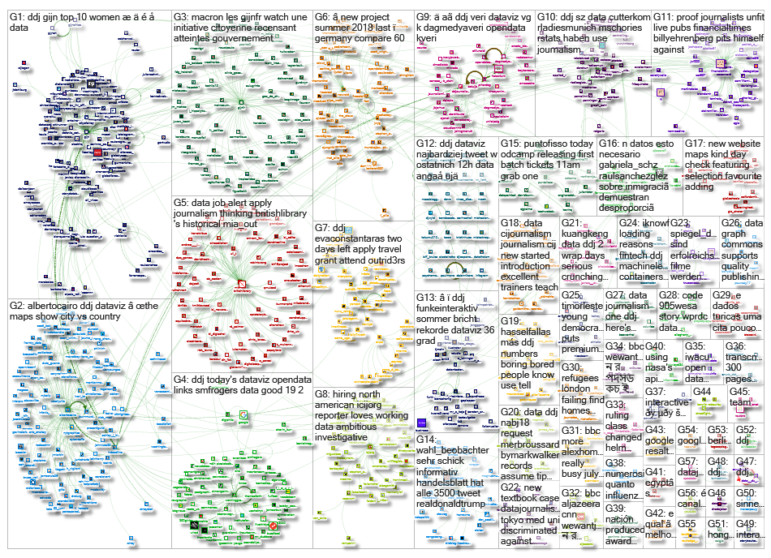
What’s the global data journalism community tweeting about this week? Our NodeXL #ddj mapping from July 30 to Aug 5 finds practical advice from @junkcharts for conference presenters to showcase their graphics, @Google making data in data journalism pieces more searchable, @funkeinteraktiv displaying the ways Germany is breaking records this summer, @eldiarioes examining Spain’s immigration boom and author Colin Woodard breaking down America’s regional cultures in The New York Times.
Graphic Advice for Conference Presenters
One of the biggest sins in presenting graphics at a conference is to copy graphics directly from your published paper to slides without modifications. Statistician Kaiser Fung offers a few tips for conference presenters to make their graphics more impactful.
Record-breaking Summer
Summer 2018 is breaking records in Germany. Funke Interativ compares Germany’s summer temperatures, relative dryness and hours of sunshine for the past 60 years and shows how much these measurements have deviated from the mean in the past few months.
America’s “11 Regional Cultures”
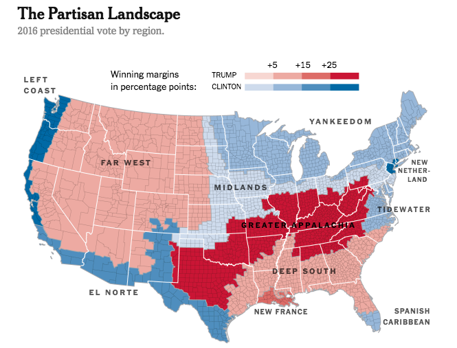
Colin Woodard, author of American Nations: A History of the Eleven Rival Regional Cultures of North America writes that the divide in American politics isn’t between rural and urban populations but rather among regional cultures shaped by past colonialism. His opinion that former rival colonizers across the continent set patterns that are influencing modern politics and culture is drawing polarizing debates on Twitter.
https://twitter.com/CLA_Coleman/status/1026512475468980224
Google Makes Data More Searchable
There is no reason why searching for datasets shouldn’t be as easy as searching for recipes, or jobs or movies. Google is working to surface more data from data journalism projects in its search results. News organizations can follow Google’s guidelines to have their data indexed.
Analyzing an Immigration Boom
Eldiario.es analyzes the effects of the 2002 immigration boom in Spain and found that immigration did not increase unemployment and it reduced the average age of inhabitants of areas with more immigrants.
Empty Land Doesn’t Vote
The New York Times produced an interactive map of the 2016 US presidential election at the highest level of detail available: by voting precinct. The map, which revealed voting enclaves and voting patterns that are shaped by racial history or that followed city limits, drew a lot of criticism. Jonathan Crowe summarizes the big map debate here.
https://twitter.com/albertocairo/status/1023667777347956736
Civil Rights Violations in US Schools
Every year, the US Department of Education investigates thousands of school districts and colleges around the country for civil rights violations ranging from racial discrimination in school discipline to sexual violence. In June, ProPublica published the status of these cases over the past three years.
Perception in Data Visualization
Northwestern University professor Steve Franconeri talks about the different ways our human visual system extracts spatial relationships between objects — object recognition, feature distributions, comparisons — and how these affect our perception of data visualization. For more videos from the OpenVis Conference, check out their YouTube channel.
https://twitter.com/walterra/status/1024956353847152641
Data Journalism Workshop in Timor-Leste
The Southeast Asian Press Alliance recently conducted a two-day training on data journalism in East Timor’s capital, Dili. Journalists and media practitioners learned about collecting and cleaning data, analysis and presentation, trends and data visualization tools, as well as journalist safety and digital security.
Data Visualization Book
Kieran Healy, associate professor of sociology at Duke University, has tried to introduce the ideas and methods of data visualization in a sensible, comprehensible, reproducible way in his soon-to-be-released Data Visualization: A Practical Introduction book.
https://twitter.com/kjhealy/status/1025413501408497664
Thanks, once again, to Marc Smith of Connected Action for gathering the links and graphing them.
 Eunice Au is GIJN’s program coordinator. Previously, she was a Malaysia correspondent for Singapore’s The Straits Times, and a journalist at the New Straits Times. She has also written for The Sun, Malaysian Today and Madam Chair.


