Resource Tipsheet
Visualizing Data
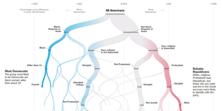
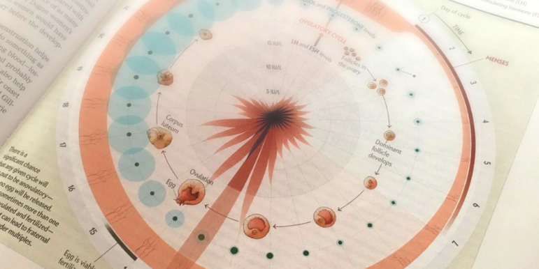
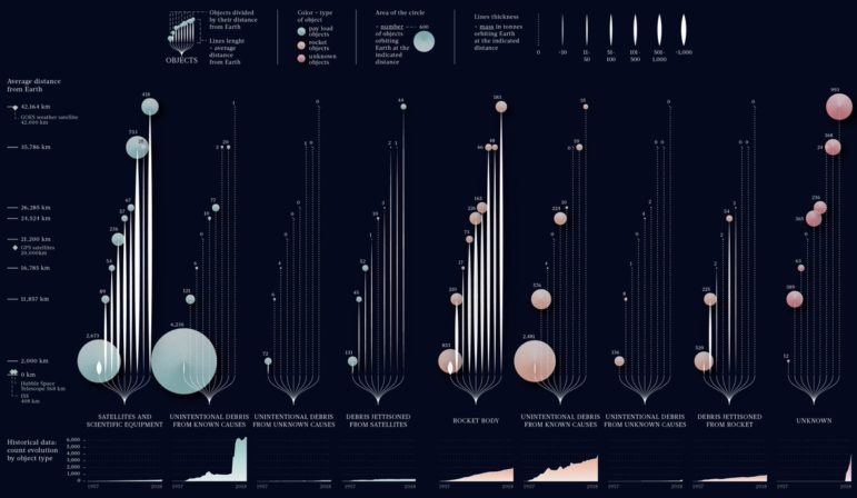
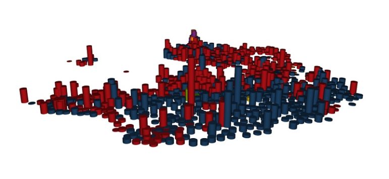
Once you’ve done your analysis, you may want to create graphs, charts, or maps to display your results. Here are some resources to help you display your data in visually appealing, reader-friendly formats. Flowing Data offers a plethora of tutorials that will help you visualize your data. You’ll learn how to make cartograms, upset plots, […]