
GIJN’s Data Journalism Top 10: What to Ask Google, Gerrymandering California and Dwindling Doctors

Step-By-Step Guide for Journalists on the Basics of Google Sheets

Tipsheet for Using Ocean Data in Your Investigations

No Coding Required: A Step-by-Step Guide to Scraping Websites With Data Miner

GIJC23 – The Future of Data Journalism: New Analytical Tools, Data Visualization, and AI
What’s the global data journalism community tweeting about this week? Our NodeXL #ddj mapping from June 18 to 24 finds a visual story about fixing household stuff by @xocasgv and @GoogleNewsInit, another about fixing political stuff by @Washingtonpost and @paulbradshaw on teaching data journalism.
“How Do I Fix a Toilet?”
In this adorable and clever visual essay, Xaquìn G.V shows what people in different countries around the world tend to search for the most when they want to fix something. In many warmer countries, it’s fridges, for North Americans and East Asians it’s toilets, while people in Northern and Eastern Europe seem to need information on how to fix lightbulbs. The project, which is a collaboration with Google News Lab, says its aim is “to highlight how much we depend on search to know ‘how to do’ everyday things.”
How to get a girlfriend? Very nice visual story by @xocasgv about things we ask google – and when we ask it. https://t.co/GaTYexKOjo #dataviz #ddj
— Robert Schoeffel (@robschoeffel) June 20, 2018
A California Solution to Gerrymandering?
Did you know that the term gerrymandering came into being after US politician Elbridge Gerry created a district in Massachusetts that was the shape of a salamander? This and other interesting facts about how and why politicians shape district boundaries in the US can be found in The Washington Post’s visual story “Where Do You Draw the Lines?”
California took a radical step to fix gerrymandering. Did it work? https://t.co/qpBE8vksEw
— Harvard Ash Center (@HarvardAsh) June 19, 2018
Downloadable Guide to Help Choose a Chart
Alberto Cairo, an author and lecturer at the University of Miami, referred to FT’s “Visual Vocabulary” poster, an incredibly useful and easy-to-use guide to help you choose which data visualization to use, during his talk about how to create effective data visualizations at the European Data & Computational Journalism Conference last week. Here’s where you can download it.
Here is FT’s Visual Vocabulary that @albertocairo referred to @datajconf. https://t.co/10KNOHYhmq #ddj #datajconf @ftdata pic.twitter.com/ofLalTmpZ6
— Bahareh Heravi (@Bahareh360) June 20, 2018
How to Teach Data Journalism
Data journalism is a broad field. There are so many things to learn, it’s hard to know where to start. With 10 years of teaching data journalism under his belt, Paul Bradshaw knows how hard it is to keep up. In his latest blog post, he reflects on what he’s learned about designing data journalism courses.
Highly interesting part 2 here from @paulbradshaw: Designing data journalism courses: reflections on a decade of teaching https://t.co/KGjHUATCsV #datajournalism #dataviz
— Kristian Strøbech (@kstrobech) June 21, 2018
Tips and Tools from IRE
Browse through a collection of presentations and tipsheets from the panels, demos and hands-on classes at the this year’s Investigative Reporters and Editors (IRE) Conference. There’s material on investigating wildlife issues, consumer investigations, covering politics and elections, drug investigations, how to tap into your community to enhance your investigations, a beginner’s guide to using R and a masterclass in writing an investigative narrative.
Just because you missed last week’s @IRE_NICAR conference, doesn’t mean you have to miss out on its lessons. Tipsheets are being updated here: https://t.co/1MkbbCCCAR #ddj #datajournalism #journo pic.twitter.com/HMr9k62KS9
— DataDrivenJournalism (@ddjournalism) June 18, 2018
Is There a Doctor in the House?
BR, Bavaria’s public broadcasting service, did a data-driven investigation and found that Germany may have a shortage of doctors. This story is in German.
Does Germany need more doctors? Thorough look into the demand-based planning system, underlying ratios from the 90s and current numbers which indicate an under-supply. #ddj article by @br_data‘s @Chrismedial, @robschoeffel and @stekhn. https://t.co/GFnjc36Kqc
— Felix Irmer (@fexi) June 18, 2018
Five Free DataViz Tools for Beginners
Journalism.co.uk put together a list of five web tools for making charts and infographics. They’re so easy to use that even absolute beginners will like them. Some offer templates to help you make graphics to spruce up your social media.
Looking for a way to make your data heavy story easier for readers to engage with on your website and social media pages? Try these free web tools to create infographics, graphs and charts to simplify complicated data. https://t.co/6tT639YeQ0
— E&P (@EditorPublisher) June 19, 2018
Wanna Learn R? Now’s Your Chance
Check out the Knight Centre for Journalism in the Americas’ latest free MOOC. Where else are you going to get an opportunity to learn how to use, R – a programming language for statistics and graphics – from Andrew Ba Tran of the Washington Post? “The course is meant for journalists, editors, journalism professors and students, but anyone from anywhere in the world who has an interest in data analysis and visualization is welcome to enroll,” says the Knight Centre. So, what are you waiting for?
Free online course about R Programming Language with @abtran! Sign-up here: https://t.co/a72YWZNa5o#MOOC #journalism #Datavisualization #freelearning pic.twitter.com/Fqa1Q0NcOt
— Ryan Sagare (@ryansagare) June 21, 2018
The Swiss Are Getting Older
Here’s another data story in German, but this one’s from Switzerland’s Neue Zürcher Zeitung. It shows that the median age of the people living in Switzerland is now 42 years compared with 32 in 1970, that means half the Swiss are older than 42. But some parts of the country appear to be bucking the trend.
Die Schweiz altert stark – in der Romandie sind die Gemeinden aber jünger geblieben als in der Deutschschweiz. Toller Teameffort @NZZStorytelling: Datenanalyse u Text mit @mjKolly, Grafiken mit @balzzz, @wiederkehra und @jkelen_kelen https://t.co/Zy3PaISNGW pic.twitter.com/mExzpaU9E6
— Alexandra Kohler (@koa_87) June 21, 2018
Thanks, once again, to Marc Smith of Connected Action for gathering the links and graphing them.
 Laura Grant is filling in for GIJN’s Eunice Au, while she is on leave. She is a managing partner of the Media Hack Collective, a Johannesburg-based digital journalism initiative, where she works on data-driven journalism projects. She is the former associate editor of digital and data projects at the Mail & Guardian and teaches digital journalism at the University of the Witwatersrand in Johannesburg.
For a look at Marc Smith’s mapping on #ddj on Twitter, check out this map.
Step-By-Step Guide for Journalists on the Basics of Google Sheets
Tipsheet for Using Ocean Data in Your Investigations
No Coding Required: A Step-by-Step Guide to Scraping Websites With Data Miner
GIJC23 – The Future of Data Journalism: New Analytical Tools, Data Visualization, and AI
How a WhatsApp Community Is Bringing India’s Data Storytellers Together

Turning the Threat to a Distant Glacier into a Local Story Through Data Visualization

One Name at a Time: How Die Zeit Built a Searchable Database of Nazi Party Members

Making Trillions Make Sense: How Reuters Visualized the AI Economy

This work is licensed under a Creative Commons Attribution-NoDerivatives 4.0 International License
Republish our articles for free, online or in print, under a Creative Commons license.
Republish this article
This work is licensed under a Creative Commons Attribution-NoDerivatives 4.0 International License
Read Next
Data Journalism
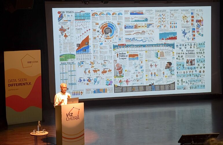
How a WhatsApp Community Is Bringing India’s Data Storytellers Together
Recently, more than 400 people gathered in the Indian city of Bengaluru for VizChitra 2026, a conference on data visualization and storytelling — but that is only a small part of the story.
Climate Data Journalism
Turning the Threat to a Distant Glacier into a Local Story Through Data Visualization
New York Times climate and environmental graphics reporter Mira Rojanasakul discusses how her team visualized the sea level rise threat from the melting Thwaites Glacier in Antarctica.
Data Journalism
One Name at a Time: How Die Zeit Built a Searchable Database of Nazi Party Members
An online tool set up by the German newspaper Die Zeit, in cooperation with archives in Germany and in the United States, allows people to search several million Nazi Party membership cards.
Data Journalism
Making Trillions Make Sense: How Reuters Visualized the AI Economy
How do you make a trillion dollars feel real to someone who has never seen that much money? Vineet Khare and Mayank Bhatt faced that very challenge for their data-driven investigation into AI investment.