Data Journalism
GIJN’s Data Journalism Top 10: Pollution in China, Visualizing Punctuation and the World Cup
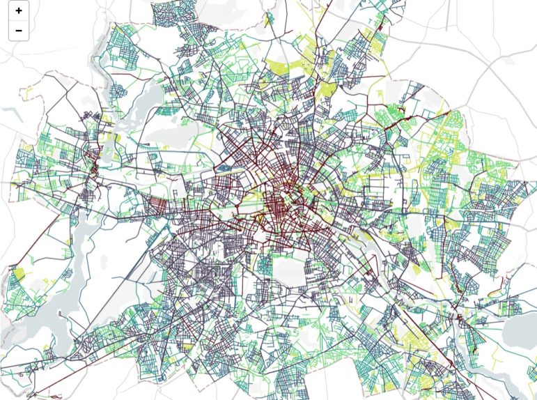
What’s the global data journalism community tweeting about this week? Our NodeXL #ddj mapping from June 25 to July 1 finds @FinancialTimes’ timelapse map of pollution over China, @mcrosasb’s choice of five interesting World Cup 2018 visualizations and @Internews’ overview of its data journalism projects in developing country newsrooms.