Data Journalism
GIJN’s Data Journalism Top 10: Game of Thrones Deaths, Visualizing Rich Hungarians, European Parliament
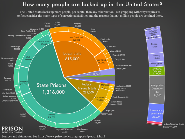
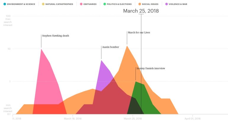
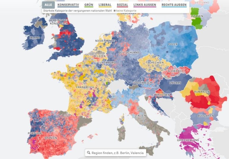
What’s the global data journalism community tweeting about this week? Our NodeXL #ddj mapping from May 20 to 26 finds @PostGraphics’ meticulous cataloguing of all on-screen deaths in Game of Thrones, @datajournalism’s tips on covering the crime beat, @DIEZEIT’s analysis of a politically diverse European parliament, and a quick beginner’s guide to learning data visualization by @AlliTorban.