GIJN’s Data Journalism Top 10: School Murders, Visualizing Uncertainty and Brazil’s Deadly Week
What’s the global data journalism community tweeting about this week? Our NodeXL #ddj mapping from May 28 to June 3 finds @washingtonpost‘s alarming data on gun violence in American schools, @vlandham‘s experiments with visualizing uncertainty and @GENinnovate with the latest data journalism trends displayed in the 2018 Data Journalism Awards entries.
An appalling number. https://t.co/OEgITpq9LZ pic.twitter.com/g8nGThsCQV
— Justin Wolfers (@JustinWolfers) May 18, 2018
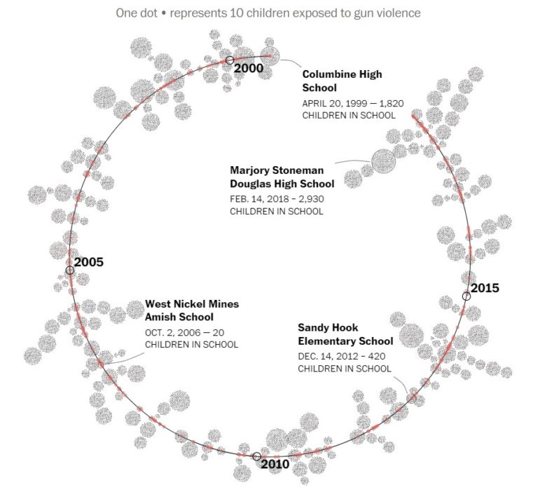
Counting Since Columbine
More than 215,000 students have experienced gun violence at school since the Columbine High School massacre in 1999. Explore the data on US school shootings that The Washington Post has pieced together by combing through news articles, open-source databases, law enforcement reports and by making calls to schools and police departments.
Check out these animation experiments for uncertainty in #dataviz by @vlandham. I especially like the wandering hulls.
https://t.co/pOSLbTpkyZ— Robert Grant (@robertstats) June 5, 2018
How to Visualize Uncertainty
HOP plots, morph icons, wandering dots and wandering hulls — Jim Vallandingham details his experiments, together with Irene Ros and Peter Beshai, on visualizing uncertainty.
Some examples of what should be the real meaning of “storytelling with data” https://t.co/O0147uxhkM pic.twitter.com/Igfb132SXA
— Rachel Costa (@Desinvisibles) June 4, 2018
Top Trends in Data Journalism Innovation
A record 630 entries from 58 countries that were submitted to the 2018 Data Journalism Awards displayed increasing innovation in data journalism. Newsrooms have changed the way they visualize maps and are utilizing drone journalism, machine learning, augmented reality and news games. Here’s Marianne Bouchart’s presentation on these latest trends in data journalism.
.@Zahedasghar explains why census numbers are important. “No provincial government wants its population proportion should show decrease since it will reduce their share in the pie.” #ddj #datajournalism #numbers https://t.co/3aA94Jfpko pic.twitter.com/IXIk8KomHj
— Data Stories (@datastoriespk1) May 28, 2018
Why the Census Matters
Different groups of people have varied interests and reasons for supporting the underestimation of population numbers in Pakistan. But associate professor Zahid Asghar emphasizes that the proper and regular conduct of population census is important in ensuring the right kind of national interventions for education, health and housing.
A quite comprehensive write up on choosing colors for visualizations by @lisacrost: https://t.co/sNodzFtCAH. For those who are looking for more advice on addressing #colorblindness, I highly recommend Okabe & Ito and their palette: https://t.co/563IGXNsIE #dataviz pic.twitter.com/yqhk1F95Bl
— Nils Gehlenborg (@ngehlenborg) May 29, 2018
What’s Your Color?
Data journalist Lisa Charlotte Rost shares some great advice to consider when choosing colors for data visualization.
Wohin fließen die #Agrarsubventionen der EU? Wir haben die deutsche Empfänger-Datenbank gescrapet und ausgewertet: https://t.co/51jtBWHTjm#ddj mit @PatrickStotz, @MariaMarquart, @nicoocin und den @NDRnds-Kollegen @the_claus & Co. pic.twitter.com/dyHDeme5pv
— Marcel Pauly (@marcelpauly) May 29, 2018
Tracking EU Subsidies in Germany
€6.5 billion of EU agricultural subsidies were paid in 2017 to Germany. But where is the money going? Spiegel Online shows the top recipients in each district, along with the unequal structure of subsidy distribution in the agriculture industry.
Atrévase a crear gráficos con estas 10 herramientas #ddj https://t.co/8AHofTaQA0
— Hassel Fallas (@HasselFallas) May 29, 2018
10 Visualization Tools (in Spanish)
La Nación’s data journalist Hassel Fallas lists her 10 favorite tools to create visualizations, along with some helpful pros and cons of each.
#Imperdible: Manual de Periodismo de Datos https://t.co/VrPcdxwbc0 #ddj pic.twitter.com/MkfWf5DyiE
— Gerardo Albarrán de Alba (@saladeprensa) May 30, 2018
Data Journalism Handbook (in Spanish)
The Data Journalism Handbook, edited by Jonathan Gray and Liliana Bounegru at the Public Data Lab, is available in Spanish. It includes case studies and tackles how to interpret and work with data as well as how to disseminate it.
Microsoft is proud to sponsor the #DataJournalismAwards and looks forward to unveiling the winner of the Public Choice Award on 5/31. See the finalists here: https://t.co/XDAq6ulQPX #MSGEN2018 #ddj #dataviz
— Power BI (@MSPowerBI) May 30, 2018
#ddj Public Choice Contenders
Almost 5,500 people voted for the 2018 Data Journalism Microsoft Award for Public Choice. G1(Globo) in Brazil took home the prize for their project documenting violent deaths in the country. Here’s a look at 11 contenders for that category.
Alberto Cairo is offering a MOOC on visualization https://t.co/PWIvtn0BIW pic.twitter.com/5U44EGZqv9
— Kent Holsinger (@keholsinger) May 29, 2018
Telling Stories with Data — Free Course
There’s still time to sign up for Knight Center’s free massive open online course “Data Visualization for Storytelling and Discovery,” taught by data expert Alberto Cairo from June 11 to July 8, 2018. The course will show you how to use data visualization to discover interesting facts, trends and patterns in data.
Thanks, once again, to Marc Smith of Connected Action for gathering the links and graphing them.
 Eunice Au is GIJN’s program coordinator. Previously, she was a Malaysia correspondent for Singapore’s The Straits Times, and a journalist at the New Straits Times. She has also written for The Sun, Malaysian Today and Madam Chair.
For a look at Marc Smith’s mapping on #ddj on Twitter, check out this map.

Basic Data Journalism Tips for Editors

My Favorite Tools: Venezuela’s Lisseth Boon on Design and Data Visualization

Document of the Day: Visual Vocabulary
How To Create a Data Journalism Team

Turning the Threat to a Distant Glacier into a Local Story Through Data Visualization

Making Trillions Make Sense: How Reuters Visualized the AI Economy

Rewriting the Rules of Digital Verification: How African Investigative Journalists Are Building New Data Models

Summer Reading List for Data Journalists: For Those Who Believe in the Power of Storytelling with Numbers

This work is licensed under a Creative Commons Attribution-NoDerivatives 4.0 International License
Republish our articles for free, online or in print, under a Creative Commons license.
Republish this article
This work is licensed under a Creative Commons Attribution-NoDerivatives 4.0 International License
Read Next
Climate Data Journalism
Turning the Threat to a Distant Glacier into a Local Story Through Data Visualization
New York Times climate and environmental graphics reporter Mira Rojanasakul discusses how her team visualized the sea level rise threat from the melting Thwaites Glacier in Antarctica.
Data Journalism
Making Trillions Make Sense: How Reuters Visualized the AI Economy
How do you make a trillion dollars feel real to someone who has never seen that much money? Vineet Khare and Mayank Bhatt faced that very challenge for their data-driven investigation into AI investment.
Data Journalism
Rewriting the Rules of Digital Verification: How African Investigative Journalists Are Building New Data Models
The global nonprofit WITNESS seeks to address one of the biggest data gaps in the digital verification landscape: the dependence on tools-based methods that lack local knowledge.
Data Journalism
Summer Reading List for Data Journalists: For Those Who Believe in the Power of Storytelling with Numbers
Featuring books spanning four continents, these recommended reads provide a global perspective on data journalism.