GIJN’s Data Journalism Top 10: Racing Snails, Presidential Gifts and Berlin’s Building Blocks
 What’s the global data journalism community tweeting about this week? Our NodeXL #ddj mapping from May 21 to 27 finds @nigelblue‘s wildly humorous infographic book about crazy competitions across the globe, @Data_Match breaking down the list of gifts given to the president of the United States by foreign leaders, and @FinancialTimes looking into the pressures Antarctica faces.
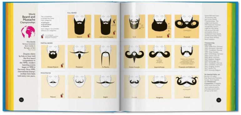
Crazy Competitions
Nigel Holmes, a graphic designer known for his playful illustrated graphics, has a new book: Crazy Competitions. From racing snails to carrying wives, these oddly wonderful competitions are illustrated and explained with brilliant infographics.
Nathan @flowingdata writes about @nigelblue‘s new book “Crazy Competitions” https://t.co/gqqLICpgIy #dataviz #infographics #ddj pic.twitter.com/vGJLQokLu3
— Alberto Cairo (@albertocairo) May 21, 2018
Gifts of Diplomacy
Each year, the US State Department publishes the list of gifts given to the president and his family by foreign leaders. DataMatch looked at which countries have sought to seduce America, from Bush to Obama.
Gifts to US presidents, 2001-2016: talk about a “special relationship”… with #SaudiArabia. The country gave an estimated $3 million in gifts to George W. Bush and Barack Obama. https://t.co/uY9Kc7oTZN #ddj (data extracted from the Federal Register) pic.twitter.com/hZmsKtVO80
— DataMatch (@Data_Match) May 26, 2018
The Fight for Antarctica
Competition for natural resources, research and tourism is putting pressure on the Cold War-era treaty that guarantees order on the continent of Antarctica.
Amazing @digitalcampbell map on @lesliehook and @BEAMander‘s story on the fight to own Antarctica: https://t.co/2DjxlXnczi #ddj #gistribe pic.twitter.com/KIJoM4g8eV
— Martin Stabe (@martinstabe) May 24, 2018
Statistical Pitfalls in News
Should you use the mean or the median? How should you interpret the “margins of error'” of polling results? Maarten Lambrechts shares his slides “Statistical Pitfalls in News” during a session at the European Investigative Journalism Conference.
And here are my slides of my #EIJC18 session ‘Statistical pitfalls in news’ https://t.co/qMCpsCMIlG pic.twitter.com/AvpfCMFSR3
— Maarten Lambrechts (@maartenzam) May 26, 2018
Telling Stories with Data — Free Course
Learn how to tell stories with data. The Knight Center is offering a free massive open online course “Data Visualization for Storytelling and Discovery” taught by data expert Alberto Cairo. Prior experience with data visualization or design is not necessary.
Brand new intro to #dataviz MOOC(s) in English and Spanish: https://t.co/Q1VsC8INCG These cover the basics, so spread the word among your non-specialist friends #infographics #ddj pic.twitter.com/WuFtpldVbI
— Alberto Cairo (@albertocairo) May 22, 2018
Rethinking Data Sharing
The sharing of data is one of the key principles of reproducible research, but Roger Peng argues there are serious considerations to take into account before any real sharing of health data can occur.
Data sharing is important for academic research, but I believe it’s going to get much harder to do it going forward, particularly for those of us doing health research. https://t.co/Q48LUS3ril
— Roger D. Peng (@rdpeng) May 24, 2018
Who Funds German Political Parties?
Political parties in German Parliament received more than 60 million euros in donations in 2016. Of this amount, the Christian Democratic Union of Germany (CDU) received the largest slice of the pie — 22.2 million euros.
Parteispenden 2016: Wer gab, wer bekam? https://t.co/FlVbm2j6S7 #ddj pic.twitter.com/VcDArV4WpJ
— Marcel Pauly (@marcelpauly) May 26, 2018
Berlin Block by Block
Berliner Morgenpost mapped the age of buildings in Berlin and visualized how the city was built through the decades block by block.
*very* nice visual explanatino of Berlin’s urban history, and the building phases its gone through, by Berliner Morgenpost @morgenpost
( especially interesting as it’s a “synthetic big city” of several smaller towns and villages ) https://t.co/0uwiWjtAqu pic.twitter.com/KfT9BvgU7S
— miska knapek (@miskaknapek) May 23, 2018
Summer of Data Science Challenge #SoDS18
What sort of data science do you want to learn more about this summer? How about data journalism with R? Timo Grossenbacher hand-curated some resources to guide you.
RT @dataandme: Great #ddj resources curated by @grssnbchr ???:
“.Rddj – Resources for doing data journalism w/ R” https://t.co/Uk8Wiuwepf #rstats #SoDS18 pic.twitter.com/Y04XZQt3VT— Rosana Ferrero (@RosanaFerrero) May 23, 2018
Free Excel Course in Spanish
Free Excel 2013 Basic Course to Intermediate. Learn basic operations, handling formulas and essential functions of all categories, graphs, tables, database operations, data filter, conditional formatting, essential tricks and more.
Curso de Excel básico-intermedio, gratis y en línea https://t.co/JFaEzMTgQP #periodismodedatos #ddj pic.twitter.com/RnKdFGAfzA
— Gerardo Albarrán de Alba (@saladeprensa) May 21, 2018
Thanks, once again, to Marc Smith of Connected Action for gathering the links and graphing them.
 Eunice Au is GIJN’s program coordinator. Previously, she was a Malaysia correspondent for Singapore’s The Straits Times, and a journalist at the New Straits Times. She has also written for The Sun, Malaysian Today and Madam Chair.
For a look at Marc Smith’s mapping on #ddj on Twitter, check out this map.

Guide to Mapping Analysis Using QGIS

GIJC23 – The Future of Data Journalism: New Analytical Tools, Data Visualization, and AI

GIJC23 – The Basics of Using Google Sheets

GIJC23 – Using Pinpoint to Organize Unstructured Data

Turning the Threat to a Distant Glacier into a Local Story Through Data Visualization

Making Trillions Make Sense: How Reuters Visualized the AI Economy

Summer Reading List for Data Journalists: For Those Who Believe in the Power of Storytelling with Numbers

From Data to Storytelling: Concept and Design Tips from the Financial Times’ John Burn-Murdoch

This work is licensed under a Creative Commons Attribution-NoDerivatives 4.0 International License
Republish our articles for free, online or in print, under a Creative Commons license.
Republish this article
This work is licensed under a Creative Commons Attribution-NoDerivatives 4.0 International License
Read Next
Climate Data Journalism
Turning the Threat to a Distant Glacier into a Local Story Through Data Visualization
New York Times climate and environmental graphics reporter Mira Rojanasakul discusses how her team visualized the sea level rise threat from the melting Thwaites Glacier in Antarctica.
Data Journalism
Making Trillions Make Sense: How Reuters Visualized the AI Economy
How do you make a trillion dollars feel real to someone who has never seen that much money? Vineet Khare and Mayank Bhatt faced that very challenge for their data-driven investigation into AI investment.
Data Journalism
Summer Reading List for Data Journalists: For Those Who Believe in the Power of Storytelling with Numbers
Featuring books spanning four continents, these recommended reads provide a global perspective on data journalism.
Data Journalism
From Data to Storytelling: Concept and Design Tips from the Financial Times’ John Burn-Murdoch
The chief data reporter for the Financial Times discusses how he considers the use of text, color, and annotation to aid visual storytelling through charts and graphics.