Data Journalism
Data Journalism Top 10: Chinese Propaganda, Social Media Abuse, Herd Immunity, Florida Condo Collapse, Pandemic Plastic
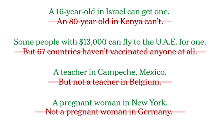
With less than a month until the start of the Olympic Games, host country Japan’s slow vaccination campaign is causing concern. Our NodeXL mapping from June 21 to 27 found a piece by The New York Times looking at Japan’s efforts to combat the pandemic in the run-up to a global sporting event. In this edition, we also feature a joint investigation by ProPublica and The New York Times into Chinese propaganda on the internet, a herd immunity calculator by German newspaper Zeit, and revelations from the Guardian about abusive posts on social media targeting English soccer players.