Data Journalism
Data Journalism Top 10: Protesting the War, Russian Sanctions, Mapping Refugees, and NICAR Tips
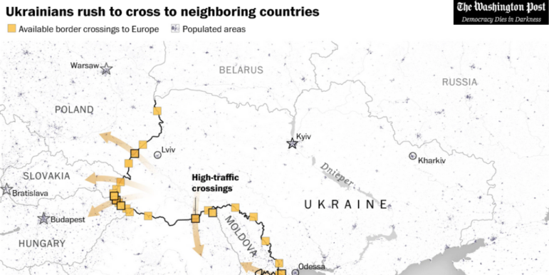
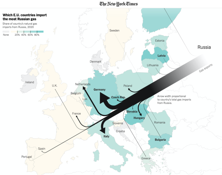
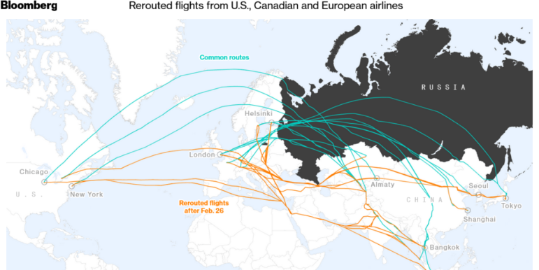
Data teams across the globe are still focused on Russia’s invasion of Ukraine, with The Economist examining the anti-war protests that have brought Russian citizens to the streets. Others have looked at the impact of flight bans, or been producing trackers to monitor and assess the sanctions that have been imposed as a result of Russian President Vladimir Putin’s order to go to war.