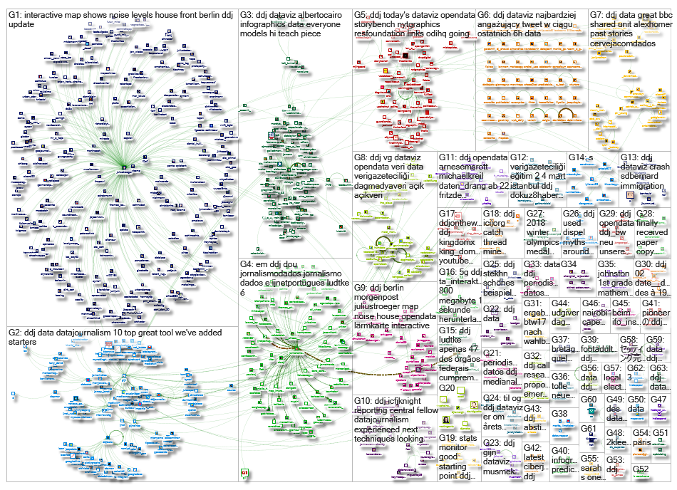
This Week’s Top 10 in Data Journalism
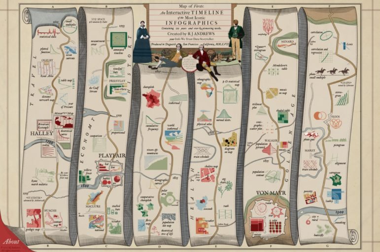
Iconic Infographics: Interactive of the most iconic infographics in the past 300 years, by RJ Andrews.
What’s the global data journalism community tweeting about this week? Our NodeXL #ddj mapping from February 19 to 25 finds economist @SethS_D analyzing Spotify data to find the correlation between our birth year and our music influences, @infowetrust illustrates three centuries of iconic infographics in a beautiful 17th century-styled dataviz and @EdjNet‘s Stats Monitor gives you #ddj news leads on European data.
What’s Your Favorite Tune?
Economist Seth Stephens-Davidowitz analyzed Spotify music data to see to what extent the year we were born influences the music we listen to. He discovered a pattern where men’s and women’s favorite songs largely came out when they were ages 14 and 13, respectively.
.@Spotify data indicates that the #music you love is the music that was released in your early adolescence – age 13 (women) & 14 (men). #datavizhttps://t.co/OXc50XMLch pic.twitter.com/L5UJJL1wVN
— Randy Olson (@randal_olson) February 11, 2018
300 Years of DataViz
RJ Andrews created a cool full screen interactive is in the style of a 17th century manuscript, which lets you explore the first 300 years of data visualization. He also has a detailed blog on the process of creating and troubleshooting it.
Veri Görselleştirme Tarihi ile Etkileşim #verigörselleştirme #verigazeteciliği #dataviz #ddj #vg https://t.co/eLaqeoqiP3 pic.twitter.com/xZYLxX6U0o
— Veri Gazeteciliği Platformu (@DagmedyaVeri) February 22, 2018
Eurostat’s Monitor
The European Data Journalism Network has a Stats Monitor that gives you news leads based on data from Eurostat. It signals interesting trends, changes and outliers. The platform allows you to visualize your stories and embed charts directly on your own website.
Our Stats Monitor is a good starting point for #ddj stories on Europe, check it out https://t.co/6eHWqjKun0
— European Data Journalism Network (@EdjNet) February 19, 2018
Guide to NICAR
Overwhelmed by the 2018 CAR Conference schedule? IRE has come up with a NICAR Guide with three possible paths: first-timer, data focused and upping your viz game.
Choose your own #NICAR18 adventure! We have three guides to help you develop a game plan.
Download the guides –> https://t.co/XVDfpfIgtB pic.twitter.com/1nHKjtoHLJ— IRE and NICAR (@IRE_NICAR) February 23, 2018
Fast and Furious 5G
Telecommunications provider Swisscom is planning to roll out 5G technology in Switzerland in the fourth quarter of 2018. Tages-Anzeiger created a simple interactive to show readers how fast downloads will be compared to the current 3G and 4G technology.
How fast will 5G internet speeds be? This site compares the downloading of an 800MB movie file to previous generations. Wow.
(In German but you’ll get it).https://t.co/NQUvMj9GKw— Roberto Rocha (@robroc) February 26, 2018
Berlin Noise Pollution
How loud is it at your doorstep? Find out your street’s noise decibel level with Berliner Morgenpost’s interactive visualization of noise pollution in Berlin. Three causes are pinpointed: traffic, public transportation and airplanes.
Our interactive map shows noise levels on every house front in Berlin. https://t.co/FJOiy2Tp9H #ddj #update pic.twitter.com/YrxafS6cnC
— Julius Tröger (@juliustroeger) February 19, 2018
Car Thefts in São Paulo
Estadao analyzed more than 419,000 car robberies in Greater São Paulo over the past decade and visualized them in this sensational dataviz. It found that the crime migrated from the center to the periphery of the metropolitan region.
Interactive map of São Paulo about where cars are being stolen. 10 years ago, there were more case in the city center, now it’s more in the suburbs.
Nice #dataviz by @Estadao, with animation, overall statistics, stories about places and individual cases.https://t.co/GtDv43tT2f
— Paul Blickle (@colorfuldata) February 27, 2018
Brazil’s Data Transparency
O Globo reported that up until early February, only 47 percent of federal agencies in Brazil complied with a decree requiring data transparency, which was instituted in May 2016 when Dilma Rousseff was president.
Menos da metade dos órgãos federais cumpre decreto de dados abertoshttps://t.co/vDkRa2N6rZ
— Leonardo Cazes (@leonardocazes) February 22, 2018
The Data Deliverer
Abraji profiles Alvaro Justen, nicknamed Turicas, an activist and collaborator of free software projects since 2004, highlighting his informative data projects.
Nosso querido @turicas, rei da @EscolaDeDados e dos primeiros homens, filho da tormenta, libertador de dados, quebrador de captchas, primeiro do seu nome e descendente da casa Python! https://t.co/WgXH8Yxjbt #ddj#turicas
— Natália Mazotte (@NataliaMazotte) February 21, 2018
stringr Tutorial
Manipulating characters – aka non-numerical data – is an essential skill for anyone looking to visualize or analyze text data. This Storybench tutorial goes over base R functions for manipulating strings in R, and introduces the stringr package.
Getting started with stringr for textual analysis in R https://t.co/xMJIM3AAMx via @storybench pic.twitter.com/0OqrO0VtiS
— Disrupt MediaLab (@dmedialab) February 23, 2018
Thanks, once again, to Marc Smith of Connected Action for gathering the links and graphing them.
For a look at Marc Smith’s mapping on #ddj on Twitter, check out this map.

Guide to Mapping Analysis Using QGIS

Step-By-Step Guide for Journalists on the Basics of Google Sheets

Basic Data Journalism Tips for Editors

My Favorite Tools: Venezuela’s Lisseth Boon on Design and Data Visualization

Turning the Threat to a Distant Glacier into a Local Story Through Data Visualization

Mexico Scrapped Its Transparency Agency — Journalists Are Still Investigating Corruption

Making Trillions Make Sense: How Reuters Visualized the AI Economy

Summer Reading List for Data Journalists: For Those Who Believe in the Power of Storytelling with Numbers

This work is licensed under a Creative Commons Attribution-NoDerivatives 4.0 International License
Republish our articles for free, online or in print, under a Creative Commons license.
Republish this article
This work is licensed under a Creative Commons Attribution-NoDerivatives 4.0 International License
Read Next
Climate Data Journalism
Turning the Threat to a Distant Glacier into a Local Story Through Data Visualization
New York Times climate and environmental graphics reporter Mira Rojanasakul discusses how her team visualized the sea level rise threat from the melting Thwaites Glacier in Antarctica.
Data Journalism
Mexico Scrapped Its Transparency Agency — Journalists Are Still Investigating Corruption
A year after Mexico dissolved the autonomous body that oversaw government transparency, journalists are still finding ways to access public documents and conduct data-based investigations.
Data Journalism
Making Trillions Make Sense: How Reuters Visualized the AI Economy
How do you make a trillion dollars feel real to someone who has never seen that much money? Vineet Khare and Mayank Bhatt faced that very challenge for their data-driven investigation into AI investment.
Data Journalism
Summer Reading List for Data Journalists: For Those Who Believe in the Power of Storytelling with Numbers
Featuring books spanning four continents, these recommended reads provide a global perspective on data journalism.