Resource Guide
Business Tools

Resource Guide Chapter
Business Tools — Chapter 1

Resource Guide Chapter
Business Tools — Chapter 2
Resource Guide Chapter
Business Tools — Chapter 3
Resource Guide Chapter
Business Tools — Chapter 4

Resource Guide Chapter
Business Tools — Chapter 5
Resource Guide Chapter
Business Tools — Chapter 6
Resource Guide Chapter
Business Tools — Chapter 7
Resource Guide Chapter
Business Tools — Chapter 8
Resource Guide Chapter
Business Tools — Chapter 9

Resource Guide Chapter
Business Tools — Chapter 10

Resource Guide Chapter
Business Tools — Chapter 11
Resource Guide Video Chapter
Video: GIJC23 – Developing a Business Strategy (Part 1 & 2)
For this guide, we’ve selected a few free, low cost, and/or beginner-level tools for illustration and data visualization. Please see the GIJN Resource Center’s Data Visualization Tools and Visualizing Data guides for expanded lists and further links to data journalism and data tools.
Illustration and Data Viz Platforms
Canva offers attractive templates for social media posts, website banners, flyers and posters, and more; it can also be used for creating branding and logos. Canva offers multiple users the ability to collaborate on projects in real time.
Cost: Free for individuals and nonprofits; paid plans starting at $9.99 per month for companies.
Languages: Available in 32 languages.
Datawrapper is a data visualization tool, capable of numerous types of representations, including graphs, charts, maps, and heatmaps. The tool can update automatically when linked to live data, and does not require any coding. Datawrapper visualizations are compatible with multiple types of devices. The free version offers an unlimited number of visualizations and user access to visualizations, which are exportable as PNG images.
Cost: Basic free version; paid version begins at $599 per month.
Languages: Available in more than 30 languages.
Easel.ly allows a user to create infographics using a number of free, ready-to-use templates, which can be downloaded in several different graphics formats.
Cost: Free for lower-resolution jpegs, $4 – 5 per month for other formats and a larger template library.
Languages: English, Spanish, Italian, German, French, Arabic, Japanese, Dutch, and Danish.
Flourish excels at creating dynamic infographics — think animated bar charts, scatter plots, or maps that show change over time. The tool is usable both by developers and by individuals who just want to upload a spreadsheet and create a simple graphic. The graphics are embeddable, and automatically scale to the device the end-user is using to view them. Although Flourish is a freemium product, the full product is offered for no cost to “public-facing mainstream news journalism” organizations through the Google News Initiative.
Cost: Basic free version makes all visualization and data publicly available; paid versions with additional privacy features begin at $69 per month.
Languages: English; available in the US, UK, and EU.
GIMP and Scribus are the best-known free software versions of, respectively, Adobe Photoshop (photo editing software) and Adobe InDesign (desktop publishing). Like most free software, the interfaces looks slightly out of date and the software tends to function more slowly than the Adobe equivalents. However, given the cost of Adobe Creative Cloud (starting at $80 per month), learning to navigate these tools, which have extensive documentation online, might prove beneficial to some organizations.
Cost: Free.
Languages: Available in many languages.
Infogram is a tool that lets you create interactive and embeddable infographics. It has more than 30 customizable chart types and allows users to create annotated maps and animations, as well. Users can easily upload data they want to illustrate as CSV or Excel files and publish the resulting graphics directly to the web or to social media. Infogram is also available as a WordPress plug-in.
Cost: Limited free version available; paid plans begin at $19 per month.
Languages: English, German, Spanish, Portuguese, and French.
Odyssey is an open-source data visualization tool created by CartoDB, a GIS software. It allows a user to create an interactive map-driven story, with text and multimedia tied to specific locations on a map, and tidy transitions between the different locations connected to a story.
Cost: Free.
Languages: English.
GoDaddy Studio’s main function is as a basic layering tool, allowing a user to add, blend, and edit overlaying text and images. The app is geared towards creating content for mobile devices, whether for ads, social media posts, or Instagram stories. Paid versions include additional fonts and templates and the ability to add files to a shared folder.
Cost: Limited free version; paid subscriptions with unlimited templates and fonts begin at $32.99 per year.
Languages: English.
Timeline.js/Storymap.js/Storyline.js/
The Knight Lab at Northwestern University has created a number of easy-to-use tools to create annotated illustrations for articles. Timeline makes interactive timelines, StoryMap makes annotated maps, and StoryLine makes annotated line graphs of change over time. Timeline and StoryLine both work directly from Google Sheets. A user enters data, the annotation they wish to add, and/or a link to the media they wish to feature from sites like YouTube or Flickr, and the software publishes the result directly to the web. StoryMap requires some additional work, but is still usable for someone with no previous coding knowledge. That said, those familiar with JSON can tinker further with these tools’ outputs.
Cost: Free.
Languages: English.
Stock Images
Unsplash is a Getty Images-owned website of free keyword-searchable stock photos, usable for both commercial and noncommercial purposes. The site hosts a growing collection of over a million full-sized images provided by individual photographers. Unsplash requests but does not require attribution.
Cost: Free.
Languages: Images are mostly tagged in English, but some have non-English tags, as well.

Tipsheet on Partnering with Civil Society Organizations and Non-Governmental Organizations

AI Accountability Reporting Guide

Guide to Mapping Analysis Using QGIS

Open Source Databases by Country

Curiosity and the Long Road to the Truth: Lessons from an Award-Winning Portuguese Reporter
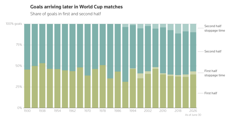
Late World Cup Goals, Foreigners Fueling Sudan’s War, Venezuela’s Deadly Double Earthquake, and Fatal SUV Blindspots

Expert Tips for Editing Investigative Podcasts

The Black Sea: How Investigative Journalism Endures in Turkey

This work is licensed under a Creative Commons Attribution-NoDerivatives 4.0 International License
Republish our articles for free, online or in print, under a Creative Commons license.
Republish this article
This work is licensed under a Creative Commons Attribution-NoDerivatives 4.0 International License
Read Next
10 Questions
Curiosity and the Long Road to the Truth: Lessons from an Award-Winning Portuguese Reporter
The journalist explains how he has built a career around long-form investigations, and delves into the process behind his recent book exposing the far-right in Portugal.
Data Journalism Top 10
Late World Cup Goals, Foreigners Fueling Sudan’s War, Venezuela’s Deadly Double Earthquake, and Fatal SUV Blindspots
Also highlighting the civilian casualties of the first 40 days of the US-Iran war, why carbon capture won’t solve climate change, and the 370,000-plus prisoners still awaiting trial in India.
Getting the Story Out
Expert Tips for Editing Investigative Podcasts
In a session on editing investigative podcasts at IRE26, veteran audio journalists offered several key lessons for producers and reporters new to investigative podcasts.
Member Profiles
The Black Sea: How Investigative Journalism Endures in Turkey
The investigative outlet focusing on the Black Sea region and Turkey is not quite exiled media, not quite traditional newsroom, but a collaborative group focused on abuses of power.