Image: Screenshot, QGIS, Tim Sutton
Guide to Mapping Analysis Using QGIS
Read this article in

GIJC23 – Basic Principles for Mapping Data Using QGIS

Developing a Data State Of Mind: Key Tips for Editors
Video Resources for Mapping, Satellites, Storytelling, Testing, Tracking, and Disinformation

My Favorite Tools: Venezuela’s Lisseth Boon on Design and Data Visualization
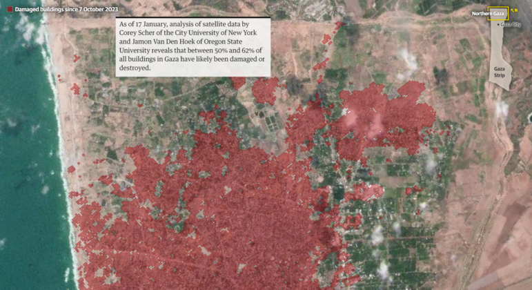
Investigative reporters use mapping for a wide range of stories: revealing crime hot spots; highlighting environmental destruction; uncovering demographic patterns; documenting war crimes. Here are some compelling examples: Gaza’s Trees Disappear, Showing a Humanitarian Crisis by Bellingcat, A Powerful US Political Family is Linked to Copper Mining in the Colombian Rainforest and This Fabric is Hailed as Eco-Friendly. The Rainforest Tells a Different Story by NBC News. There are so many more.
This guide will take you from the basics of QGIS to more advanced data analysis in ways only possible with mapping software.
By the end, you will be able to:
- Use QGIS to analyze maps and data.
- Understand the key parts of the program for everyday investigative work.
- Know how to import data and maps.
- Work with several different maps, so you can learn different tools for different reporting scenarios that are common.
- Learn how to join data using intersects and more.
You do not need any prior experience with mapping software. But if you have it, that’s great; this guide will allow you to build on those skills.
1. Getting Set Up
Install QGIS
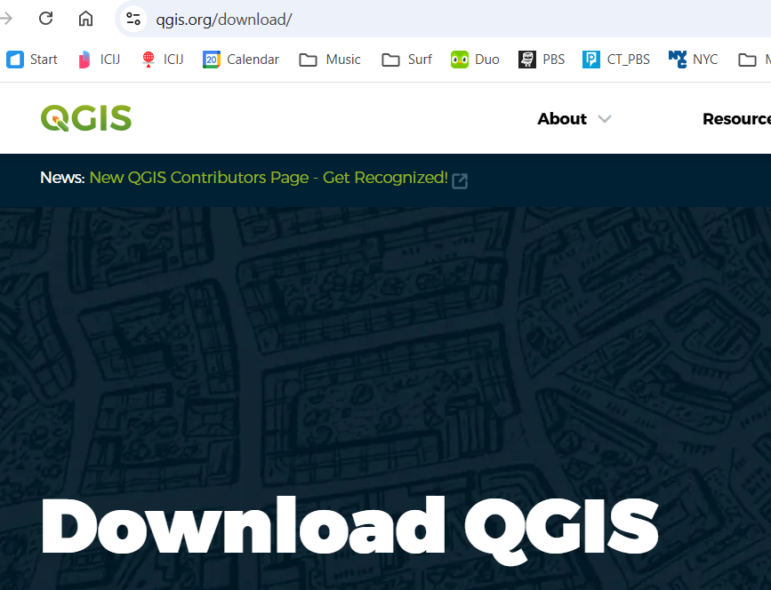
First, download and install QGIS, a free, widely-used mapping program. During installation, accept the standard defaults for your operating system.
You should see a screen like this. Accept all the standard defaults for your laptop’s operating system. This should be quick setup.
Download the Data
The data used for the exercises in this guide is here. Download the data to your laptop and note the folder where you saved it. For example, you might create a folder named GIJC_Mapping so you can easily find everything later.
2. Starting QGIS
When you start up QGIS for the first time, your screen may look slightly different, depending on your laptop and your version of the software. No worries. We’ll make sure you can follow along with the tutorial below.
Let’s say your first look is a menu bar and a blank page like this.
![]()
There are a lot of buttons and options — but here is the secret — you really just need to know a dozen or so of these to do most of the investigative work in mapping.
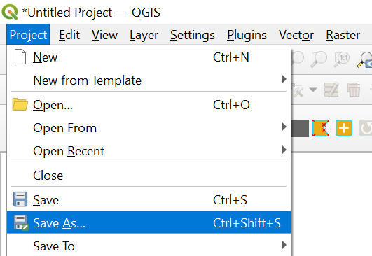
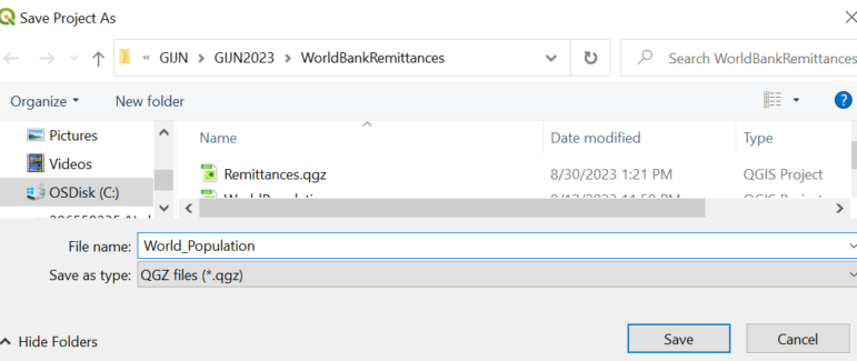
First, we’re going to create and save a project — this will be the place where we will create our first map in this class.
Go to the left-most part of the menu bar and click on: Project → Save As… We’ll call it World_Population.
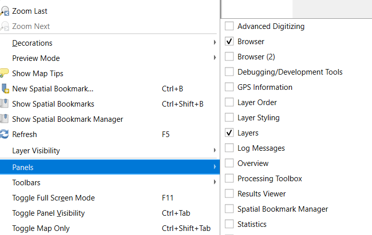
Show the Layers Panel (Legend)
Now, before we bring in our first map, let’s make sure you can see a legend for your map, which QGIS calls the Layers panel. This will help you navigate as your maps get more complex.
- Go to View → Panels → Layers.
- Ensure Layers is checked.
On some installations, this may already be on by default. If so, no need to change anything.
3. Bringing In Your First Map
Maps in QGIS are called layers. There are a bunch of different types. For starters, we will use some of the most common kinds, which. QGIS calls Vector Layers. We’ll explore other options below.
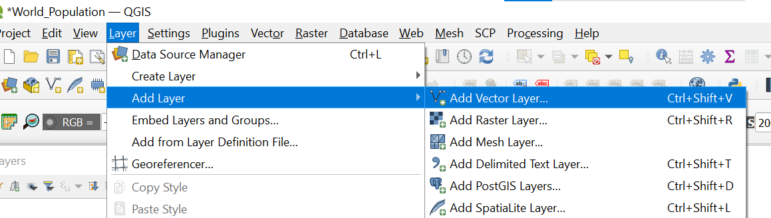
To load the map you downloaded earlier:
- In QGIS, go to Layer → Add Layer → Add Vector Layer…
- Browse to the folder where you downloaded the training data.
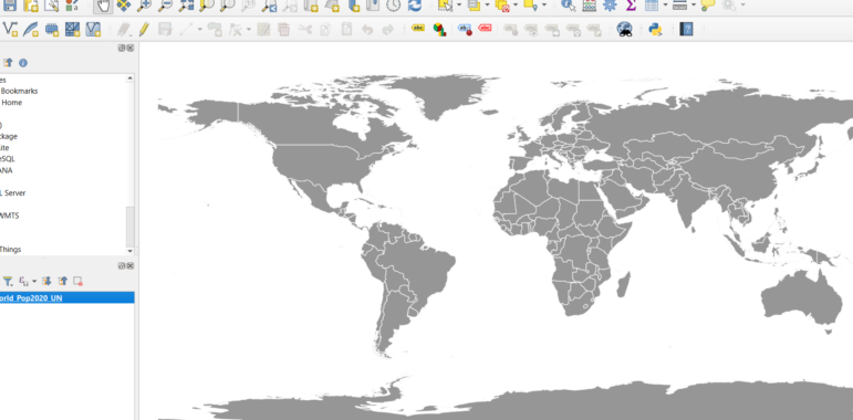
- Select World_Pop2020_UN.shp.
- Click Open, then Add.
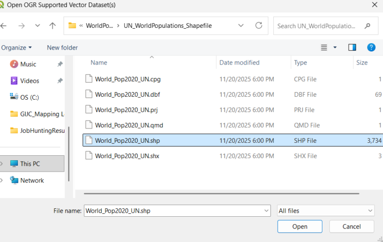
This filetype — a shapefile with a .shp extension — is among the most common mapping files. There are a lot of free shapefiles available for anywhere in the world. In this case, the file is from the United Nations and contains population data.
Your screen should now look something like this:
(The overall color may be different. We will play more with this later on.)
Let’s learn several buttons that will help us better navigate this map — and the deeper analysis we’ll do later on in the class. Some of these may be intuitive.
Zoom in
First, you may want to zoom into a country or region.There is a zoom button along the top menu — the icon that looks like a magnifying glass with a plus sign:

Just click and drag a square around the region you wish to zoom into.=
Move your map around
You may want to move around your map. In this case, go for the white gloved hand along the top menu:

Zoom out
You want to zoom out. That is the magnifying glass with the minus sign:

Just click and drag a square around the region you wish to zoom out from.
Going back to the way things looked before
Another handy button is to go back to how your map looked one step back. Like you zoomed in too far and now want to go back one step. It’s the magnifying glass with the back arrow.

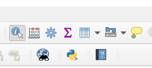
Get more information
You may also want to know more about an area on your map — use the icon with the little i (for information):
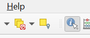
When you use this information button and click on a place, you should get a pop-up box that shows you the underlying data that comes with this map (see highlighted red country, Malaysia, below):
Every digital map has underlying data. And you can quickly add more data. We will do that later.
4. Basic Map Analysis with Symbols
The basic UN map we have is adequate, but it could tell us much more. First, it’s a single color. We are now going to learn more about symbology. How things look on a map — and how it can help you spot patterns.
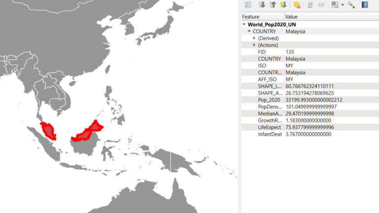
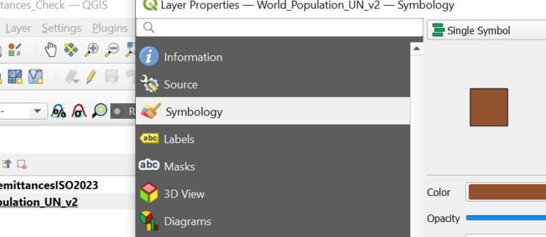
Double-click in the legend on the name of the map:
You should get a pop-up window that gives you a range of options:
Make sure “Symbology” is highlighted.
Notice how on the top it says “Single symbol?” That’s why our map is just one color.
A great way to begin to see patterns is by changing “Single symbol” to “Graduated colors.” But there are decisions to make now.

In this example, there is a series of decisions to make.
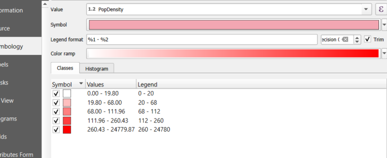
- Which type of data should we visualize? Here, we chose population density — indicating how many people per square kilometer live in a country.
- Then, at the bottom, how will we break down the data? To show you clear differences, I chose equal count. Others can also be helpful, like natural breaks and standard deviation. We’ll talk about that in a bit.
- How many different colors or gradations will we use? Here, we’ll stick with the default setting of five. You may want to choose fewer. So we can play with the color ramp.
The result tells us a lot:
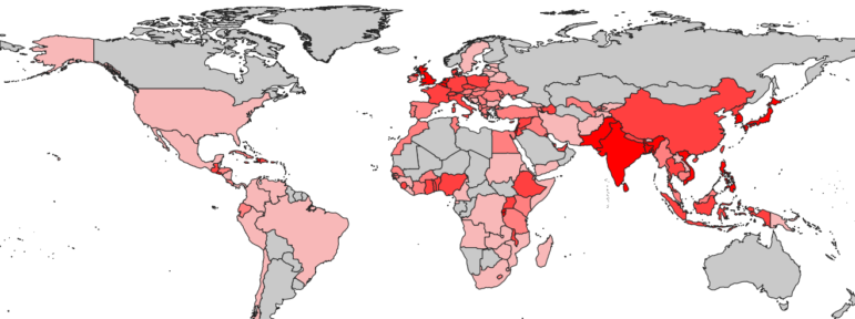
Parts of Europe and Southeast Asia (darker red) are among the most densely populated areas of the planet.
But there is a lot more data underneath this map. You can try these other options.
What happens when you look at life expectancy? At the median age of a population? At population growth rates?
Let’s break this down and focus on infant death rates (but this method works for examining other rates and numbers). Let’s group things. QGIS and other mapping programs give you options on how to lump groups of numbers together. A good baseline for how to group things is by using something that statisticians call natural breaks. It helps reduce the signal-to-noise ratio, a measure indicating how clear a message is. It is generally a fair way to group things together. To better understand this, let’s walk through an example focusing on infant mortality rates.
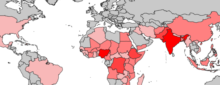
You can begin to see regional or country-level demographic differences. For example, the darker red shades for Nigeria, Democratic Republic of Congo-Kinshasha, Ethiopia, Pakistan, and India stand out and indicate a higher rate of infant deaths — which could be a data point that sparks an investigation to understand why.
This is an example of performing basic map analysis.
Now, let’s try a bit more advanced work.
First, save this project again.
5. Mapping Different Kinds of Data: Spreadsheets, Shapefiles, and Combining Them
This time, we’re going to map two different kinds of data. One will be a shapefile, just like we did earlier. The other will be an ordinary spreadsheet that has latitude and longitude or physical addresses.
We will close our last project and now create a new project. We can call it Police_Shootings.
The data we’ll use is part of an actual award-winning investigation into New York police shootings.
Let’s go to the folder labeled NYCPoliceShootings. All the data we need for this part is in a folder called InvestigatingPoliceShootings.
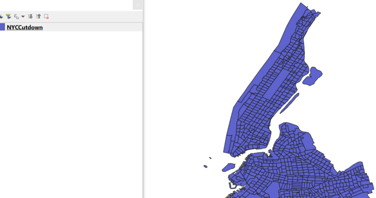
First, let’s bring in a map for part of New York. It is labeled NYCCutdown and covers Manhattan and Brooklyn. It’s in the folder labeled NewYorkCity_DemographicShapefile.
Bring it in the same way we did earlier in our countries map, going along our menu bar to Layer → Add Layer → Add Vector Layer.
![]()
Your screen may look something like this:
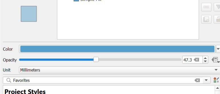
That dark color may be a bit much for when we overlay police shootings, so let’s lighten it up.
Let’s click on “Symbology” and lighten the color, along with lowering the opacity. Opacity is how thick the color; making it more translucent allows you to see layers and what might be on top of or under it.
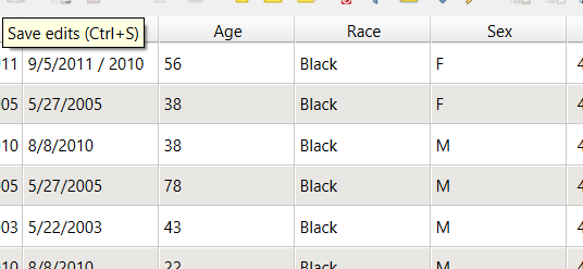
Now we are going to add the New York police shootings. This is from a reporter’s spreadsheet, where she recorded each time an innocent bystander was shot by New York police and was either injured or killed. It is part of a much larger dataset. She built this spreadsheet by reporting out every New York City police officer shooting over more than a decade.
How can we map a spreadsheet when it is not a mapping file? This is a common problem. There are several ways to do this.
In this case, we have the street address and the latitude and longitude. Such spreadsheets may exist for crimes, chemical spills, natural disasters, and more.
We’ll go to Layer → Add Layer → Add Delimited Text Layer…
But this time we’ll choose a delimited text layer:
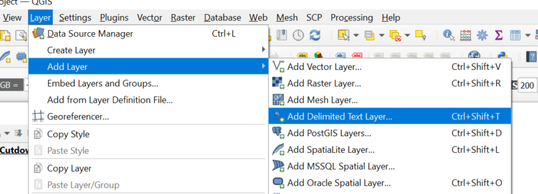
Now let’s choose NYCShootingsManhattanBrookly.csv. It is a spreadsheet saved as a CSV file. 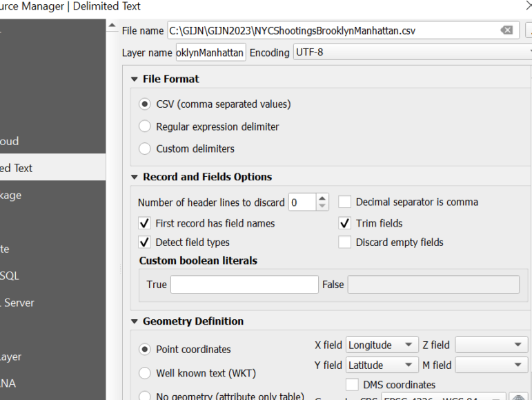
It has columns labeled Latitude and Longitude, to make it easier for QGIS to know the column names.
Your result may look like this:
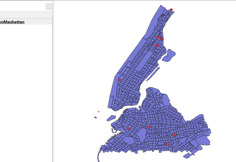
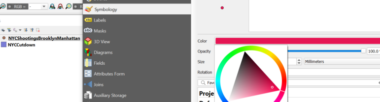
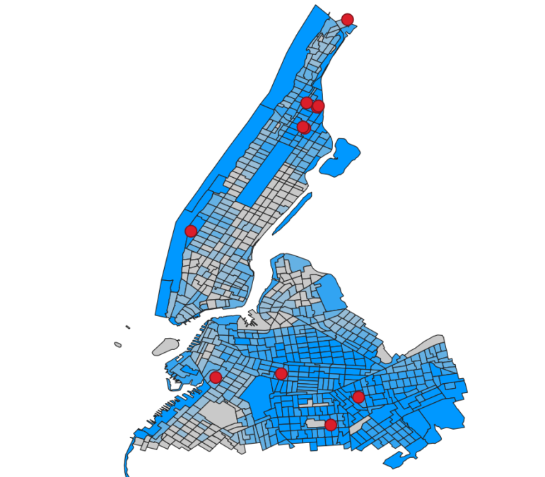
If the colors coming in are close together and hard to see, let’s take a few minutes to make them clearer for the audience. To make the dots or points for each shooting appear red, select the shootings file in the legend, double-click the file, and change its symbology to red by double-clicking the color.
Now we have a map of shootings in Manhattan and Brooklyn for more than a decade. Remember, this is just a slice of the data. The final story had far more cases. This is just a sample of the data for this lesson.
Let’s dig deeper. What are the communities like where these shootings happen?
Let’s look closer at our map of Manhattan and Brooklyn. We’ll take a similar approach like we did with the world population map.
In this case, we’ll use US Census data that tells us a little about the demographics of each small neighborhood.
We’ll double-click on the file name, call up Symbology, and notice it has demographic data.
Let’s choose 1.2 PctBlack – the proportion of the population that is African American.
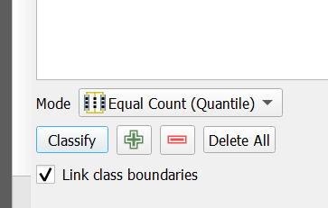
We also want to select Equal Count and click the Classify button to do the math.
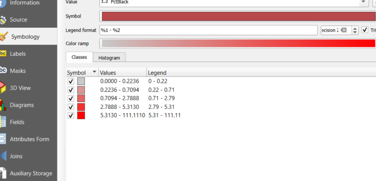
The result now tells us a lot more about where police shootings of innocent bystanders are happening.
See any pattern? The police shootings of innocent bystanders are happening in neighborhoods with a larger proportion of African Americans. This data point prompts numerous other questions, to understand why. We’ll want to document our work and save it.
6. Turning Incident Data into a Shapefile and Doing a Union
Now we’ll want to improve our shooting data to include neighborhood demographic data.
What does this do? It takes your spreadsheet and officially creates a mapping file, known as a shapefile. This can work in multiple other programs.
Now we can take an extra step and actually join the census data with our shootings data — so we can later scroll through the data of our new shootings file and be able to write quickly and with precision, the demographics of the neighborhood where the shooting occurred.
We’re going to do what is called a union — this will physically join our two maps. Be patient — there are a couple of default settings we’ll need to change to make this happen.
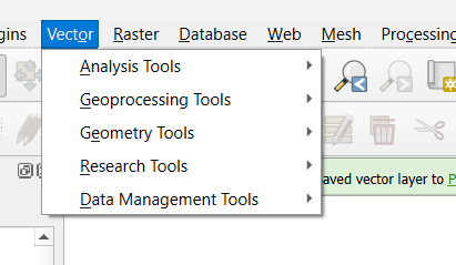
First, we navigate to the vector part of our QGIS toolbar menu
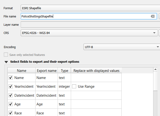
Right-click the Shootings layer in the Layers panel.
Choose Export → Save Features As…
Choose ESRI Shapefile as the format. Name the file and choose a save location.
Click OK.
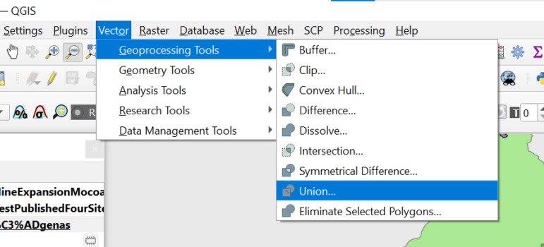
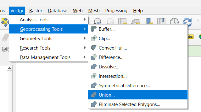
Select Geoprocessing Tools → choose Union.
You then need to choose how you want your union to work. You want to see each shooting — but now know the demography of the neighborhood where the shooting happened. So we will choose this:
- The input layer is the shooting file
- The overlay layer is the demography file
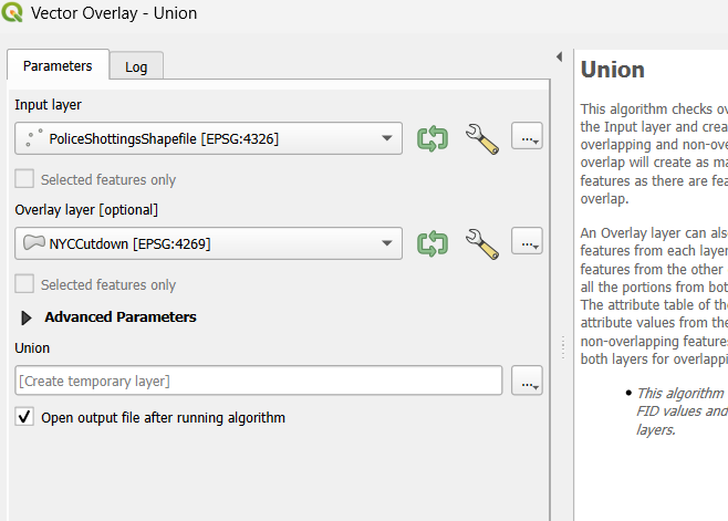
But, the tricky part here are settings.
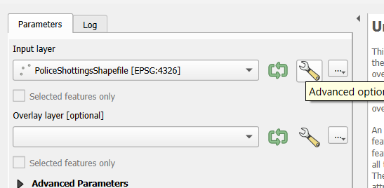
First, click the little wrench icon for the demographic file — the one labeled NYCCutdown.
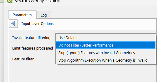
Then select Do not Filter (Better Performance)
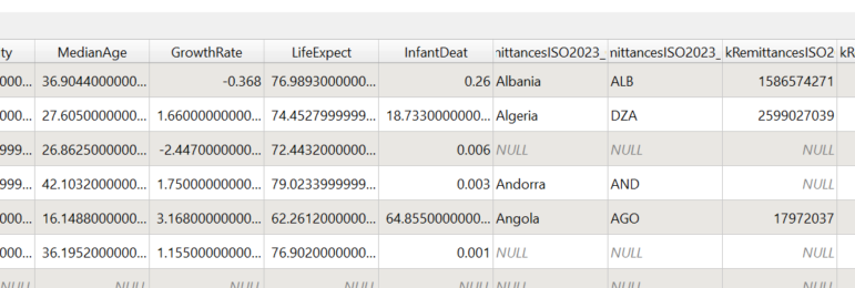
Now, if you want to see how we’ve combined the datasets, let’s check out the union shapefile’s underlying data table — known in mapping software as an Attributes Table.
Right-click on the Union file → Navigate to open the Attributes Table.

And you should see this as you scroll across:
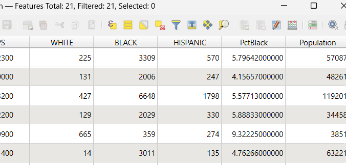
This file, now saved on your hard drive, can be easily brought into a spreadsheet program. That can be handy.
7. Intersects and Unions, Calculating Area, and Creating a New Shapefile
This section walks you through a more complex, real-world investigation: mapping how proposed mining concessions interact with protected rainforests and Indigenous territories in Colombia.
Now let’s start a new project, using data from an investigation published earlier in 2025. All of this sectioninvolves real data from government agencies.
This data comes from a Pulitzer Center investigation into proposed mines in Colombia, involving protected rainforests, lands for Indigenous people, and a large multinational mining company.
Our examples so far have used one or two maps. This story involves six maps.
All of them are in the InvestigatingRainforests folder.
Let’s first add a base layer we are familiar with — the world population map we used earlier.
Remember, we go along the menu bar to: Layer → Add Vector Layer → Choose the World_Pop2020_UN.shp file, then click Add and Close.
![]()
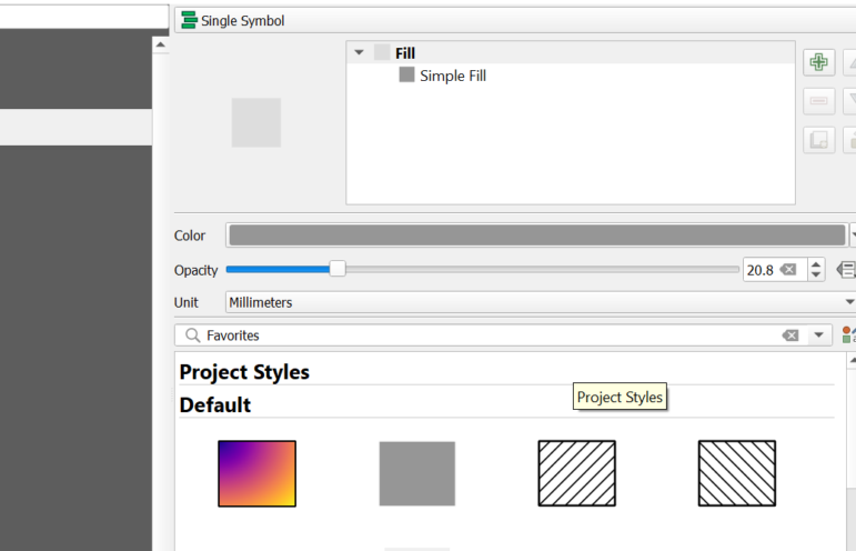
When the map comes in, QGIS may pick a bright color. Let’s tone this down. Why? We’re combining six maps, and we want to reduce any confusion. This is just a base map for this exercise.
To avoid clashing contrasts, let’s click on the file name and go back to symbology. Let’s choose a gray color, and reduce its opacity to about 20 percent.
This base layer will just help keep us oriented as we add in more maps. This is a rainforest story, so next, let’s add in a map of rainforests in Colombia.
To add more maps, we go along the menu bar to: Layer → Add Vector Layer. In the rainforest folder choose the shapefile. Then click Add and Close.
Then let’s zoom to this layer. It may also have come in as some unusual color. As we just did with the first map, for this one, let’s change that color by clicking on the file name, and choosing a green hue, and reduce its opacity to 40 percent.
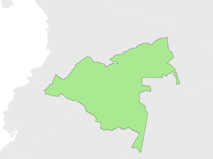
Your map should look something like this:
A mining company plans to start digging in this region. It has applied for permits for two phases of work. This would involve cutting down part of the rainforest. Let’s see where they plan to work.
In the ProposedMine folder, find the shapefiles for Phase 1 and Phase 2. Add both using Layer → Add Vector Layer…. Then, Zoom to the mining layers.
For each phase, adjust colors and opacity so they are distinct and visible against the rainforest layer.
At this point, you should be getting comfortable with importing in shapefiles and changing how they look.
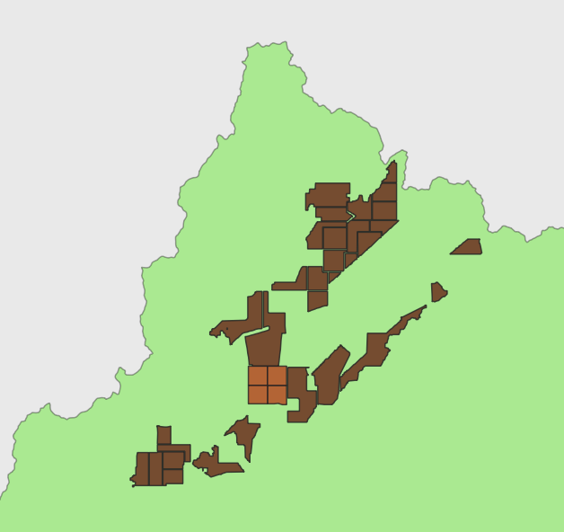
Now, one part of the story should be clear: This proposed mine would involve removing vegetation in the marked sections of the rainforest.
Might there be more to the story?
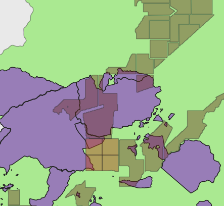
Let’s learn more about this region. From reporting, we know there are lands that have certain government protections. These are for the rainforest and for Indigenous communities. Let’s import those maps into this project.
First, look at land that the government has deemed environmentally protected – where development is not supposed to happen. Now you should see that the mine, in its first phase of development, would intrude not just into rainforest, but into environmentally protected land.
Now zoom in on that section. Your map may look something like this, depending on the colors and opacity you selected.
You can see where there is an overlap of the planned mine (brown) and protected rainforest (green).
8. Using Intersects to Map Overlaps and Calculate Area
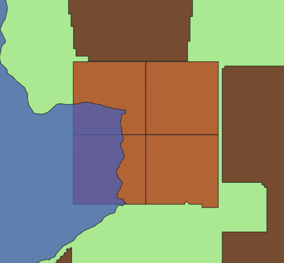
Now we are going to take advantage of one of the most commonly used tools of mapping analysis. We are going to create our own map of this area where the Phase 1 development and the protected lands meet.
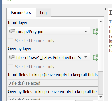
To start, we are going to go to a different part of the menu bar. Go to Vector → Geoprocessing Tools → Intersection.
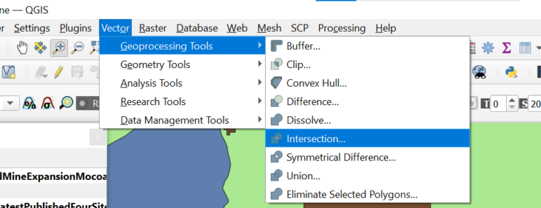
Set the Input layer to the Phase 1 mining shapefile.
Set the Overlay layer to the environmentally protected lands shapefile.
Leave the other settings at their defaults.
Choose an output file name and location.
Run the tool.
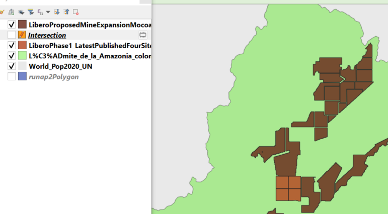
The resulting layer shows only the areas where the Phase 1 mine overlaps protected land.
Save your project.
Calculate the Area of Overlap
QGIS can calculate the area of each polygon and store it in a new field. This is crucial for reporting the scale of impact. Like everything in QGIS, there are a few ways to do this.
Click on Open Field Calculator, the icon toward the right that looks like a miniature abacus — that’s the tool that lets us do calculations and save them in our map.
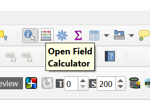
It asks a few questions.
Check → Create a new field.
We named ours AreaOfLand. We want the numbers in decimals, so we have a little more precision. And in the Expression box — to do the math — type this: $area. Click on OK to create the field.
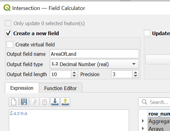
Now we know the area.
QGIS will calculate the area for each feature, typically in square meters (depending on the layer’s coordinate reference system). When you use your information button, you can scroll down and see the resulting number.
Saving Your New File
QGIS, at this point, is saving all this information in its virtual memory. Let’s hard-code this file and save it, so we have a more permanent copy. We are going to create our own shapefile.
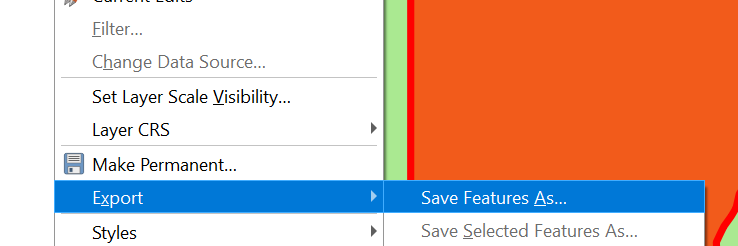
Right-click on the file name, choose Export → Save Features As…
Then name the file.
We now have more detailed information to question both the government and the mining company about.
9. Intersecting with Indigenous Lands
Beyond environmental protections, you may also want to know how the mine affects Indigenous territories. It’s a way to practice our new skill of doing intersects.
To make things simpler, let’s turn off our protected lands map and our newly created intersection map. Just use the check boxes in your legend. We should be back to a map that looks like this:
Let’s bring in the shapefile stored in the IndigenousLands folder. The result, after you play with colors, might look like this:
As reporters, we have a few options. First, we could take the information button.
Just be sure you’re on the legend that the Indigenous peoples file is the active or selected layer.
Now click on the Indigenous peoples’ lands that seem to be at risk of trespass by the mine. This will help identify which communities to call and ask about the proposed mine, and whether they plan to oppose the development.
We can also figure out how much land in the proposed mine would overlap territory officially designated as belonging to Indigenous peoples. We will do an intersect — the same analysis that we did just before this.
Using the Union Tool
You may also notice that environmentally protected areas overlap Indigenous communities. What if you wanted to know how much land the mine might span, including either environmentally protected land AND Indigenous communities. But also avoid double-counting any territory.
First we would start as if we would be doing an intersect, going to Vector → Geoprocessing Τools…. Then we would select Union…, and pick the two files — the ones covering Indigenous peoples and the other for environmentally protected lands.
This will merge the two files — and avoid any duplication between the two.
For bonus points, you could also use a union to join the mining files — both phase 1 and phase 2 — into a single overall mining development proposal shapefile.
Once we have this union file, then we can, once again, perform an intersect with the mining file.
10. More Joining Data with Maps
Sometimes we may have data that is not in a map, and does not have an address or latitude and longitude coordinates, and we want to map it. Here is how to do that in QGIS.
We get data — in this case from the World Bank, about remittances, which is the money that workers who go overseas send back home to their families.
The data is not on a map, but it does include the name of each country and its two-letter ISO abbreviation. Here is how we can map the data to better see the overall pattern.
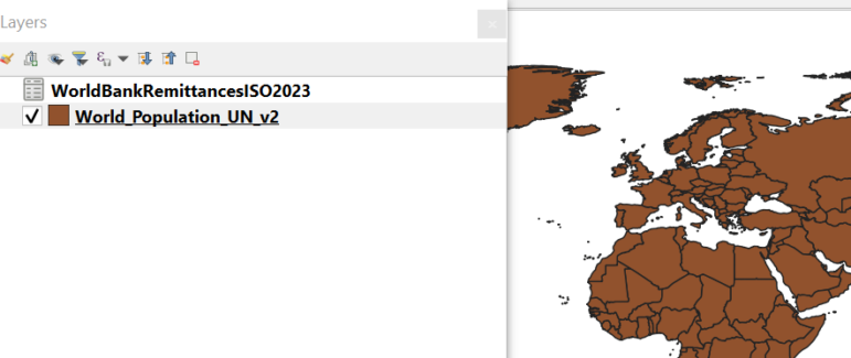
First, let’s have our standard world map with UN population data. Now let’s add the spreadsheet — actually a .csv file — to our map.
The next part is also a join, but a little tricky.
The order of things matter.
1. Make sure your shapefile — the population map — is the active layer. Click once with your cursor to be sure. Notice here how the file name is now highlighted? This is how you know it is the active layer.
2. Now double-click on the file name, and you should again get the properties pop-up window. Like this:
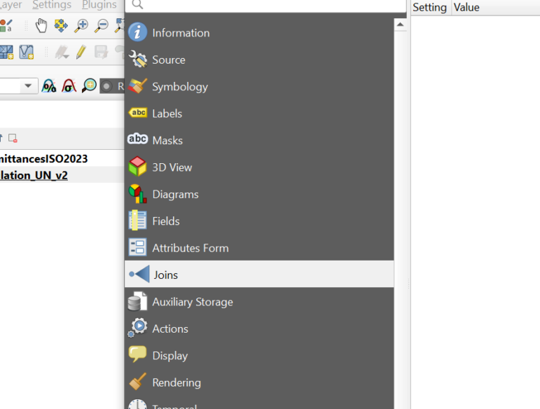
3. Now click Joins. We are about to do a join between the map and the data. Then click the green plus sign you see lower down.
4. You should get a pop-up box. It’s going to make guesses on how you want to do this join. But it’s probably guessing wrong, and we need to fix this.
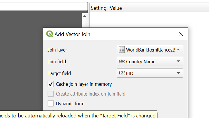
5. We want the join to be: Joining with the remittances data, using the ISO codes.
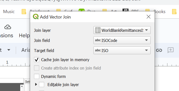
6. Now hit OK and in the next window, Apply and OK. Just to be sure.
7. Now open the attribute table. You could right-click on the file name or hit the icon along the top of the menu bar, on the right side, that looks like a mini spreadsheet.
8. Notice that now, when you scroll through the data, you now have connected country-by-country remittances with the map.
9. Now let’s play around mapping remittances. Go back to the map name… double click the name and get the popup properties window and go to symbology.
 =
=
Choose the field name to do the mapping — let’s pick the most recent year of data. And now equal count to classify the data range into five buckets.
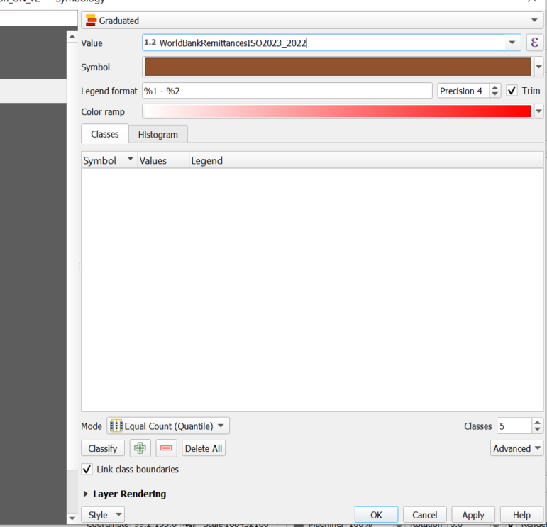
Now, be sure to hit the Classify button lower down in the pop-up box. This does the math for us.
Your pop-up box should now look like this:
Hit Apply and OK.
Your map may look something like this:
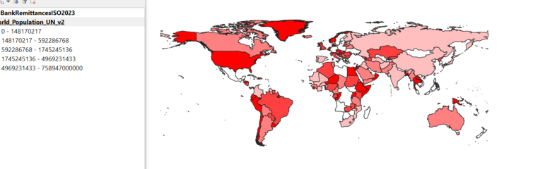
And you can now begin to hunt for interesting patterns. This may also help you spot missing data you may wish to inquire more about.
Calculating Rates
You can do this, but it can be tricky.
![]()
Look for the icon in the upper right that looks like the Greek letter Epsilon.

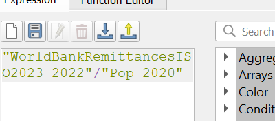
You will see the menu now ready to calculate a rate. To make things easy, copy the field name WorldBankRemittancesISO2023_2022.
Type a dividing sign, since we’re doing math for a rate. Then, paste in the field name — this is to ensure you get the right double quotes.
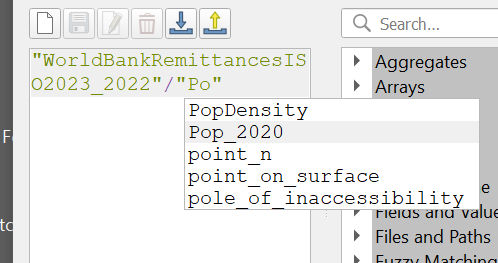
And divide remittances by recent population.
Hit OK …
Hit Classify → Apply → OK
And now — aside from places with missing values that raise questions — you see some interesting patterns.
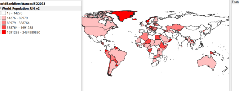
The Horn of Africa, Southeast Asia, and parts of Latin America remain of interest by either standard.
Mapping Tool Next Steps
There are many other ways you can use QGIS. The hope of this guide is to give you a foundation to give journalists around the world a greater familiarity with this free tool that has a robust user community, and that you can use these skills for your investigative stories.
There are other valuable mapping tools as well. Some are free and some may cost you money. But the lessons here are transferable — they should help you as you incorporate more mapping analysis for your reporting.
 Andy Lehren is Mongabay’s investigations editor. He is a former investigative reporter and editor for The New York Times and NBC News, concentrating on national and international projects. He is a former Pulitzer Center Rainforest Investigations Network fellow. Recently he worked for International Center for Journalists, where he oversaw a global environmental collaboration, and for Inside Climate News. He is on the Board of Directors for Investigative Reporters & Editors, and teaches investigative reporting at CUNY’s Graduate School of Journalism. Honors include a Polk, Peabody, Emmys, multiple IRE, Columbia duPont, Murrow and Overseas Press Club awards. He was part of a Pulitzer-winning investigation and also part of a Pulitzer finalist investigation. His stories have led to companies to pay millions in fines and in compensation for wrongdoing. They have led to arrests and changes in laws and regulations.
 Kuek Ser Kuang Keng is a digital journalist, data journalism trainer, and media consultant based in Kuala Lumpur, Malaysia. He is the founder of Data-N, a training program that helps newsrooms integrate data journalism into daily reporting. Partnering with regional journalism organizations including Google News Initiatives, WAN-IFRA and Internews, he has been conducting regular digital journalism workshops since 2018, reaching over 1,000 journalists in Asia. He also provides consulting and mentoring to media organizations in data, visual and interactive journalism. He has more than 15 years of experience in digital journalism. He started as a reporter at Malaysiakini, the leading independent online media in Malaysia, and worked on high-profile corruption cases and electoral frauds during the eight-year stint. He has also worked in several U.S. newsrooms, including NBC, Foreign Policy, and PRI.org, mostly on data-driven reporting. He holds a Master’s in journalism from New York University. He is a Fulbright scholarship recipient, a Google Journalism Fellow, and a Tow-Knight Fellow.
GIJC23 – Basic Principles for Mapping Data Using QGIS
Developing a Data State Of Mind: Key Tips for Editors
Video Resources for Mapping, Satellites, Storytelling, Testing, Tracking, and Disinformation
My Favorite Tools: Venezuela’s Lisseth Boon on Design and Data Visualization

Trust Issues: Using Data to Dig Into Who Profits from US Tribal Lands

Why Any Reporter Can Now Source Free, Quality Satellite Images of Almost Anywhere on Earth
Mapping Conflict: Using Satellite Radar Data to Track the War Damage in Gaza