There are a plethora of programs available for data visualization. Some are very simple to use and require no coding, while others are more difficult to learn but offer greater flexibility and interactivity. Here are some of the most popular options for journalists.
ArcGIS online is a tool from Esri to create and share online maps. It also has an extensive library of existing maps, but be sure to use only those from a trusted source. Esri also has a Storymaps platform to help you integrate maps into stories.
CartoDB is a tool for building interactive maps. There is a free version for students. A professional account for individuals and freelancers costs $199/month for an annual plan, and organizations can create accounts for a subscription fee that depends on their needs. Account pricing information can be found here.
Chartbuilder is a free, open-source graphing tool that offers limited graphical options (line, bar, and scatterplots only) and the option to export graphics as image files, SVG, or JSON.
D3 is a JavaScript library for creating visualizations using data. It allows for interactivity and animation. Examples of the graphics that D3 can produce are available here. A free GitHub tutorial on how to use D3 can be found here. Translations of the documentation are available in several languages, including Chinese, Spanish, Russian, Turkish, and Portuguese.
Datawrapper is a data visualization tool developed in Germany that does not require programming skills. It allows for a variety of charting and mapping functions. There is a free, limited plan, as well as paid plans for individuals, teams, and newsrooms that range from approximately $33/month to $564/month. The website offers free how-to articles on the Academy page.
Plotly Chart Studio is a tool that allows users to create charts, graphs, and d3 interactive visualizations without coding. It offers paid plans that range from $99/year for students to $840/year for professional users. There is also a free limited version.
Plotly.js is a free, open-source library for charting in JavaScript. It requires programming experience. There are versions available for use in R, Python and other languages. Documentation is available on GitHub.
StoryMapJS is a free tool to help you tell stories on the web that highlight the locations of a series of events. It is a new tool, yet stable, and it has a friendly authoring tool.
Tableau is an interactive data dashboard tool that does charting, mapping and other visualizations. Check the website for current pricing. It also is free to members of Investigative Reporters and Editors. Tableau Public is free, but limited in the data sources that can be used.
TimelineJS is a free, open-source tool that enables users to build visually-rich interactive timelines. It’s available in 40 languages. The content lives in a Google spreadsheet, so it’s easy to update.

Guide to Mapping Analysis Using QGIS

Step-By-Step Guide for Journalists on the Basics of Google Sheets

Tipsheet for Using Ocean Data in Your Investigations

No Coding Required: A Step-by-Step Guide to Scraping Websites With Data Miner
How a WhatsApp Community Is Bringing India’s Data Storytellers Together

Turning the Threat to a Distant Glacier into a Local Story Through Data Visualization

One Name at a Time: How Die Zeit Built a Searchable Database of Nazi Party Members

How The Washington Post Combined Data and Human Stories to Cover Hurricane Helene’s Aftermath

This work is licensed under a Creative Commons Attribution-NoDerivatives 4.0 International License
Republish our articles for free, online or in print, under a Creative Commons license.
Republish this article
This work is licensed under a Creative Commons Attribution-NoDerivatives 4.0 International License
Read Next
Data Journalism
How a WhatsApp Community Is Bringing India’s Data Storytellers Together
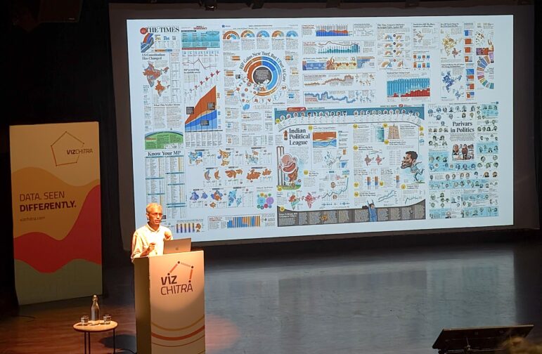
Recently, more than 400 people gathered in the Indian city of Bengaluru for VizChitra 2026, a conference on data visualization and storytelling — but that is only a small part of the story.
Climate Data Journalism
Turning the Threat to a Distant Glacier into a Local Story Through Data Visualization
New York Times climate and environmental graphics reporter Mira Rojanasakul discusses how her team visualized the sea level rise threat from the melting Thwaites Glacier in Antarctica.
Data Journalism
One Name at a Time: How Die Zeit Built a Searchable Database of Nazi Party Members
An online tool set up by the German newspaper Die Zeit, in cooperation with archives in Germany and in the United States, allows people to search several million Nazi Party membership cards.
Data Journalism
How The Washington Post Combined Data and Human Stories to Cover Hurricane Helene’s Aftermath
From Storybench, Washington Post climate reporter Brady Dennis is interviewed about his immersive story on Hurricane Helene and the importance of combining data and human experience.