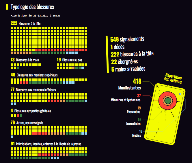
Accessibility Settings

color options

monochrome muted color dark

reading tools

isolation ruler

Topic

Data Journalism

649 posts

Data Journalism

GIJN’s Data Journalism Top 10: Pirates vs. Princesses, Buenos Aires Crime, Awards & Fellowships

What’s the global data journalism community tweeting about this week? Our NodeXL #ddj mapping from January 7 to 13, 2019 finds @SZ’s analysis revealing how children’s books perpetuate gender stereotypes, @A24COM mapping the hottest crime spots and times in Buenos Aires, @dw_akademie offering a data journalism fellowship opportunity, and great chances to win awards from @WorldGovSummit and @GENinnovate’s Data Journalism Awards.

Resource

Document of the Day: Visual Vocabulary

Inspired by the Graphic Continuum by Jon Schwabish and Severino Ribeca, the Financial Times graphic team came up with their own neat chart of visualizations. The Visual Vocabulary is a guide to help journalists pick the right type of visualization for their story.

Data Journalism

GIJN’s Data Journalism Top 10: El Salvador’s Corpses, Searching for Women, Merging Data

What’s the global data journalism community tweeting about this week? Our NodeXL #ddj mapping from December 31, 2018 to Jan 6, 2019 finds experts sharing their thoughts on machine learning in journalism with @storybench, @funkeinterativ and @webk1d’s useful tool to merge datasets, @pewresearch’s overview of female under-representation in online image searches, and an analysis by @EDNNews on corpses bodies sent back to El Salvador.

Resource Video

Nils Mulvad – The story behind the data

More than ever, investigative journalists need to understand electronic data to do their jobs. To find, extract, analyze and tell stories, increasingly they need to deal with spreadsheets, databases, and visualizations. Nils Mulvad (https://x.com/nmulvad) is an Investigative journalist based in Denmark, who has worked with data journalism for more than 20 years. Visit GIJN’s resource […]

Data Journalism

The 25 Best Data Visualizations of 2018

Over the last few years, data and data analysis have taken on a new quality. Data and information is now a tool for creating beautiful visuals. What used to be simple charts and scatter plots are now complex and creative pieces of data art — some beautiful enough to hang up on your wall. Visme picked a collection of the best data visualizations of 2018.

Data Journalism

GIJN’s Data Journalism Top 10 in 2018: Visual Vocabulary, Eclectic Visualization, Google Dataset Search, Laughing in Parliament

It’s been a great year for data journalism and visualizations. GIJN’s Top 10 #ddj series captured snapshots of what’s popular on Twitter among the global data journalism community for 46 weeks in 2018. For this edition, we asked NodeXL to map 2018’s most popular #ddj tweets from January 1 to December 11 and the results are in. This year’s most popular tweets include @FinancialTimes’ ever-popular Visual Vocabulary chart, @Google’s Dataset Search, @hnrklndbrg’s eclectic visualizations, and @SZ’s analysis of Germany’s parliamentarians using laughter as a debate weapon.

Data Journalism

GIJN’s Data Journalism Top 10: Mapping Wildfires, Insuring Climate Risk, Data Viz for Kids

What’s the global data journalism community tweeting about this week? Our NodeXL #ddj mapping from December 3 to 9 finds @BuzzFeedNews mapping wildfire prone areas across America, @dwnews dissecting the value of insurance against climate change, the release of @infobeautyaward winners, and @jschwabish teaching fourth grade kids the wonders of data visualization in fun and inventive ways.

Data Journalism

GIJN’s Data Journalism Top 10: London’s Murder Hotspots, Hungary’s Media Monopoly, Data Journalism’s Fallacies

What’s the global data journalism community tweeting about this week? Our NodeXL #ddj mapping from November 26 to December 2 finds @VRCCrimCam mapping London’s medieval murder hotspots, @geckoboard illustrating common data fallacies to avoid, @ddjournalism teases the beta launch of the Data Journalism Handbook 2.0, and @GoogleNewsInit displays its data journalism courses.

Data Journalism

GIJN’s Data Journalism Top 10: Dear Abby Data, South Africa’s Pit Toilets, The Economist’s Inequality, Politico Goes Open Source

What’s the global data journalism community tweeting about this week? Our NodeXL #ddj mapping from November 19 to 25 finds society’s most urgent concerns in the textual data of a long-standing @dearabby column, a kerfuffle over @The Economist’s regional inequality graph, dangerous pit toilets in Africa highlighted by @SECTION27news and a gift of sorts from @politico, who open sourced their elections data management system.

Data Journalism

GIJN’s Data Journalism Top 10: Number Jungles, Gender Gaps, Uber Maps, Brexit Woes

What’s the global data journalism community tweeting about this week? Our NodeXL #ddj mapping from November 5 to November 11 finds employment problems in the UK from @FinancialTimes, Polish data counter-narratives with @gazeta_wyborcza, cool geospatial analysis toys from @Uber, plus the launches of new data labs with @AlterEco_, data articles with @fstalph and @eborgesrey and data newsletters with @voydorg_en.

Data Journalism

GIJN’s Data Journalism Top 10: Forecasting Elections, Counting Fast Food, Kampala’s Swamp City, Gasping for Air

What’s the global data journalism community tweeting about this week? Our NodeXL #ddj mapping from October 22 to 28 finds @NateSilver538 talking about election forecasting, @BBCNews highlighting the prevalence of fast food outlets in the UK, @washingtonpost comparing how tough it is for Americans to vote by state, and @business and @HowWeGetToNext on battling for fresh air in India and Europe.

Data Journalism

GIJN’s Data Journalism Top 10: Stories with Maps, Tools with Charts, Casting for Shakespeare

What’s the global data journalism community tweeting about this week? Our NodeXL #ddj mapping from October 15 to 21 finds @Esri’s @AllenCarroll talking the power of maps in storytelling, @visualizingdata’s catalogue of charts and corresponding tools to help information designers, and @ericwilliamlin’s deep dive into the data of casting decisions in Shakespearean plays since the 1900s.

Data Journalism

GIJN’s Data Journalism Top 10: New York’s Luxury Homes, Climate Dangers, Inspiring Data Viz

What’s the global data journalism community tweeting about this week? Our NodeXL #ddj mapping from Oct 8 to 14 finds 25 inspirational data visualizations collated by @VismeApp, a @nytimes op-ed by climate scientists warning of the future dangers of heat and humidity combined, @FT maps of New York’s glut of luxury residences and @ejcnet with veteran data journalists on web scraping.

Data Journalism

GIJN’s Data Journalism Top 10: Useful Chatbots, Less-Is-More Tables and Data Mapping Billions of Birds

What’s the global data journalism community tweeting about this week? Our NodeXL #ddj mapping from Sept 17 to 23 finds numerous data to map, from @NatGeo’s migration of billions of birds to @morgenpost’s Berlin schools and @A24COM’s internet access in Argentina. There’s also @dhanalytics’ tips on improving data tables and @mcrosasb on two useful chatbots.

Data Journalism

GIJN’s Data Journalism Top 10: Sad Tunes Algorithm, Fragapane’s Beautiful Dataviz, African Pay Gap, Euro-Xenophobia

What’s the global data journalism community tweeting about this week? Our NodeXL #ddj mapping from Sept 10 to 16 finds @miriamquick analyzing @Spotify data to rank the top five saddest songs, @Code4Africa creates a tool to measure gender pay gap in African countries, @fedfragapane shares beautiful illustrations on Instagram, #edjnet finds Italy, Turkey and Greece topping the list of Europe’s xenophobic countries, and @TaylorMirf highlights the low rates of immunizations in Washington state.

Data Journalism Reporting Tools & Tips

Document of the Day: DataViz Cheatsheet

Economist Jonathan Schwabish created a handy data visualization cheatsheet with straightforward key principles to adhere to when creating data visualizations. Remember: avoid 3D, make labels easy to read and try small multiples.

Data Journalism

GIJN’s Data Journalism Top 10: German Heat, Austrian Arms, Quebec School Fees and Salvadoran Kidney Disease

What’s the global data journalism community tweeting about this week? Our NodeXL #ddj mapping from Sept 3 to 9 finds @FiveThirtyEight attacked by the green-eyed monster with their equivalent of Bloomberg’s “Jealousy List,” @daswasfehlt breaks down Austria’s export of arms, @GoogleAI announces the beta launch of Google Datasets Search, and @SZ documents how climate change is wreaking havoc on temperatures in Germany but boosting ice-cream sales.

Data Journalism

GIJN’s Data Journalism Top 10: School Shootings, Trains vs Planes, Ukraine-Russia Trade, UK Airport Crimes

What’s the global data journalism community tweeting about this week? Our NodeXL #ddj mapping from Aug 27 to Sept 2 finds @nytclimate personalizing climate change, @npr fact-checking the US Education Department’s school shooting data, @dwnews calculating the cost of travel to the environment, and @junkcharts dissecting the strengths of Thailand cave rescue data visualizations.

Data Journalism

The Database Documenting 60 Years of Conflict in Colombia

For five years, about 100 people processed 10,236 datasets from 592 sources and documented 353,531 facts for the Memory and Conflict Observatory, a project that seeks to document the violent events that occurred during the Colombian war. The results can be summarized into a shocking number: 262,197 fatalities over 60 years. Sociologist Andrés Fernando Suárez led the team, and this is what he learned.

Data Journalism

GIJN’s Data Journalism Top 10: Muslims to Mecca, Women (Not) in Netflix, Inside Airbnb Europe, London’s Foul Air

What’s the global data journalism community tweeting about this week? Our NodeXL #ddj mapping from Aug 20 to 26 finds @Numerama analyzing the representation of women in @netflix series and finds it lacking, @AJEnglish creating an interactive explainer on how 2 million Muslims make the pilgrimage to Mecca every year, @FT readers brainstorming air pollution solutions for London, and @Bastamag digging into data of @Airbnb — a cash cow for home renters.

Data Journalism

GIJN’s Data Journalism Top 10: Egyptian Bots, Pocket Inequality, Loner Jobs and Knife Emergencies

What’s the global data journalism community tweeting about this week? Our NodeXL #ddj mapping from Aug 13 to 19 finds @puddingviz proving that women’s pockets are inferior to men’s once and for all, @vizzuality pondering the impact cartographers have on our understanding of the world by presenting nocturnal activity in daytime maps, @InfoTimes_ discovering the bots behind the political debate in Egypt and @hnrklndbrg’s visualizations on everything from loner jobs to knife emergency room visits.

Data Journalism

GIJN’s Data Journalism Top 10: Faking Climate Change Data and in WEB Du Bois’ Black Americ

What’s the global data journalism community tweeting about this week? Our NodeXL #ddj mapping from Aug 6 to 12 finds @sciam profiling a new color scale for the color blind, @EDudinskij’s fun dissertation on dataviz in science fiction movies, @morgenpost using satellite imagery to show the consequences of droughts, and @gregladen and Grant Foster calling bull on a climate change denier’s flawed graphs.

Data Journalism

America’s Cultural Landscape, Germany’s Record Summer, Spain’s Immigration Boom, Google’s Data Search

What’s the global data journalism community tweeting about this week? Our NodeXL #ddj mapping from July 30 to Aug 5 finds practical advice from @junkcharts for conference presenters to showcase their graphics, @Google making data in data journalism pieces more searchable, @funkeinteraktiv displaying the ways Germany is breaking records this summer, @eldiarioes examining Spain’s immigration boom and author Colin Woodard breaking down America’s regional cultures in The New York Times.

Data Journalism

GIJN’s Data Journalism Top 10: Dam Disaster in Laos, Global Star Gazing, Why We Love Pie Charts

What’s the global data journalism community tweeting about this week? Our NodeXL #ddj mapping from July 23 to 29 finds @NadiehBremer visualizing beautiful constellations imagined by different cultures, @mslima diving deep into why we love pie charts, @leigh_tami18 explaining the various methods of joining datasets and the Reuters Graphic’s team visualization of the dam disaster in Laos.

Data Journalism

GIJN’s Data Journalism Top 10: Nike’s Vaporflys, Trump’s Trade War, FastCharts, Datapasta

What’s the global data journalism community tweeting about this week? Our NodeXL #ddj mapping from July 16 to 22 finds @UpshotNYT confirming Nike’s claim that their Vaporflys really do give runners an advantage, @FinancialTimes visualizes Trump’s escalating trade war, Britain’s digital divide and introduces their new charting tool and @MilesMcBain makes some data journalists very happy by creating Datapasta.

Data Journalism

GIJN’s Data Journalism Top 10: Footballers’ Salaries, Google Trends and Gender Bias with Pudding

What’s the global data journalism community tweeting about this week? Our NodeXL #ddj mapping from July 9 to 15 finds @morgenpost’s interactive slider showing how fast a German national footballer earns your monthly salary, tons of interesting Google search data in its @GoogleTrends data store, @durand101 and @puddingvizgender exposing bias in the UK House of Commons and @EdjNet offering a search engine for 800,000 EU datasets.