
Document of the Day: Visual Vocabulary
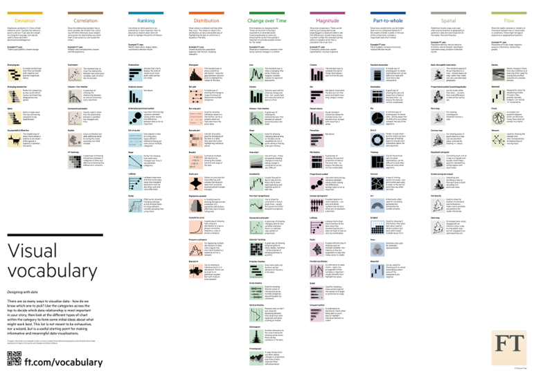
 Inspired by the Graphic Continuum by Jon Schwabish and Severino Ribeca, the Financial Times graphic team came up with its own neat chart of visualizations. The Visual Vocabulary is a guide to help journalists pick the right type of visualization for their story.
FT’s graphic team divided the types of graphics into nine categories — deviation, correlation, ranking, distribution, change over time, magnitude, part-to-whole, spatial and flow — depending on what needs to be communicated to readers.
Each graphic has a bite-sized description of what each visualization can be used to show, and some even include common pitfalls of reader misinterpretation. Also included are examples of what the FT uses the graphics for in its own newsroom. Visual Vocabulary is so popular with data journalists that it even made our Top 10 #ddj 2018 list. Download it here.


