
GIJN’s Data Journalism Top 10 in 2018: Visual Vocabulary, Eclectic Visualization, Google Dataset Search, Laughing in Parliament
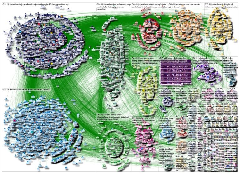
It’s been a great year for data journalism and visualizations. GIJN’s Top 10 #ddj series captured snapshots of what’s popular on Twitter among the global data journalism community for 46 weeks in 2018. For this edition, we had NodeXL map 2018’s most popular #ddj tweets from January 1 to December 11 and the results are in. This year’s most popular tweets include @FinancialTimes‘ ever-popular Visual Vocabulary chart, @Google‘s Dataset Search, @hnrklndbrg‘s eclectic visualizations, and @SZ‘s analysis of Germany’s parliamentarians using laughter as a debate weapon.
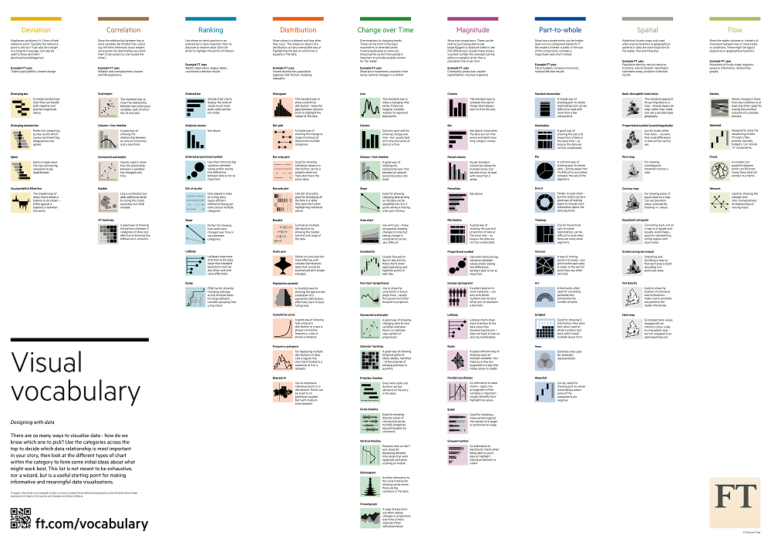
Visual Vocabulary
Financial Times’ Visual Vocabulary chart might be the new standard for reference charts about different types of charts. It’s appeared in our Top 10 #ddj list repeatedly through 2018. Seems data journalists love to share this useful resource!
Google Dataset Search
There are many thousands of data repositories on the web providing access to millions of datasets online, but how to find what you’re looking for? Cue Google Dataset Search. Similar to how Google Scholar works, this search engine will help scientists, data journalists and anyone else trying to track down datasets wherever they’re hosted.
OCCRP Data
Our friends at the Organized Crime and Corruption Reporting Project operate an impressive platform called Investigative Dashboard, where you can search for leads in a growing global index of public registries, documents, datasets and more. They even have a team of researchers who offer free support to reporters to help track down hidden assets, companies and individuals.
Eclectic Visualizations
Swedish software/product developer/manager Henrik Lindberg’s hobby includes producing data visualizations, which he compiles in Github. His creations are quite an interesting collection, ranging from Kids Ecological Footprint to Holiday at the Emergency Room.
Optimized Color Palette
Inspired by a Renaissance painting, Andrea Cirillo created PaletteR, a lean package which lets you extract a custom number of representative colors from any image and produce an optimized palette of colors.
https://twitter.com/albertocairo/status/993845249628884998
Laughter as a Weapon
How has the addition of the far-right Alternative for Germany party in the German federal parliament influenced their proceedings? To evaluate this, Süddeutsche Zeitung sat in on all parliamentary meetings for six months and analyzed 1,500 speeches, including each applause and every laugh, which could signal that the laughing party was ridiculing or humiliating its opponent. (In German.)
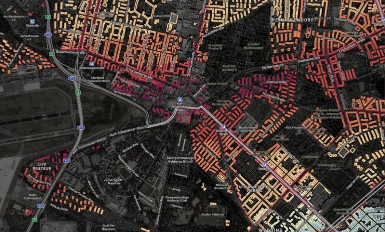
Berlin Noise Map
Searching for a flat in Berlin? You might want to check the local noise pollution before you make a decision. Berliner Morgenpost’s noise map is not just beautiful and interactive, it also struck a chord with Berliners who used it to check how loud decibel levels can get on their streets. (In German.)
Germany’s Broken Rental Market
The rapid increases in Germany’s property prices have made housing a crucial social issue. A Süddeutsche Zeitung crowdsourced investigation received 57,000 responses that painted a bleak picture of the German housing market — young parents who raise children in a shared flat because they cannot afford their own; old couples who fear the death of their partner because they cannot hold on to the apartment with one person’s finances; and single mothers who barely survive because over half their income goes to rent. (In German.)
Data Newsletter
If you want the latest data news every Tuesday, subscribe to technologist Giuseppe Sollazzo’s newsletter. He promises content on data journalism, data visualization, open data and every other thing “data,” dipped in a geeky sauce. Here are two of his stories which also appeared on our Top 10 #ddj lists this year: the average face of a UK member of parliament and a tool to chart the frequency of words uttered in parliamentary debates.
DataViz with Alberto Cairo
This year, data enthusiasts had the opportunity to learn from data visualization expert Alberto Cairo. For free! Hosted by the Knight Center, Cairo taught how to use graphs, maps, charts and diagrams to extract meaning from large amounts of data and how to use data visualization to tell stories to different kinds of audiences.
Thanks, once again, to Marc Smith of Connected Action for gathering the links and graphing them.
 Eunice Au is GIJN’s program coordinator. Previously, she was a Malaysia correspondent for Singapore’s The Straits Times, and a journalist at the New Straits Times. She has also written for The Sun, Malaysian Today and Madam Chair.


