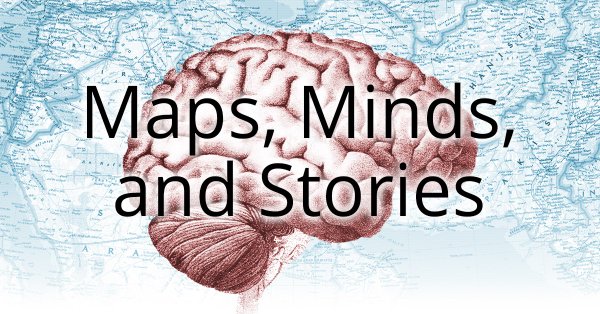
GIJN’s Data Journalism Top 10: Stories with Maps, Tools with Charts, Casting for Shakespeare
What’s the global data journalism community tweeting about this week? Our NodeXL #ddj mapping from October 15 to 21 finds @Esri’s @AllenCarroll talking the power of maps in storytelling, @visualizingdata’s catalogue of charts and corresponding tools to help information designers, and @ericwilliamlin’s deep dive into the data of casting decisions in Shakespearean plays since the 1900s.
How Maps Reveal Hidden Stories
Since he was a child, Allen Carroll has always loved maps. Now program manager for storytelling at Esri, Carroll grew up staring at world maps, gas station maps, and even drew all sorts of elaborate maps by hand. Here he writes his first piece in a series of reflections on the power of maps and storytelling. (Disclosure: GIJN has an agreement with ESRI which allows us to provide free mapping software for GIJN members.)
Shakespearean Ambitions
What does the future hold for aspiring Shakespearean actors? Apparently, if you’re an actress who wants a starring turn in Shakespeare’s plays, you’d pretty much have to do so before you turn 40. Composer-turned-coder Eric William Lin took a deep dive into the data from more than 1,000 productions of Shakespearean plays between 1900 and 2018 and discovered how age, gender and race affect casting.
Chartmakers’ Directory
Andy Kirk’s chartmaker directory is a catalog of charts and corresponding tools that will help information designers answer the most common question in data visualization: “Which tool do you need to make that chart?”
Mapping Police Violence
Mapping Police Violence is a research collaborative collecting comprehensive data on police killings across the United States in order to quantify the impact of police violence in communities.
Breathing Polluted Air
Financial Times reports on how air pollution is killing residents in urban cities around the world. Fine particles in polluted air contributes to 7 million premature deaths worldwide, estimates the World Health Organization. And eight in 10 people in the world are breathing polluted air above the WHO’s safe limit.
Mapping Every Building in the US
The New York Times mapped almost every building in the United States, showing the built legacy of the country. The images are drawn from a huge database that Microsoft released to the public this year. The company’s computer engineers trained a neural network to analyze satellite imagery and then to trace the shapes of buildings across the country.
Ask the Question, Visualize the Answer
The questions you ask before visualizing data will help you figure out what charts to use. Nathan Yau writes an insightful blogpost on how one dataset can be visualized in many different ways depending on the questions you ask it.
Observe, Collect, Draw
Statistician Nathan Yau gives information designers Giorgia Lupi and Stefanie Posavec’s #ObserveCollectDraw book some love in his blog post. He describes what you can do with this visual journal for data and labels it as fun!
Visual Perception in Visualization
Data Stories Podcast speaks to scientist Steve Haroz on visual perception in data visualization. Haroz urged information designers to make decisions based on empirical research, not just assumptions about best practices.
Shortlist: Information Is Beautiful Awards
The Kantar Information Is Beautiful Awards shortlist is out and it’s full of gorgeous and inspiring infographics and data visualizations. Winners will be revealed at an awards ceremony on December 4, 2018 in New York.
Thanks, once again, to Marc Smith of Connected Action for gathering the links and graphing them. Editor’s Note: GIJN removed an item that ran in an earlier edition of this story, on emerging words from Google Search, after GIJN we were alerted that the item was inaccurate and prematurely released. We have substituted the Financial Times’ report on air pollution in its place.
 Eunice Au is GIJN’s program coordinator. Previously, she was a Malaysia correspondent for Singapore’s The Straits Times, and a journalist at the New Straits Times. She has also written for The Sun, Malaysian Today and Madam Chair.
For a look at Marc Smith’s mapping on #ddj on Twitter, check out this map.

Guide to Mapping Analysis Using QGIS

Basic Data Journalism Tips for Editors

My Favorite Tools: Venezuela’s Lisseth Boon on Design and Data Visualization

Document of the Day: Visual Vocabulary

Turning the Threat to a Distant Glacier into a Local Story Through Data Visualization

Making Trillions Make Sense: How Reuters Visualized the AI Economy

Summer Reading List for Data Journalists: For Those Who Believe in the Power of Storytelling with Numbers

From Data to Storytelling: Concept and Design Tips from the Financial Times’ John Burn-Murdoch

This work is licensed under a Creative Commons Attribution-NoDerivatives 4.0 International License
Republish our articles for free, online or in print, under a Creative Commons license.
Republish this article
This work is licensed under a Creative Commons Attribution-NoDerivatives 4.0 International License
Read Next
Climate Data Journalism
Turning the Threat to a Distant Glacier into a Local Story Through Data Visualization
New York Times climate and environmental graphics reporter Mira Rojanasakul discusses how her team visualized the sea level rise threat from the melting Thwaites Glacier in Antarctica.
Data Journalism
Making Trillions Make Sense: How Reuters Visualized the AI Economy
How do you make a trillion dollars feel real to someone who has never seen that much money? Vineet Khare and Mayank Bhatt faced that very challenge for their data-driven investigation into AI investment.
Data Journalism
Summer Reading List for Data Journalists: For Those Who Believe in the Power of Storytelling with Numbers
Featuring books spanning four continents, these recommended reads provide a global perspective on data journalism.
Data Journalism
From Data to Storytelling: Concept and Design Tips from the Financial Times’ John Burn-Murdoch
The chief data reporter for the Financial Times discusses how he considers the use of text, color, and annotation to aid visual storytelling through charts and graphics.