
GIJN’s Data Journalism Top 10: Dear Abby Data, South Africa’s Pit Toilets, The Economist’s Inequality, Politico Goes Open Source
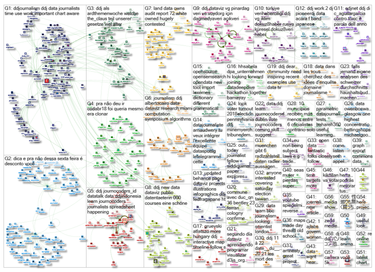
What’s the global data journalism community tweeting about this week? Our NodeXL #ddj mapping from November 19 to 25 finds society’s most urgent concerns in the textual data of a long-standing @dearabby column, a kerfuffle over @The Economist‘s regional inequality graph, dangerous pit toilets in Africa highlighted by @SECTION27news, and a gift of sorts from @politico, who open sourced their elections data management system.
Dear Abby on American Anxieties
For more than half a century, Dear Abby — America’s longest-running advice column — has offered counsel to thousands of worried and conflicted readers. The Pudding partnered with IBM to turn these readers text-based concerns into data. They grouped them into a “constellation of concerns” and revealed that some of the most debated topics were on sex, religion and LGBTQ issues.
Graphing Kerfuffle
A year ago, The Economist published a chart on regional equality in nine countries that caused a kerfuffle, with some readers calling the chart misleading. In this piece, the head of data journalism at The Economist, Alex Selby-Boothroyd, responds to those criticisms by explaining the challenges of charting inequality and discussing possible alternative solutions.
Dangerous Pit Toilets
For many South African school-going children, going to the toilet can be dangerous. The NGO Section27, with education data initiative Passmark, collected data from 86 schools in Limpopo between May and July 2018 and found that nearly half of them had unlawful pit toilets and the sanitation facilities were in poor condition. (Disclaimer: GIJN’s IT Coordinator Alastair Otter contributed to this report.)
Open Source Elections Data
Politico is sharing its system for modeling and publishing election-centric civic data with other newsrooms. Civic, constructed as a Django project, centralizes the storage of election data and can be reused for different applications. Politico is inviting other newsrooms to use what they have built and help to improve it.
Germans Monitoring Flight Punctuality
SWR has been analyzing the punctuality of over 2,000 daily flights at seven international airports in southwestern Germany using public sources. Just after midnight, the flight times of the previous day are automatically analyzed. (In German.)
Tracking Global Warming Reduction
According to the Climate Action Tracker, which tracks the progress of countries’ efforts to keep warming below 2°C, Russia, Saudi Arabia, Turkey, USA and Ukraine are woefully behind in their reduction targets. Turkey will be one of the countries most affected by global warming due to its semi-arid climate. (In Turkish.)
Coda.BR Resources
Didn’t make it to this year’s Coda.BR event, the biggest data journalism conference in Brazil? Fret not, the School of Data has compiled more than 30 presentations and resources from the conference in one place. (In Portuguese.)
Visualization Literacy Conundrum
Michael Correll discusses what visualization literacy means. He warns that the term “literacy” has sometimes been used to shift the blame to audiences rather than data visualizers failing to provide the necessary tools for audiences to understand the charts.
Survey on Statistics Course
The European Journalism Centre, in collaboration with Paris21, is looking to develop a video training course on helping journalists with official statistics. Fill in their survey if you are interested.
Indonesia’s Journocoders
Indonesia, the world’s fourth most populous country, is home to a budding ecosystem of journocoders. They hold monthly meetups to learn data journalism techniques together, and have covered D3.js, mapping, data wrangling, data cleaning and more.
Thanks, once again, to Marc Smith of Connected Action for gathering the links and graphing them.
 Eunice Au is GIJN’s program coordinator. Previously, she was a Malaysia correspondent for Singapore’s The Straits Times, and a journalist at the New Straits Times. She has also written for The Sun, Malaysian Today and Madam Chair.
For a look at Marc Smith’s mapping on #ddj on Twitter, check out this map.

Basic Data Journalism Tips for Editors

My Favorite Tools: Venezuela’s Lisseth Boon on Design and Data Visualization

Document of the Day: Visual Vocabulary
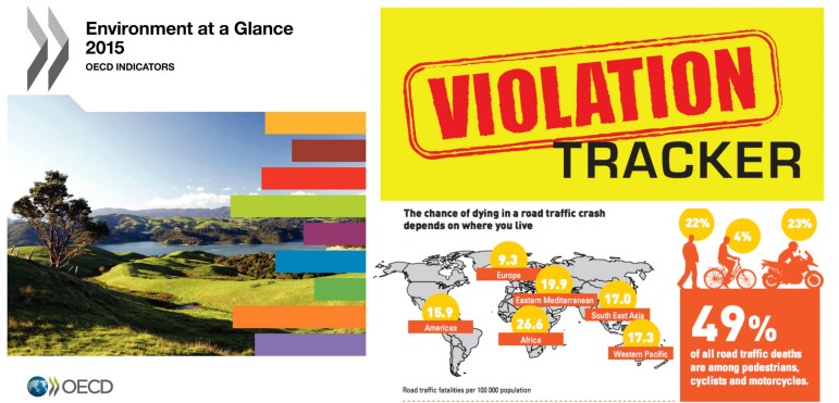
Research Desk: Violation Tracker, Road Safety, Biz Regs

Turning the Threat to a Distant Glacier into a Local Story Through Data Visualization

Making Trillions Make Sense: How Reuters Visualized the AI Economy

Summer Reading List for Data Journalists: For Those Who Believe in the Power of Storytelling with Numbers

From Data to Storytelling: Concept and Design Tips from the Financial Times’ John Burn-Murdoch

This work is licensed under a Creative Commons Attribution-NoDerivatives 4.0 International License
Republish our articles for free, online or in print, under a Creative Commons license.
Republish this article
This work is licensed under a Creative Commons Attribution-NoDerivatives 4.0 International License
Read Next
Climate Data Journalism
Turning the Threat to a Distant Glacier into a Local Story Through Data Visualization
New York Times climate and environmental graphics reporter Mira Rojanasakul discusses how her team visualized the sea level rise threat from the melting Thwaites Glacier in Antarctica.
Data Journalism
Making Trillions Make Sense: How Reuters Visualized the AI Economy
How do you make a trillion dollars feel real to someone who has never seen that much money? Vineet Khare and Mayank Bhatt faced that very challenge for their data-driven investigation into AI investment.
Data Journalism
Summer Reading List for Data Journalists: For Those Who Believe in the Power of Storytelling with Numbers
Featuring books spanning four continents, these recommended reads provide a global perspective on data journalism.
Data Journalism
From Data to Storytelling: Concept and Design Tips from the Financial Times’ John Burn-Murdoch
The chief data reporter for the Financial Times discusses how he considers the use of text, color, and annotation to aid visual storytelling through charts and graphics.