GIJN’s Data Journalism Top 10: DRC’s Election Fraud, San Francisco’s Interactive Art, Ultimate Data Viz List
What’s the global data journalism community tweeting about this week? Our NodeXL #ddj mapping from January 14 to 20 finds a @FinancialTimes exposé of possible electoral fraud in Congo, @sxywu‘s beautiful visualization of interaction between a museum and the public, and @maartenzam‘s data visualization list to end all lists.
Electoral Fraud in the DRC
The Financial Times obtained two sets of voting data from the Democratic Republic of Congo’s presidential elections last month. One was purportedly electronic tallies obtained from the electoral commission’s central database, and the other dataset was collected manually by the Catholic Church’s 40,000 observers. Both sets of data revealed Martin Fayulu as the clear winner by a huge margin compared to his contender Felix Tshisekedi, whom authorities announced as the winner.
https://twitter.com/janinegibson/status/1085143922836467713
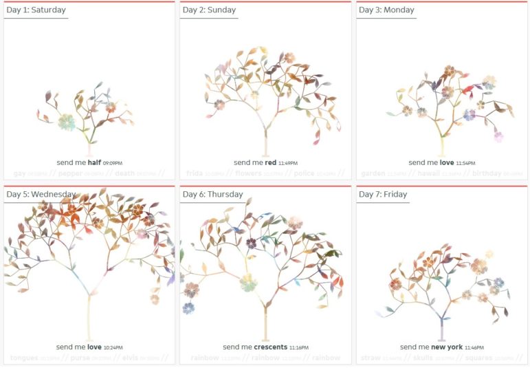
San Francisco’s MOMA: Sending Art Love
These beautiful flowering tree visualizations created by Shirley Wu in October last year depict the interaction of five people with the San Francisco Museum of Modern Art via text message over the the course of a week. The data came from the museum’s “Send Me SFMOMA” project, which invited the public to send keywords, colors or an emoji to a five digit number that triggered its API to respond with an artwork matching the message.
Mega List of Best Dataviz Lists
In keeping with his annual tradition since 2015, data journalist Maarten Lambrechts compiled a comprehensive list of 2018 lists focused on visualizations, charts, graphics, maps, satellite journalism and science photography.
Dark Ages of Data
Info technology innovator Stephen Few believes that we do not yet live in an “Information Age” but are still stuck in the “Data Age,” where we are obsessed with the production, collection, storage, dissemination and monetization of digital data. To move past this, info professionals will need to develop foundational skills to truly make sense of data. More of this in his new book “The Data Loom: Weaving Understanding by Thinking Critically and Scientifically about Data,” tentatively scheduled for release in April.
Mapping Unregistered Land
Anna Powell-Smith, chief product officer at Flourish and technology lead at whoownsengland.org, mapped 5.2 million acres of unregistered land in England and Wales (about 15 percent of all land there), using data from the Land Registry. These lands, which likely haven’t changed hands for at least 20 years, are probably owned by old families or institutions.
Tools for Sleuthing Online
Bellingcat’s free online open source investigation toolkit is a great resource for journalists. It lists many useful tools, including satellite and mapping services, verification tools for photos and videos, websites to archive web pages, and much more. GIJN liked it so much we featured it as a Document of the Day last year. Bellingcat’s researcher Aric Toler provides a few suggestions on how to use some of the tools in a tweet thread.
Data Tools
If your New Year’s resolution is to dabble more with data, Journocoders Indonesia has gathered some tools to help fulfill your goal. (Summary excerpted from Alberto Cairo’s data visualization online course.) (In Indonesian.)
Sketch Collection on a Wall
The digital communication agency Troa, based in Montpellier, France, invited customers, partners, friends and anyone who was curious, to draw sketches on their website. The creations will be gathered to form a final collective work that will be displayed on a wall in the agency’s office. (In French.)
Analyzing Children’s Books: Methodology
Last week’s Top 10 #ddj included Süddeutsche Zeitung’s data analysis of more than 50,000 children’s books, which revealed prevalent gender stereotypes. Adventures were skewed towards boys books while girls had more princesses and magic. Here, the team behind the popular piece explains its methodology. (In German.)
German Data Cleaning Tool
Also in last week’s Top 10 #ddj, we shared news that data in GENESIS Online, Germany’s Federal Statistical Office’s database, has been made available for free. Unfortunately, the data released do not comply with common standards of machine-readable datasets. Katharina Brunner built a tool to help journalists clean that data.
https://twitter.com/berndoswald/status/1086195253248438273
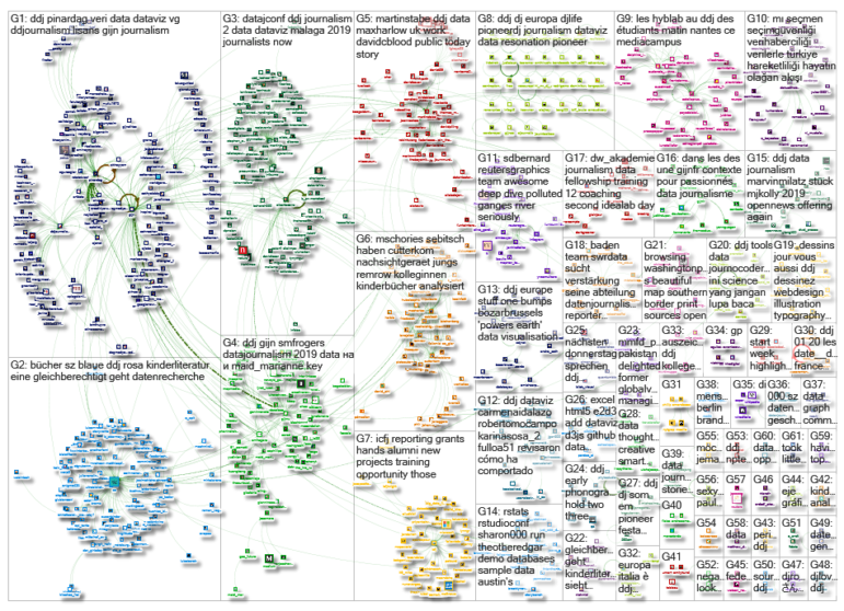
Thanks, once again, to Marc Smith of Connected Action for gathering the links and graphing them.
 Eunice Au is GIJN’s program coordinator. Previously, she was a Malaysia correspondent for Singapore’s The Straits Times, and a journalist at the New Straits Times. She has also written for The Sun, Malaysian Today and Madam Chair.
For a look at Marc Smith’s mapping on #ddj on Twitter, check out this map.

Guide to Mapping Analysis Using QGIS

Basic Data Journalism Tips for Editors

My Favorite Tools: Venezuela’s Lisseth Boon on Design and Data Visualization

Document of the Day: Visual Vocabulary

Turning the Threat to a Distant Glacier into a Local Story Through Data Visualization

Making Trillions Make Sense: How Reuters Visualized the AI Economy

Data Cleaning Tools and Techniques for Non-Coders

Summer Reading List for Data Journalists: For Those Who Believe in the Power of Storytelling with Numbers

This work is licensed under a Creative Commons Attribution-NoDerivatives 4.0 International License
Republish our articles for free, online or in print, under a Creative Commons license.
Republish this article
This work is licensed under a Creative Commons Attribution-NoDerivatives 4.0 International License
Read Next
Climate Data Journalism
Turning the Threat to a Distant Glacier into a Local Story Through Data Visualization
New York Times climate and environmental graphics reporter Mira Rojanasakul discusses how her team visualized the sea level rise threat from the melting Thwaites Glacier in Antarctica.
Data Journalism
Making Trillions Make Sense: How Reuters Visualized the AI Economy
How do you make a trillion dollars feel real to someone who has never seen that much money? Vineet Khare and Mayank Bhatt faced that very challenge for their data-driven investigation into AI investment.
Data Journalism
Data Cleaning Tools and Techniques for Non-Coders
Understanding, organizing, and validating data directly affects the accuracy of stories. New tools make cleaning accessible to journalists without coding.
Data Journalism
Summer Reading List for Data Journalists: For Those Who Believe in the Power of Storytelling with Numbers
Featuring books spanning four continents, these recommended reads provide a global perspective on data journalism.