Data Journalism
Data Journalism Top 10: How US Infection Spread, Data Hires, Identity Theft, and Lightning Strikes vs. Lottery Wins
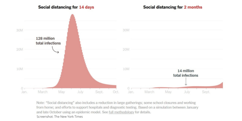
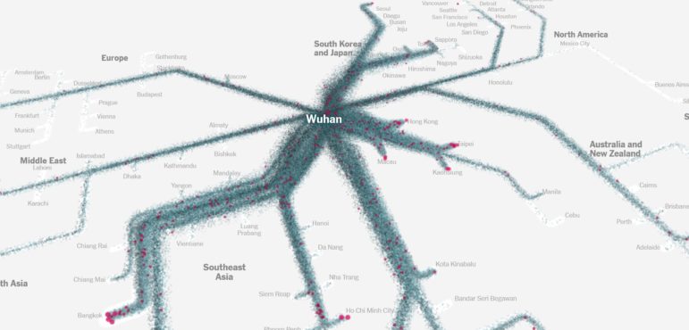
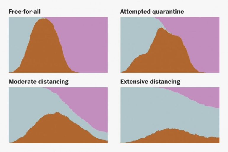
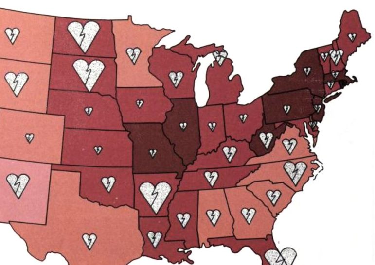
Our NodeXL #ddj mapping from June 22 to 28 finds The New York Times analyzing travel patterns and genetic data to show how the disease spread across the United States, and the impact it has had on nursing homes and elderly care facilities. The Washington Post is responding to the increasing importance of visual data communication by expanding its data and graphics team, and the Pulitzer Center is calling for data journalism story proposals.