
GIJN’s Data Journalism Top 10: Partisan School Books, Holy Walks to Nando’s, Brazil’s Bolsonaro, How to Become UK Prime Minister

Step-By-Step Guide for Journalists on the Basics of Google Sheets

Tipsheet for Using Ocean Data in Your Investigations

No Coding Required: A Step-by-Step Guide to Scraping Websites With Data Miner

GIJC23 – The Future of Data Journalism: New Analytical Tools, Data Visualization, and AI
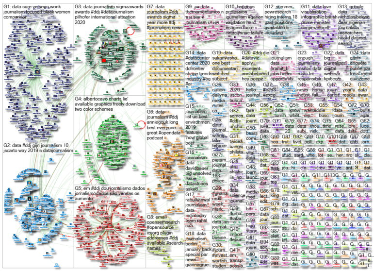
What’s the global data journalism community tweeting about this week? Our NodeXL #ddj mapping from January 6 to 12 finds the New York Times exposing partisan editing in school textbooks, a new data science platform from Turkey, Delayed Gratification’s infographic on how to become the British prime minister, Alberto Cairo making his graphics available for free, and an analysis of fact-checks of Brazilian President Jair Bolsonaro.
Politicization of School Textbooks
The New York Times analyzed some of the most popular social studies textbooks used in California and Texas. It found that the textbooks were customized for students in different states, and their contents sometimes diverge in ways that are shaded by partisan politics.
https://twitter.com/AnandWrites/status/1216357692324884480
How to Be a British Prime Minister
The United Kingdom’s electorate seems to have a type for their choice of prime minister, according to an infographic by Delayed Gratification. Want the top job in British government? The data analysis suggests that if you are a white male, English by birth, and educated in a private school, you have good odds.
Bolsonaro’s False Statements Analyzed
According to speeches checked and compiled by Aos Fatos, Brazil’s President Jair Bolsonaro made 608 false or misleading statements in his first 12 months in office, which is an average of 1.6 per day. This means that of the 1,067 phrases fact-checked in 2019, 56% contained some degree of distortion. May and June had the highest concentration of misleading statements, when topics such as the environment and weapons were highlighted in his presidential speech.
https://twitter.com/tainalon/status/1215385383942459400
How Far Is Your Bishop from Nando’s?
Writer and clergyman Fergus Butler-Gallie shared a fun graphic showing how far bishops would have to walk from their cathedrals to reach a Nando’s restaurant. Unfortunately, priests from Truro and Bath and Wells would have to walk more than five hours to reach one.
2019 Data Year in Review
Enrico Bertini and Moritz Stefaner, hosts of Data Stories podcast, released a special end-of-the-year episode for 2019 – instead of the usual one guest, it featured 13 guests who work with data or design. Each person talked about developments in data visualization around the world and the central challenges.
Free Graphics from How Charts Lie
Alberto Cairo, Knight Chair in Visual Journalism and author of “How Charts Lie,” recently made most of the graphics in his latest book available to download for free. He also made a few edits to the first print edition. Anyone who wants to receive cards containing these edits, contact Cairo here.
https://twitter.com/AlbertoCairo/status/1214909174104182784
Best of Nathan Yau’s Graphics
Statistician Nathan Yau usually looks at datasets from various angles before making one to two graphics per angle. He recapped the most popular topics/datasets and their accompanying charts published last year, including How Couples Meet and Stay Together, How Sleep Patterns Change with Age, and How Much Money People Make.
Data Science Platform
Melda.io is a web-based cloud-native data science platform, an initiative from Turkey. You can create data analysis projects with R, python, publish your work, interact, and co-create with others.
A Look at the Universal Credit System
Daily Post took an in-depth look at the people benefiting under the new Universal Credit welfare system that is replacing six “legacy” benefits in the UK. It also explores the flaws in the system, and links with homelessness and food banks.
Investigating Public Data in Brazil
Just launched in Brazil: Núcleo Jornalismo is a journalistic project that aims to be an independent vehicle that will investigate public data to bring more transparency to the government, political debate, and public policy. The initiative is supported by Volt Data Lab.
Thanks again to Marc Smith of Connected Action for gathering the links and graphing them. The Top Ten #ddj list is curated weekly.
 Eunice Au is GIJN’s program coordinator. Previously, she was a Malaysia correspondent for Singapore’s The Straits Times, and a journalist at the New Straits Times. She has also written for The Sun, Malaysian Today, and Madam Chair.
For a look at NodeXL’s mapping on #ddj and data journalism on Twitter, check out this map.
Step-By-Step Guide for Journalists on the Basics of Google Sheets
Tipsheet for Using Ocean Data in Your Investigations
No Coding Required: A Step-by-Step Guide to Scraping Websites With Data Miner
GIJC23 – The Future of Data Journalism: New Analytical Tools, Data Visualization, and AI

Turning the Threat to a Distant Glacier into a Local Story Through Data Visualization

One Name at a Time: How Die Zeit Built a Searchable Database of Nazi Party Members

Making Trillions Make Sense: How Reuters Visualized the AI Economy

How the Hindu Is Embedding AI Into Its Data Journalism

This work is licensed under a Creative Commons Attribution-NoDerivatives 4.0 International License
Republish our articles for free, online or in print, under a Creative Commons license.
Republish this article
This work is licensed under a Creative Commons Attribution-NoDerivatives 4.0 International License
Read Next
Climate Data Journalism
Turning the Threat to a Distant Glacier into a Local Story Through Data Visualization
New York Times climate and environmental graphics reporter Mira Rojanasakul discusses how her team visualized the sea level rise threat from the melting Thwaites Glacier in Antarctica.
Data Journalism
One Name at a Time: How Die Zeit Built a Searchable Database of Nazi Party Members
An online tool set up by the German newspaper Die Zeit, in cooperation with archives in Germany and in the United States, allows people to search several million Nazi Party membership cards.
Data Journalism
Making Trillions Make Sense: How Reuters Visualized the AI Economy
How do you make a trillion dollars feel real to someone who has never seen that much money? Vineet Khare and Mayank Bhatt faced that very challenge for their data-driven investigation into AI investment.
Data Journalism
How the Hindu Is Embedding AI Into Its Data Journalism
LLMs are quietly reshaping data journalism workflows at The Hindu, helping reporters process vast document sets, write scripts and build interactive tools.