GIJN’s Data Journalism Top 10: Thanksgiving Travel, Visualization Art, Bad Charts, Dataharvest
What’s the global data journalism community tweeting about this week? Our NodeXL #ddj mapping from November 18 to 24 finds Google Trends mapping the busiest places and times for Thanksgiving, Al Jazeera profiling the work of data journalist Mona Chalabi and her hand-drawn visualizations, the Tow Center for Digital Journalism examining machine learning and artificial intelligence in journalism, and the Investigative Reporting Workshop collating useful public datasets in one place.
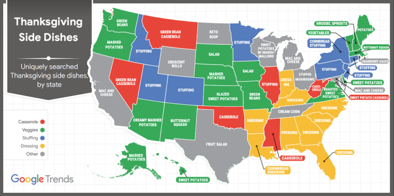
Happy (Traffic-Free) Thanksgiving
Using data from 2018, Google Trends mapped out the most popular places people like to visit during the Thanksgiving holidays and the peak crowd times so you can plan your visits at non-peak hours to reduce wait times and stress. There’s also a map of popular side dishes by state. Want to play with more datasets? Google Trends Datastore has some fun ones from most popular Halloween costumes to Star Wars characters.
https://twitter.com/LizbethDeSelm/status/1199446431477710848
Redefining Data Journalism Through Art
Using hand-drawn sketches and simple imagery, data journalist Mona Chalabi turns complex data into accessible and easily understandable illustrations. Her goal is to create visualizations that won’t alienate people or make people feel like “I’m not smart enough to understand this.” Al Jazeera profiles her work in a 25-minute video, including her preparations for an art exhibition and a data visualization workshop she teaches at London’s Design Museum.
Data, Computation, and Journalism
“Reporters depend on data, and through computation they make sense of that data. This reliance is not new,” writes Bernat Ivancsics and Mark Hansen for the Tow Center for Digital Journalism. They dive into the history of data and computation in journalism and examine the complexities of using machine learning and artificial intelligence in reporting.
Misleading Charts
In an interview with IJNet, Alberto Cairo, Knight Chair in Visual Journalism at the University of Miami, talks to Corinne Podger about how charts can be misleading based on his book “How Charts Lie.” Podger summarizes five key takeaways from the book. For more, check out Cairo’s presentation slides on the topic for the Big Things Data & AI Conference.
Public Accountability Data
Searching across siloed public datasets can be arduous and time consuming. With this in mind, the Investigative Reporting Workshop built The Accountability Project to collect and put public data in one place to ease searches by journalists and researchers. More details in the launch story from July.
https://twitter.com/aeisman/status/1161366230009294850
BBC Data Journalism Training
The BBC’s Local News Partnership (LNP) is continuing its 12-week data journalism training scheme in 2020. Journalists working for organizations that are part of the partnership can apply for secondments at BBC’s Shared Data Unit. Deadline: December 20, 2019.
Visualizations Beyond Pie Charts
At this year’s African Investigative Journalism Conference, data journalists Alastair Otter and Laura Grant shared seven ways to visualize data stories, including story examples and tools to use. (Disclaimer: Otter is GIJN’s IT coordinator.)
Public Transport Versus Cars
The expansion of public transport is often one of the most popular political demands. Addendum was curious about which districts in Austria still had potential for such expansions. From its data analysis, it found that public transport could not compete with cars in a majority of the districts. (In German.)
https://twitter.com/gerald_gartner/status/1197073195725205504
Guide: Data Journalism in Newsrooms
Sérgio Spagnuolo, publisher of Volt Data Lab, wrote a data journalism guide for newsrooms based on his experience and informal exchange of ideas with the data journalism community in Brazil. It covers preparation and capacity building, an ideal data journalism team, data sources, transparency policy, and more. (In Portuguese.)
Early Bird Tickets for Dataharvest
The 10th annual Dataharvest & European Investigative Journalism Conference will be held in Mechelen, Belgium, from May 14 to 17. Early bird tickets are available until February 15. Need to convince your editor to send you there? Try these arguments.
Thanks again to Marc Smith of Connected Action for gathering the links and graphing them. The Top Ten #ddj list is curated weekly.
 Eunice Au is GIJN’s program coordinator. Previously, she was a Malaysia correspondent for Singapore’s The Straits Times, and a journalist at the New Straits Times. She has also written for The Sun, Malaysian Today, and Madam Chair.
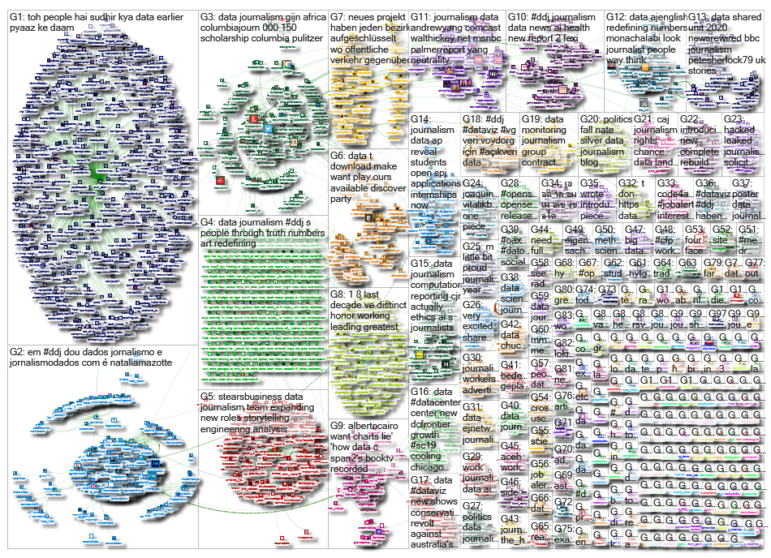
For a look at NodeXL’s mapping on #ddj and data journalism on Twitter, check out this map.

Document of the Day: Visual Vocabulary

Tipsheet on Partnering with Civil Society Organizations and Non-Governmental Organizations

AI Accountability Reporting Guide

Guide to Mapping Analysis Using QGIS
Data Journalism Top 10: Bats and the Next Pandemic, China’s Electric Battery Dominance, and Brazil’s Healthcare ‘Holes’

My Favorite Tools: Indian Journalist and Data Designer Gurman Bhatia
Why Dynamic Data Visualization Is Key to Covering Climate Change
Data Journalism Top 10: Climate Disasters, Olympic Running, Russian Healthcare, and Bulgarian Coal Plants

This work is licensed under a Creative Commons Attribution-NoDerivatives 4.0 International License
Republish our articles for free, online or in print, under a Creative Commons license.
Republish this article
This work is licensed under a Creative Commons Attribution-NoDerivatives 4.0 International License
Read Next
Data Journalism Data Journalism Top 10
Data Journalism Top 10: Bats and the Next Pandemic, China’s Electric Battery Dominance, and Brazil’s Healthcare ‘Holes’
GIJN’s weekly, curated look at the Top 10 in Data Journalism highlights bats and predicting the location of the next pandemic, China’s electric battery dominance, and mapping out Brazil’s healthcare “holes.”
Data Journalism My Favorite Tools
My Favorite Tools: Indian Journalist and Data Designer Gurman Bhatia
For GIJN’s My Favourite Tools series, we spoke with Indian journalist and information designer Gurman Bhatia. She has worked at the Hindustan Times in Delhi and been a part of the award-winning team at Reuters Graphics, where she worked on visualizations for topics as diverse as election fraud in India, use of force during protests in Hong Kong, and bushfires in Australia.
Data Journalism
Why Dynamic Data Visualization Is Key to Covering Climate Change
As calls for change grow louder in light of the latest IPCC (Intergovernmental Panel on Climate Change) report and in the run up to COP26 conference in Glasgow this November, it’s time to focus on how data visualization can help people grasp the challenges that lie ahead.
Data Journalism
Data Journalism Top 10: Climate Disasters, Olympic Running, Russian Healthcare, and Bulgarian Coal Plants
Our weekly project that maps the most popular data journalism stories on Twitter found several environmental projects this week, including a climate disaster in Germany, air pollution in South Asia, and deforestation in Brazil. We also feature more data-driven coverage of the Tokyo Olympics, an investigation into Bulgarian coal plants, and a guide to creating appealing data visualizations based on simple charts.