
GIJN’s Data Journalism Top 10 for 2019: People Are The Story, Pirates vs. Princesses, Open Source Journalism, How Charts Lie, UN Votes
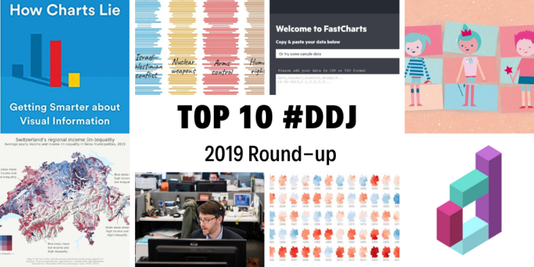
Throughout this year, we’ve brought you weekly “snapshots” of the Twitter conversation surrounding data journalism. But this week, we look at what the global data journalism community tweeted about the most during all of 2019. Below you’ll find links to stories from Brazil, Germany, Switzerland, the UK, the US, and elsewhere.
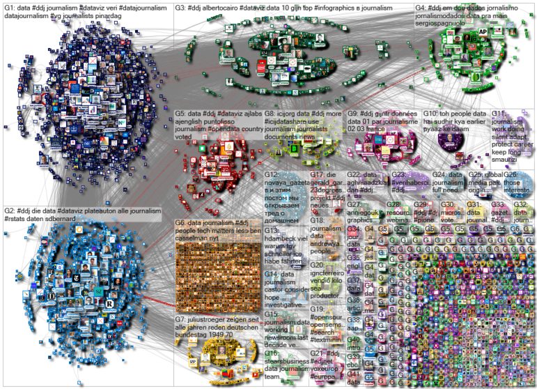
Among the highlights, our NodeXL #ddj mapping from January 1 to December 17 finds The New York Times’ Ben Casselman reminding us that despite all the advancements in data journalism, data isn’t the story — people are. We also found Al Jazeera analyzing the key issues voted on at the United Nations General Assembly over seven decades, Süddeutsche Zeitung proving with data that children’s literature is littered with gender stereotypes, and Datajournalism.com providing a steady stream of resources.
Data Isn’t the Story, People Are
Ben Casselman, an economics reporter at The New York Times, uses R programming language, works with vast data sets, makes charts, and wrangles data on spreadsheets — and yet he says the most important piece of technology on his desk is the landline telephone. This is because, he explains, “The best stories almost always emerge from talking to people, whether they are experts or just ordinary people affected by the issues we write about.”
Key Issues at the UN
Every September, leaders worldwide gather at the United Nations General Assembly to examine the biggest problems facing the planet. To understand the key issues debated and voted upon by UN members states over the decades, Al Jazeera Labs analyzed voting patterns from 1946 to 2018. Read about their process here.
Pirates for Boys, Princesses for Girls?
An amazing data analysis of children’s books by Süddeutsche Zeitung reveals that they are full of gender stereotypes. Keywords such as princess, magic, rainbow, and unicorn were typically found in books for girls while boys’ books had keywords such as treasure, captain, and adventure. More often than not, male protagonists in the books had more relation to “travel” while female protagonists were linked to “falling in love.” (In German.)
Open Source Journalism
Open source journalism might just be the best antidote to spin: The transparency of its authors showing their work during each step of the investigative process helps earn readers’ trust. The New York Times profiles Bellingcat, an investigative news site that uses open source techniques.
https://twitter.com/davidsirota/status/1201568457273286659
Data Resources
Looking to conquer your fear of math, numbers, and crunching data as well as pick up new data skills? Datajournalism.com is a regular resource of data journalism analysis, online courses, and community discussions for both aspiring and seasoned data journalists. Its editors are also finalizing the manuscript of the second Data Journalism Handbook, and they welcome feedback here on how the community has used the book thus far.
How Charts Lie
Journalists sure love freebies — like this early sneak peek in October of “How Charts Lie,” the latest book by data visualization expert Alberto Cairo. In the book’s introduction, Cairo quickly dives in to dissect how a “Citizens for Trump” graphic showing that a majority of citizens had purportedly voted for Trump is misleading. The book is now available in stores.
https://twitter.com/AlbertoCairo/status/1184059685986619392
Bivariate Map Tutorial
SRF Data’s Angelo Zehr took a hard look at wage differentials in Switzerland and created an interactive map showing the income distribution in each community. Based on this map, Timo Grossenbacher worked with Zehr to produce a tutorial on creating bivariate (with two variables) thematic maps with R.
Create Charts. Fast.
This year, The Financial Times soft-launched FastCharts, a chart-maker touted as simpler to use than Excel or Google Sheets. The idea to create this tool for the newsroom came about when the FT realized that it took too long to create one simple chart for the web and its print equivalent.
How Much Warmer Are German Cities?
Germany is getting warmer, significantly, as a result of climate change. Zeit Online created an interactive to show Germans how much the temperature in their own community has developed over the past 137 years.
Open Data in Brazil
Brasil.io obtains public data, properly structures the data, and makes it available to the public for use. Coordinated by Álvaro Justen, the platform has data on Brazil’s elections, magistrates’ salaries, federal government’s direct spending, and more.
Thanks again to Marc Smith of Connected Action for gathering the links and graphing them. The Top Ten #ddj list is curated weekly.
 Eunice Au is GIJN’s program coordinator. Previously, she was a Malaysia correspondent for Singapore’s The Straits Times, and a journalist at the New Straits Times. She has also written for The Sun, Malaysian Today, and Madam Chair.
For a look at NodeXL’s mapping on #ddj and data journalism on Twitter, check out this map.


