Data Journalism Top 10: Viral Dataviz, DIY Masks, Breaking the Wave, China and US Response to COVID
From “flattening the curve” to “social distancing,” and now “breaking the wave,” the global data journalism community is using new terminology in its attempts to explain the intricacies of COVID-19 to the masses. Our NodeXL #ddj mapping from April 6 to 12 finds Reuters Graphics explaining its “breaking the wave” chart, The Washington Post helping readers figure out the best material to make their own masks, the Financial Times comparing responses by China and the US in handling the pandemic, and the Press Gazette highlighting the huge appetite for data-driven visual journalism on COVID-19.
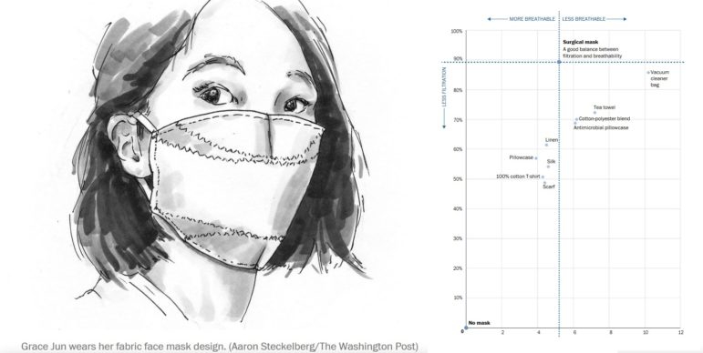
Do-It-Yourself Masks
Medical-grade masks are scarce and should be reserved for front line healthcare workers who are repeatedly exposed to huge amounts of the virus. So what can we do when some experts advise us to wear face coverings in public? The Washington Post offers a mask template and tutorial by Parsons School of Design Assistant Professor Grace Jun to guide us to make our own masks. The Post even created a chart to show what type of material you can use for your do-it-yourself mask that has a good balance between filtration and breathability.
https://twitter.com/theSysk/status/1247971802854326273
Breaking the Wave
We’ve all heard of “flattening the curve,” and now Reuters Graphics is coining the term “breaking the wave.” To get a clearer view of how far each country is from containing the disease, Reuters’ Jon McClure charts the rate at which people are dying from the disease instead of the number of confirmed cases. You can read his explanation of “breaking the wave” here, which means bringing the death rate down until the number of fatalities is no longer multiplying each week. Statistician Nathan Yau highlighted this fresh metaphor in his blog.
Tragedy of Two Failing Superpowers
Martin Wolf, chief economics commentator at the Financial Times, compared the response and performance of China and the United States in handling the COVID-19 emergency. The opinion piece is supplemented with charts showing the failure of the United States to contain the disease.
Coronavirus Visualizations Go Viral
The Press Gazette highlights the success of coronavirus-related data-driven visual journalism produced by the Financial Times, The Times, and The Washington Post. John Burn-Murdoch, Sam Joiner, and Emilio Garcia-Ruiz, from the three respective media organizations, explain the idea and process behind the record-breaking articles which resonated with readers worldwide. Bonus: John Burn-Murdoch explains the Financial Times’ trajectory tracker in this video.
Mapping Availability of Intensive Care Beds
Berliner Morgenpost is keeping track of the availability of intensive care beds across Germany. Using data reported by clinics, it is mapping which facilities are full, facing shortages, or still have spare beds.
Pandemic’s First 100 Days
The Guardian visualized the first 100 days of the novel coronavirus outbreak with a neat scrolling timeline, a rotating globe, and a case counter.
Why Not to Make a COVID-19 Dataviz
Data viz specialist Will Chase, who used to work as a research analyst for an epidemiologist, hasn’t made any charts, maps, dashboards, trackers, or models of COVID-19 so far. He explains why he hasn’t jumped on the bandwagon and urges others to abstain from analyzing or visualizing COVID-19 data.
COVID-19 Open Research Dataset
In response to the COVID-19 pandemic, the Allen Institute for AI partnered with research groups to prepare and distribute the COVID-19 Open Research Dataset (CORD-19), a free resource of over 51,000 scholarly articles — including over 40,000 with full text — about COVID-19 and the coronavirus family of viruses.
Design for Scientists, Science for Designers
Statistician Alexander Schacht interviewed data viz expert Alberto Cairo on his podcast “The Effective Statistician.” They discussed charts, the coronavirus, and the importance of design for scientists and researchers, as well as the importance of science for designers.
https://twitter.com/LaughlinPaul/status/1247821493272272897
Mapping Tools
Need to build quick and dirty maps on the fly? Or advanced ones using only a spreadsheet? Mike Reilley has compiled a long list of mapping tools to choose from.
Thanks again to Marc Smith of Connected Action for gathering the links and graphing them. The Top Ten #ddj list is curated weekly.
 Eunice Au is GIJN’s program coordinator. Previously, she was a Malaysia correspondent for Singapore’s The Straits Times, and a journalist at the New Straits Times. She has also written for The Sun, Malaysian Today, and Madam Chair.
For a look at NodeXL’s mapping on #ddj and data journalism on Twitter, check out this map.

http://nodexlgraphgallery.org/Pages/Graph.aspx?graphID=224926

Guide to Mapping Analysis Using QGIS

Basic Data Journalism Tips for Editors

My Favorite Tools: Venezuela’s Lisseth Boon on Design and Data Visualization

Document of the Day: Visual Vocabulary

Turning the Threat to a Distant Glacier into a Local Story Through Data Visualization

Making Trillions Make Sense: How Reuters Visualized the AI Economy

Summer Reading List for Data Journalists: For Those Who Believe in the Power of Storytelling with Numbers

From Data to Storytelling: Concept and Design Tips from the Financial Times’ John Burn-Murdoch

This work is licensed under a Creative Commons Attribution-NoDerivatives 4.0 International License
Republish our articles for free, online or in print, under a Creative Commons license.
Republish this article
This work is licensed under a Creative Commons Attribution-NoDerivatives 4.0 International License
Read Next
Climate Data Journalism
Turning the Threat to a Distant Glacier into a Local Story Through Data Visualization
New York Times climate and environmental graphics reporter Mira Rojanasakul discusses how her team visualized the sea level rise threat from the melting Thwaites Glacier in Antarctica.
Data Journalism
Making Trillions Make Sense: How Reuters Visualized the AI Economy
How do you make a trillion dollars feel real to someone who has never seen that much money? Vineet Khare and Mayank Bhatt faced that very challenge for their data-driven investigation into AI investment.
Data Journalism
Summer Reading List for Data Journalists: For Those Who Believe in the Power of Storytelling with Numbers
Featuring books spanning four continents, these recommended reads provide a global perspective on data journalism.
Data Journalism
From Data to Storytelling: Concept and Design Tips from the Financial Times’ John Burn-Murdoch
The chief data reporter for the Financial Times discusses how he considers the use of text, color, and annotation to aid visual storytelling through charts and graphics.