Data Journalism Top 10: COVID-19’s Spread, Death Rates, and Curve Flattening; The Shape of Dreams; Transphobia Tracking
The attention of the global data journalism community remains very much tuned in to the developing COVID-19 pandemic, which is reflected in our NodeXL #ddj mapping from March 16 to 22. The New York Times mapped the movements of millions of people to trace how the virus spread from China, The Financial Times tracked how coronavirus case trajectories compare among countries, while Robert Kosara explains the brilliance of a “Flatten the Curve” cartoon. We also found a wonderful respite from COVID-19 with data visualization designer Federica Fragapane’s project analyzing the dreams of people around the world.
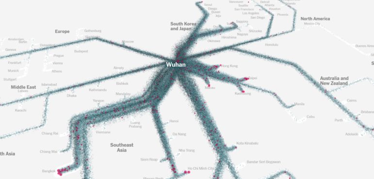
How the Virus Got Out
Even with major border lockdowns, travel restrictions, and extensive reduction of flights, the world has been unable to halt the widespread outbreak of the novel coronavirus. The New York Times explores why these restraints haven’t been enough by mapping the movements of hundreds of millions of people.
https://twitter.com/apoorva_nyc/status/1241706093627289600
Coronavirus Death and Case Tracker
The Financial Times is tracking the trajectories of coronavirus-related deaths and cases worldwide, putting them in the same chart to show how countries compare with one another. It offers a worrying look at which countries have outbreaks on the same trajectory as Italy, the hardest hit nation in Europe so far. The previously pay-walled article is now free-to-read.
Why “Flattening the Curve” Went Viral
Robert Kosara, senior research scientist at Tableau Software, breaks down why the widely-circulated “Flatten the Curve” cartoon by epidemiologist Dr. Siouxsie Wiles and illustrator Toby Morris is such a succinct piece of visual communication.
Linear or Non-linear Scales?
Do readers understand non-linear scales? And should data journalists avoid them? Alberto Cairo, Knight Chair in Visual Journalism at the University of Miami, explores this topic of using linear versus non-linear scales in his blog, and offers an example from Spain’s El País newspaper of how newsrooms can provide both views.
https://twitter.com/AlbertoCairo/status/1239912046600347648
How COVID-19 Spread Across the Globe
Der Tagesspiegel visualized how COVID-19 spread across the globe in a time-lapse graphic. It also analyzed the speed at which the virus spread, and offered a glimpse at how badly the outbreak strains the population in each country by showing the number of infected per capita in affected countries. Hendrik Lehmann, head of Der Tagesspiegel’s innovation lab, also suggests some excellent coronavirus explainers here.
Tracking COVID-19 in L.A.
The Los Angeles Times offers a comprehensive look at the coronavirus outbreak situation in Los Angeles, including the trends over time, deaths, accounting of tests, mode of transmission, and more, using plenty of charts and maps.
The Shape of Dreams
Data visualization designer Federica Fragapane created a beautiful dream explorer based on Google Trends search data. She analyzed the different types of dreams across the globe, the search frequency for their meanings, the possible connections among languages that shared the same dream subjects, as well as unique dream subjects according to language. For example, there were searches for camel dreams in Arabic and iguana dreams in Spanish. She explains the process of making this project here.
Data Science for Journalists
Jonathan Soma, who runs the Lede Program, put together a site offering practical data science concepts and tools for journalists to learn and apply to investigations. It has practical guides, real-life story examples, and reference materials.
Visualize Responsibly
At a time when the world is inundated by coronavirus news and COVID-19 charts, data visualization designer Amanda Makulec wrote a cautionary piece advising everyone to #vizresponsibly and to consider ten key points before making another chart about the pandemic.
Transphobia Tracking
Transgender rights activist Andrea James is building an interactive data visualization platform mapping people and media outlets that publish biased content about gender identity and expression. It will examine articles covering the topic in English and assign them a bias score.
Thanks again to Marc Smith of Connected Action for gathering the links and graphing them. The Top Ten #ddj list is curated weekly.
 Eunice Au is GIJN’s program coordinator. Previously, she was a Malaysia correspondent for Singapore’s The Straits Times, and a journalist at the New Straits Times. She has also written for The Sun, Malaysian Today, and Madam Chair.
For a look at NodeXL’s mapping on #ddj and data journalism on Twitter, check out this map.

Basic Data Journalism Tips for Editors

My Favorite Tools: Venezuela’s Lisseth Boon on Design and Data Visualization

Document of the Day: Visual Vocabulary

Tipsheet on Partnering with Civil Society Organizations and Non-Governmental Organizations

Turning the Threat to a Distant Glacier into a Local Story Through Data Visualization

Making Trillions Make Sense: How Reuters Visualized the AI Economy

Summer Reading List for Data Journalists: For Those Who Believe in the Power of Storytelling with Numbers

From Data to Storytelling: Concept and Design Tips from the Financial Times’ John Burn-Murdoch

This work is licensed under a Creative Commons Attribution-NoDerivatives 4.0 International License
Republish our articles for free, online or in print, under a Creative Commons license.
Republish this article
This work is licensed under a Creative Commons Attribution-NoDerivatives 4.0 International License
Read Next
Climate Data Journalism
Turning the Threat to a Distant Glacier into a Local Story Through Data Visualization
New York Times climate and environmental graphics reporter Mira Rojanasakul discusses how her team visualized the sea level rise threat from the melting Thwaites Glacier in Antarctica.
Data Journalism
Making Trillions Make Sense: How Reuters Visualized the AI Economy
How do you make a trillion dollars feel real to someone who has never seen that much money? Vineet Khare and Mayank Bhatt faced that very challenge for their data-driven investigation into AI investment.
Data Journalism
Summer Reading List for Data Journalists: For Those Who Believe in the Power of Storytelling with Numbers
Featuring books spanning four continents, these recommended reads provide a global perspective on data journalism.
Data Journalism
From Data to Storytelling: Concept and Design Tips from the Financial Times’ John Burn-Murdoch
The chief data reporter for the Financial Times discusses how he considers the use of text, color, and annotation to aid visual storytelling through charts and graphics.