Data Journalism
Data Journalism Top 10: Herd Immunity, Coronavirus in Prison, Elder Abuse, Journalism Rock Stars, Layoffs
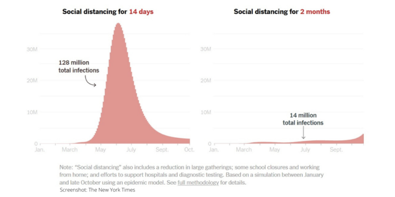
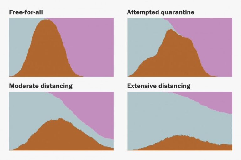
Throughout the coronavirus pandemic, we’ve seen heated debate on whether to best solve the health crisis through “herd immunity” — the indirect protection that occurs when much of a population becomes immune to infection. Our NodeXL #ddj mapping from May 11 to 17 finds FiveThirtyEight creating a simulation calculator which shows that getting to herd immunity without a vaccine isn’t quite that simple; The Marshall Project tracking COVID-19 cases and deaths in prisons across America; the BBC’s Media Show highlighting data journalists as the media’s latest rock stars; and Istories and MediaZona examining elder abuse in Russia, which experts fear may worsen during the pandemic with so many people staying home.