Data Journalism
GIJN’s Data Journalism Top 10: Giraffe Anatomy, 3D Animation, Pub Crawls, ISIS Talks, Trump Lobbyists
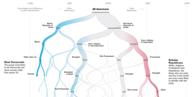
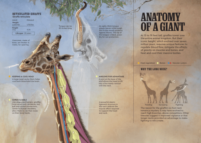
What’s the global data journalism community tweeting about this week? Our NodeXL #ddj mapping from October 14 to 20 finds National Geographic illustrating the unique anatomy of giraffes, The Washington Post explaining the process of building a 3D interactive animation on autonomous driving, The Pudding creating a fun pub crawl generator, and Robert Kosara investigating how people read pie charts.