Data Journalism
10 Visualizations About Criminal Justice
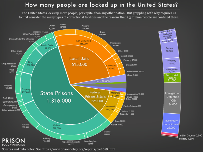
Journalists and data experts were busy last year attempting to quantify and analyze the criminal justice machine in the United States. Storybench cut through the noise and pulled out these 10 visualizations that best explain the world of criminal justice.