Accessibility Settings

color options

monochrome muted color dark

reading tools

isolation ruler

Tag

data visualization

212 posts

Data Journalism

Top 10 #ddj: The Week’s Most Popular Data Journalism Links
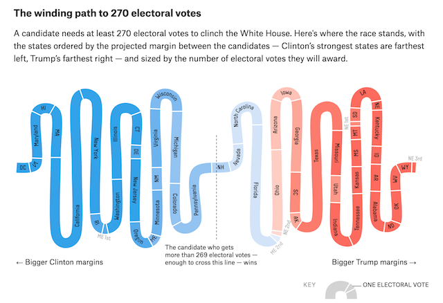
What’s the data driven journalism (#ddj) crowd tweeting about? Here are the week’s Top Data Journalism Links on Twitter (for January 23-29). If you click on an image, you’ll be redirected to GIJN’s new Pinterest board, where you can find links to the stories.

This week our links include items from the Global Editors Network, Journalism.co.uk, Askmedia.fr (and GIJN’s own data resource page in Spanish. Thanks to Marc Smith of Connected Action for gathering the links and graphing them.

News & Analysis

Why We Need To Tell Stories

So you’ve amassed terabytes of data, reams of documents and hours of expert testimony, all backing up your conclusions. What’s the best way to convince people you’re right?

Tell them a story.

Ideally, a compelling, colorful tale weaving in memorable anecdotes and striking details. Printed in a clear, legible font. Oh, and it helps – no kidding – if it rhymes.

At least according to Nobel-prizewinning economist Daniel Kahneman, author of the outstanding Thinking, Fast and Slow, who’s made a career out of understanding – experimentally – how our brains take in information and make decisions. It isn’t always pretty, but it does help explain why storytelling is a centuries-old means of passing on information.