OPEN CALL: Cyber Investigations Training Course – Digital Threats in the Age of AI
August 7, 2026 • 23:59
-
day
days
-
hour
hours
-
min
mins
-
sec
secs

Accessibility Settings

color options

monochrome muted color dark

reading tools

isolation ruler

Tag

data visualization

220 posts

Data Journalism

GIJN’s Data Journalism Top 10: Game of Thrones Deaths, Visualizing Rich Hungarians, European Parliament

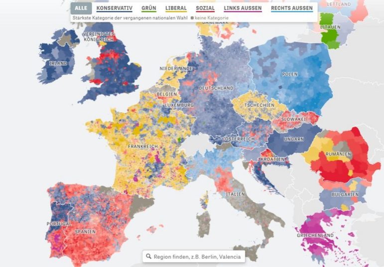
What’s the global data journalism community tweeting about this week? Our NodeXL #ddj mapping from May 20 to 26 finds @PostGraphics’ meticulous cataloguing of all on-screen deaths in Game of Thrones, @datajournalism’s tips on covering the crime beat, @DIEZEIT’s analysis of a politically diverse European parliament, and a quick beginner’s guide to learning data visualization by @AlliTorban.

Data Journalism

GIJN’s Data Journalism Top 10: Populism Popularity, DataViz Pedagogy, National vs. Local Media, German Migration

What’s the global data journalism community tweeting about this week? Our NodeXL #ddj mapping from April 29 to May 5 finds @zeitonline mapping German migration post-reunification, @FILWD pointing out the gaps in current data visualization teaching syllabi, @AlJazeera launching its data journalism introductory guide, and @WSJ highlighting the stark divide between national and local media in the United States.

Data Journalism

GIJN’s Data Journalism Top 10: History of Infographics, Colorism in Fashion, Weather Trends

What’s the global data journalism community tweeting about this week? Our NodeXL #ddj mapping from April 22 to 28 finds an interesting breakdown of colorism in fashion by @puddingviz, a series of gorgeous maps on natural disasters and extreme weather trends in the United States by @PostGraphics, a preview of a book on the history of infographics by @srendgen, and @UpshotNYT’s recap of its best articles from the past five years.

Data Journalism

GIJN’s Data Journalism Top 10: Data Feminism, Blockchain for Investigations, Train Speeds, EU DataViz Conference

What’s the global data journalism community tweeting about this week? Our NodeXL #ddj mapping from April 15 to 21 finds an informative interactive tool about the health of our generation by @srfdata, a piece by academic @wsaqaf explaining how journalism can utilize blockchain for investigations, data visualization teaching materials by @R_Graph_Gallery, and a book draft on data feminism by @kanarinka and @laurenfklein.

Data Journalism

GIJN’s Data Journalism Top 10: AI-Powered Investigations, Why Companies Donate, Data From PDFs, UK Pay Gap

What’s the global data journalism community tweeting about this week? Our NodeXL #ddj mapping from April 8 to 14 finds a zine focused on machine learning-powered investigative journalism produced by @bxrobertz, a video explainer from @FT on whether big corporations are really generous or just avoiding taxes, @knowtheory and @amandabee reviewing seven optical character recognition tools and @workbenchdata offering a tutorial on visualizing @Twitter data.

Data Journalism

GIJN’s Data Journalism Top 10: Copycat Laws, Melting Ice, Rwanda’s Genocide Trials, Data Do’s and Don’ts

What’s the global data journalism community tweeting about this week? Our NodeXL #ddj mapping from April 1 to 7 finds @JuliaAngwin sharing do’s and don’ts of data journalism projects at @journalismfest, @elconfidencial highlighting the negative effects on Spain’s economy if women stopped working for a day, @azcentral and @USATODAY revealing just how many bills in the United States are copied from model legislations, and @justiceinfonet visualizing data on trials for the Rwandan genocide.

Data Journalism

GIJN’s Data Journalism Top 10: Visualizing Air Raids, Dictator Decrees, Dataviz Crimes, Random Samples

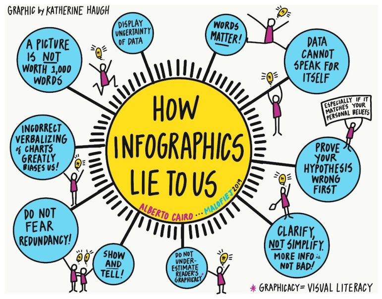
What’s the global data journalism community tweeting about this week? Our NodeXL #ddj mapping from March 25 to 31 finds @ajlabs visualizing air raids through sound, @infobae exposing secret dictatorship decrees in Argentina, @albertocairo presenting on how charts can be misleading and how to fix them, and @TheEconomist laying bare the “crimes” against data visualization they have committed.

Data Journalism

GIJN’s Data Journalism Top 10: Populism Quiz, EU Fact-Checking, Twitter Data, GitHub 101

What’s the global data journalism community tweeting about this week? Our NodeXL #ddj mapping from March 18 to 24 finds a collection of beautiful news graphics by Megan Jaegerman curated by statistician @EdwardTufte, @tagesanzeiger’s quiz testing readers’ level of populist leanings, a new collaborative fact-checking effort by the name of @FactcheckEU, and @briromer’s interesting piece on maps that break strict geography rules.

Data Journalism

GIJN’s Data Journalism Top 10: Lying Charts, Flu Tracker, Soaring Alcohol Costs, Taxing Football

What’s the global data journalism community tweeting about this week? Our NodeXL #ddj mapping from February 25 to March 3 finds a @nytimes profile of its much admired data editor @amandacox; a flu tracker by @morgenpost; and a double dose of skepticism in @amandabee’s roundup of bad data interpretations and @albertocairo’s “How Charts Lie” book.

Data Journalism

GIJN’s Data Journalism Top 10: FT’s Chart Quiz, 65 Years of Human Rights Data, Build a Brexit Voter

What’s the global data journalism community tweeting about this week? Our NodeXL #ddj mapping from February 18 to 24 finds a fun @FinancialTimes quiz that tests your ability to read charts, the creation of a @DataVizSociety to foster engagement in the data visualization community and data viz designer @fedfragapane’s analysis of Human Rights Protection data from 1950 to 2014.