Accessibility Settings

color options

monochrome muted color dark

reading tools

isolation ruler

Tag

coronavirus

88 posts
Forbidden Stories' Pegasus Project exposé

Data Journalism

Data Journalism Top 10: Pegasus, Silencing Reporters, Europe Flooding, Diversity Mapping, K-pop

Our NodeXL mapping from July 12 to 18, which tracks the most popular data journalism stories on Twitter each week, found a series of articles resulting from the collaborative project that analyzed an unprecedented leak of more than 50,000 phone numbers selected for surveillance. In this edition, we also feature an insight into Facebook’s data wars by The New York Times, an interactive piece by Al Jazeera on how the holy city of Mecca has expanded, and a colorful project by the Washington Post on the rise of K-pop.

Data Journalism

Data Journalism Top 10: Hot Dogs, Ransomware, Earth’s Hottest Places, Miami Building Collapse, Bezos Empire

High vaccination rates in some parts of the world are helping to curb the spread of COVID-19 and allowing communities to resume normal life. But vaccinations can also give a false sense of security, with new variants threatening to prolong the pandemic. Our NodeXL mapping from June 28 to July 4, found Portuguese newspaper Público creating a tool to help readers find out what activities they can do after getting the vaccine at minimal risk. In this edition, we also take a look at a piece examining forest fires in Mexico, an analysis of the worst cyberattacks by Bloomberg, and a lively data-driven essay on same-gender lyrics by The Pudding.

Data Journalism

Data Journalism Top 10: Tulsa Race Massacre, Canada’s Prison Bias, Colombia’s Police Violence, Football’s Big Money, Europe’s Lobbyists, Battling Misinformation

For inmates in Canada, risk assessments can determine which type of prison they are sent to and their chances of successfully reentering society. But an investigation by The Globe and Mail revealed that these assessments are biased against Indigenous and Black inmates. Our NodeXL #ddj mapping from May 24 to 30 also found an interactive project by The New York Times recreating the Black neighborhood in Tulsa, Oklahoma destroyed in 1921, and data-driven reporting on the influence of big money in soccer, the cost of Italy’s vaccination campaign, and police violence during the recent protests in Colombia.

News & Analysis

How Nonprofit Newsrooms Pioneered In-Depth Healthcare Coverage Before the Pandemic

When the COVID-19 pandemic took hold last year, editors scrambled to rapidly assemble teams to cover the crisis. Steps ahead were the outlets already dedicated to investigating health as a subject who knew how to source and build networks of public health and vaccine experts, and crucially, how to investigate both the science and the politics behind the pandemic response. 

Data Journalism

Data Journalism Top 10: The Rise of Big Tech, India’s Bad Vaccine Data, Why Data Journalists Need Safeguards

Four of the world’s most influential technology companies are based on the US West Coast. Amazon, Apple, Facebook, and Google have had an enormous impact on our daily lives. But how did Big Tech get so big? Our NodeXL #ddj mapping from April 19 to April 25 found a piece by The Washington Post showing how the success of these behemoths has been fueled by hundreds of acquisitions of smaller companies over the past decade. In this edition, we also feature an investigation into faulty vaccine data publicized by the Indian government, a list of the world’s top 1,000 climate scientists by Reuters, and a look at Europe’s growing rail network.

Data Journalism

Data Journalism Top 10: Ramadan Fasting, Volcanic Eruptions, Climate Change Economics, China’s Forced Labor

Driving an electric car and buying solar panels are things individuals can do to help slow climate change. But according to a new study, most people don’t realize that achieving a real impact on greenhouse emissions requires significant lifestyle sacrifices. Our NodeXL #ddj mapping from April 12 to April 18 found a story by the Financial Times showing that the best way in individual can reduce their carbon footprint is to have one less child. We also feature an explainer of Ramadan fasting by Al Jazeera, a look into China’s polysilicon factories by Bloomberg, and Chinese tycoon Jack Ma’s jet-setting ways.

Structuring visual narratives, by Gurman Bhatia

Data Journalism

Data Journalism Top 10: Women’s Careers, Vitamin D, Visual Stories, Electric Cars, Japan’s Ghost Towns

On the one-year anniversary of the COVID-19 crisis being declared a global pandemic, outlets around the world looked back on how the coronavirus has transformed our lives. Our NodeXL #ddj mapping from March 8 to 14 found a comprehensive summary of how the health crisis unfolded in the United States by The Washington Post, and a look at the COVID-19 crisis in Hungary. In this edition, we also feature The Economist’s interactive tool estimating the risk posed by COVID-19 based on a person’s health, a story about the ghost towns in Fukushima by NPR, and an analysis of the future of electric cars by The New York Times.

Data Journalism

Data Journalism Top 10: Back to School, Australian Open Underdog, Amazon Oxygen Shortage, Big Tech & Green Energy

How can we get students and teachers safely back into classrooms? For many months, this has been a key question for public authorities, school leaders, and parents around the world. This topic and others topped the data journalism stories on Twitter from February 8 to 14. Check out #ddj stories from The New York Times, NPR, the Financial Times, FiveThirtyEight, and The Pudding.

Data Journalism

Data Journalism Top 10: Polarized America, Australia’s Pandemic, Poland’s Toxic Air, the Arab Spring, Life as Lego

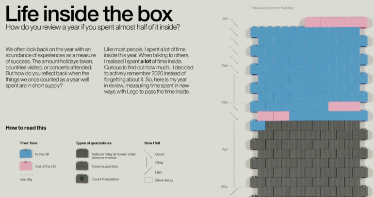
Our NodeXL #ddj mapping from January 25 to 31 found interactive projects by the Australian Broadcasting Corporation and The Guardian analyzing these events. In this edition, we also feature environmental reporting by The New York Times and The Economist, a Wall Street Journal story on the GameStop Reddit mania that shook stock markets, and a visual representation of 2020 using Lego bricks.

Data Journalism

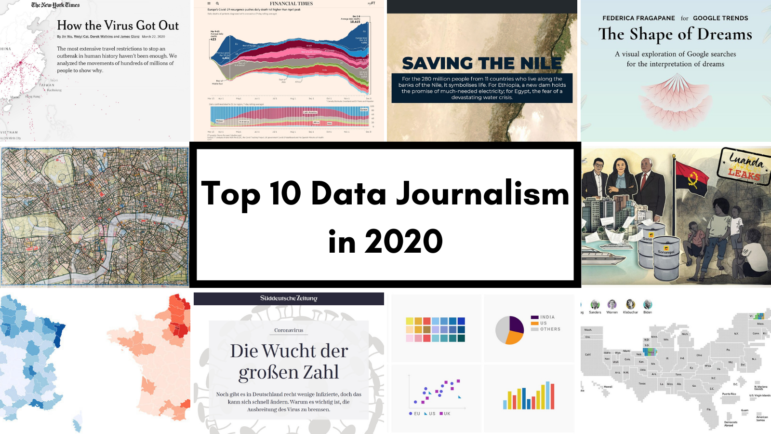
Data Journalism Top 10 for 2020: COVID-19, Saving the Nile, Shape of Dreams, Visualizations for the Colorblind

For those unfamiliar with GIJN’s Top 10 Data Journalism roundup, each week we select the most popular data journalism items on Twitter. We do this by using NodeXL to map use of the terms #ddj and data journalism, and then add a bit of old-fashioned human curation to highlight the most compelling items. At the end of the year, we survey the entire period and pick the best from hundreds of tweets. This year — the year of the pandemic — in which the coronavirus dominated public conversation and news headlines, our mapping reflects that reality.