Accessibility Settings

color options

monochrome muted color dark

reading tools

isolation ruler

Tag

climate crisis

13 posts

Data Journalism

Data Journalism Top 10: Climate Disasters, Olympic Running, Russian Healthcare, and Bulgarian Coal Plants

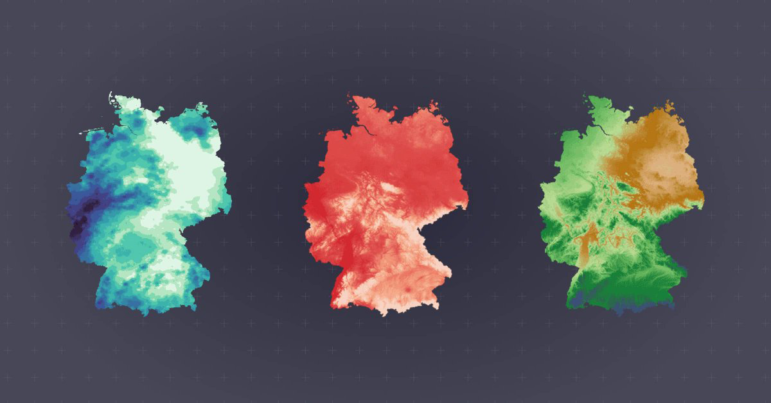
Our weekly project that maps the most popular data journalism stories on Twitter found several environmental projects this week, including a climate disaster in Germany, air pollution in South Asia, and deforestation in Brazil. We also feature more data-driven coverage of the Tokyo Olympics, an investigation into Bulgarian coal plants, and a guide to creating appealing data visualizations based on simple charts.

Data Journalism

Data Journalism Top 10: A Stunning COVID Data Blunder, Beautiful News, Arctic Fires, Eviction Abuses, Isolating Students

The advancement of technology and availability of complex data tools has been a real boon to society, but utilizing the wrong tools for the job can have dire consequences. Our NodeXL #ddj mapping from October 5 to 11 finds British media organizations the BBC and the Guardian reporting on a blunder by the English national health authority: it used the wrong Excel file format to store data, resulting in the loss of thousands of COVID-19 test data results. Meanwhile, German television news program ZDF heute highlighted how the Arctic has reached record high temperatures this year, DCist and Spotlight DC examined problems in the process of evictions, and we find Information is Beautiful offering a daily feed of uplifting news among the gloom of 2020’s news cycle.

Data Journalism

Data Journalism Top 10: Humanizing COVID Deaths, Coronavirus Searches, Climate Change Songs, Brazil’s Cursing Cabinet

The devastating consequences of the coronavirus pandemic can get lost in the mass of numbers presented. Journalists are working hard to humanize the data. Our NodeXL #ddj mapping from May 18 to 24 finds The New York Times with a moving tribute to lives lost to COVID-19; Schema Design, the Google News Initiative, and Axios visualizing coronavirus-related Google searches; and The Atlantic revealing the US CDC conflated results of two types of coronavirus tests.

Data Journalism

Data Journalism Top 10: COVID-19 Data Viz, Brazil President’s Tweets, Beach Erosion, India’s Influencers, London by Bike, Syllabi

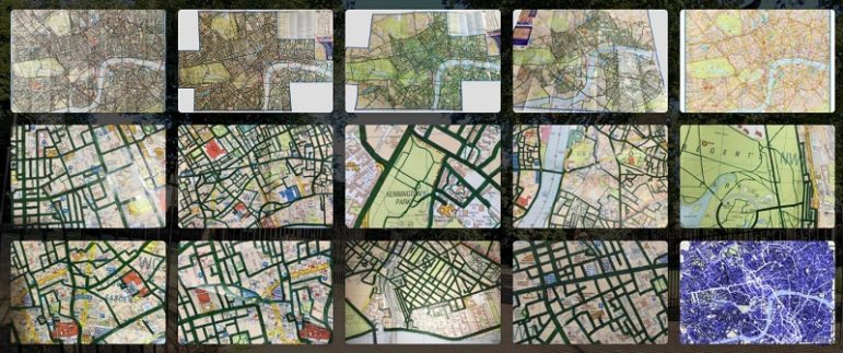
What’s the global data journalism community tweeting about this week? Our NodeXL #ddj mapping from March 2 to 8 finds a list of COVID-19 related data visualizations selected by health activist Joel Selanikio, Folha De S. Paulo analyzing Brazilian President Jair Bolsonaro’s tweets, VoxEurop highlighting the potential disappearance of the world’s beaches due to climate change, and Davis Vilums mapping every central London street over four years by cycling.

News & Analysis

What Investigative Journalism Will Look Like in 2020

GIJN asked investigative journalists around the world to look ahead at what’s in store for 2020. Here are the trends, key forces, and challenges they expect will affect investigative and data journalism in the coming year, as well as the new skills and approaches we should be thinking about.

Data Journalism

GIJN’s Data Journalism Top 10: Australia’s Deadly Wildfires, Sigma Awards, Best of Data Viz 2019

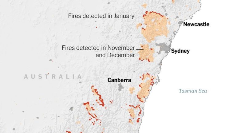
What’s the global data journalism community tweeting about this week? Our NodeXL #ddj mapping from December 30, 2019 to January 5, 2020 finds The New York Times examining Australia’s brutal fire season, the launch of The Sigma Awards to honor outstanding data journalism, Der Tagesspiegel analyzing the major changes across the globe in the past decade, and inspiring best-of data visualization lists by Nathan Yau, Pew Research Center, ZEIT ONLINE, the Los Angeles Times and the Financial Times.

Data Journalism

GIJN’s Data Journalism Top 10 for 2019: People Are The Story, Pirates vs. Princesses, Open Source Journalism, How Charts Lie, UN Votes

Throughout this year, we’ve brought you weekly “snapshots” of the Twitter conversation surrounding data journalism. But this week, we look at what the global data journalism community tweeted about the most during all of 2019. Below you’ll find links to stories from Brazil, Germany, Switzerland, the UK, the US, and elsewhere.

Data Journalism

GIJN’s Data Journalism Top 10: Trump’s Tweets, London’s Polluted Tube, Rising Seas, Data Voids

What’s the global data journalism community tweeting about this week? Our NodeXL #ddj mapping from November 4 to 11 finds The New York Times analyzing more than 11,000 of Trump’s tweets, The Financial Times measuring air quality in London’s Underground, Der Tagesspiegel creating an interactive of the Berlin Wall, and Nieman Lab discussing data voids exploited by media manipulators.

Data Journalism

GIJN’s Data Journalism Top 10: Plastic Mountains, #SharpieGate, Stopwatch Analysis, Collaborative Software

What’s the global data journalism community tweeting about this week? Our NodeXL #ddj mapping from September 9 to 15 finds ProPublica open-sourcing its collaborative reporting software; CityLab interviewing Mark Monmonier, author of “How to Lie With Maps,” on Donald Trump’s deceptive hurricane map; Al Jazeera surveying South Sudan’s citizens on displacement; and Reuters visualizing just how bad the Earth’s problem is in terms of single-use plastics.