Accessibility Settings

color options

monochrome muted color dark

reading tools

isolation ruler

Tag

charts

50 posts

Data Journalism

Data Journalism Top 10: Climate Disasters, Olympic Running, Russian Healthcare, and Bulgarian Coal Plants

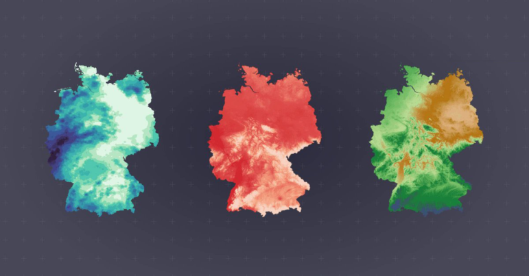
Our weekly project that maps the most popular data journalism stories on Twitter found several environmental projects this week, including a climate disaster in Germany, air pollution in South Asia, and deforestation in Brazil. We also feature more data-driven coverage of the Tokyo Olympics, an investigation into Bulgarian coal plants, and a guide to creating appealing data visualizations based on simple charts.

Data Journalism

Data Journalism Top 10: Death and Wealth, Internet Privacy Tool, COVID Under Control, Dataviz Colors

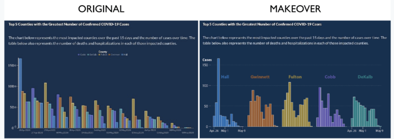
“Death is the great equalizer,” or so the saying goes. But our NodeXL #ddj mapping from September 21 to 27 finds an investigation by The Boston Globe Spotlight team that proves otherwise: race and income influences how and when people die. In this Top 10 #ddj edition, we also found The Markup launching its new privacy tool, the Financial Times examining how Finland, and the cities of Madrid and New York City handled the pandemic, as well as a great guide by Datawrapper’s Lisa Charlotte Rost to choosing better colors for your charts.

Data Journalism

10 Tips for Visualizing COVID-19 Data

In the latest webinar in the GIJN series on Investigating the Pandemic, an investigative reporter, a health data expert, and a world-renowned visualization professor shared insights on what newsrooms should consider when presenting COVID-19 information visually. An online audience of journalists from 46 countries heard that clear explanation and transparency were critical for all graphic formats.

Data Journalism

Data Journalism Top 10: Black Lives Matter Protests, Police Shootings, Questions on COVID-19 Research Site, Russian Orphans

The death of African American George Floyd in police custody has resulted in a major uproar against structural racism in the United States. Our NodeXL #ddj mapping from June 1 to 7 finds The New York Times examining police use of force in Minneapolis, the city in which Floyd died after being pinned down by a police officer. The Washington Post also dug into data of every fatal shooting in the US by police officers since 2015.

Data Journalism

Data Journalism Top 10: Coronavirus Super-spreaders, Massive Unemployment, COVID-19 Life Expectancy, Violent Cops

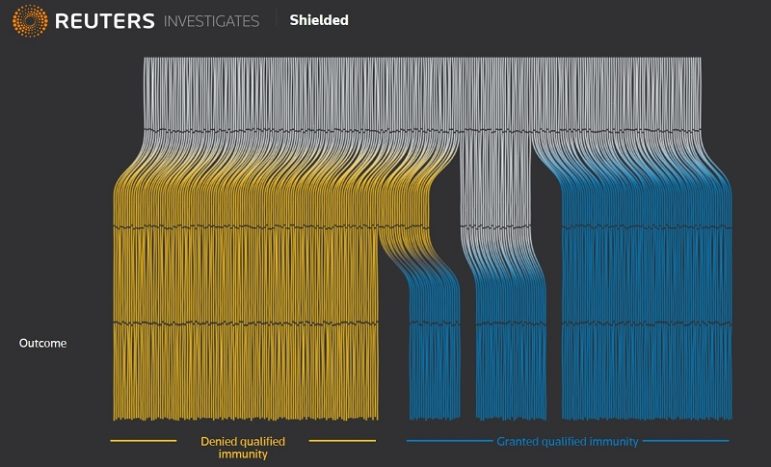
Economies around the world have taken a big hit as countries implement lockdown measures to curb the spread of the coronavirus. Our NodeXL #ddj mapping from May 4 to 10 finds The New York Times looking into businesses that could be potential infection super-spreaders, and the alarmingly high unemployment rate, while German news media NDR and ZDF heute have examined lost life expectancy due to COVID-19 and the importance of intensive care beds. While Reuters published an important analysis into the use of little-known law that is increasingly being used to grant immunity to police who have used excessive force.

Data Journalism

Data Journalism Top 10: Viral Dataviz, DIY Masks, Breaking the Wave, China and US Response to COVID

From “flattening the curve” to “social distancing,” and now “breaking the wave,” the global data journalism community is using new terminology in its attempts to explain the intricacies of COVID-19 to the masses. Our NodeXL #ddj mapping from April 6 to 12 finds Reuters Graphics explaining their “breaking the wave” chart, The Washington Post helping readers figure out the best material to use to make their own masks, the Financial Times comparing the response of China and the United States in handling the pandemic, and Press Gazette highlighting the huge appetite for data-driven visual journalism about COVID-19.

Data Journalism

Data Journalism Top 10: Social Distancing, Coronavirus Clusters, Flattening the Curve, Trump Cherry-Picks Data

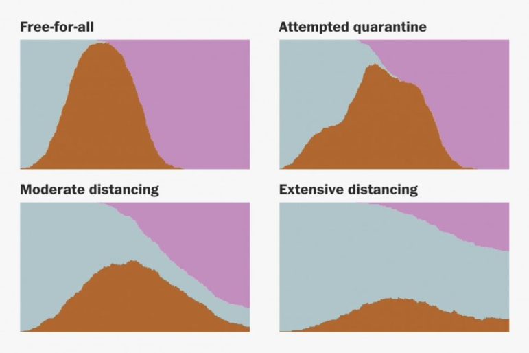
The novel coronavirus is very much dominating the Twitter chatter among the global data journalism community this week. Our NodeXL #ddj mapping from March 9 to 15 finds The Washington Post simulating different social distancing scenarios and their effects on slowing the spread of COVID-19, South China Morning Post highlighting research into a cluster case, Süddeutsche Zeitung charting the exponential growth in countries with high infection rates, and The New York Times spotlighting the jobs which put workers at the greatest risk of contracting the virus.

Data Journalism

GIJN’s Data Journalism Top 10: Partisan School Books, Holy Walks to Nando’s, Brazil’s Bolsonaro, How to Become UK Prime Minister

What’s the global data journalism community tweeting about this week? Our NodeXL #ddj mapping from January 6 to 12 finds the New York Times exposing partisan editing in school textbooks, a new data science platform from Turkey, Delayed Gratification’s infographic on how to become the British prime minister, Alberto Cairo making his graphics available for free, and an analysis of fact-checks of Brazilian President Jair Bolsonaro.

Data Journalism

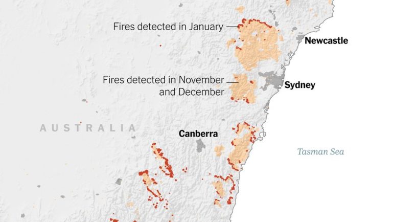
GIJN’s Data Journalism Top 10: Australia’s Deadly Wildfires, Sigma Awards, Best of Data Viz 2019

What’s the global data journalism community tweeting about this week? Our NodeXL #ddj mapping from December 30, 2019 to January 5, 2020 finds The New York Times examining Australia’s brutal fire season, the launch of The Sigma Awards to honor outstanding data journalism, Der Tagesspiegel analyzing the major changes across the globe in the past decade, and inspiring best-of data visualization lists by Nathan Yau, Pew Research Center, ZEIT ONLINE, the Los Angeles Times and the Financial Times.