Data Journalism
Data Journalism Top 10: Simple Google Searches, COVID Contracts, Mining Indigenous Land, Nashville Hot Spots, Blackstone in Berlin
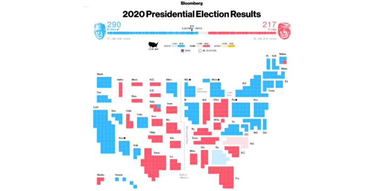
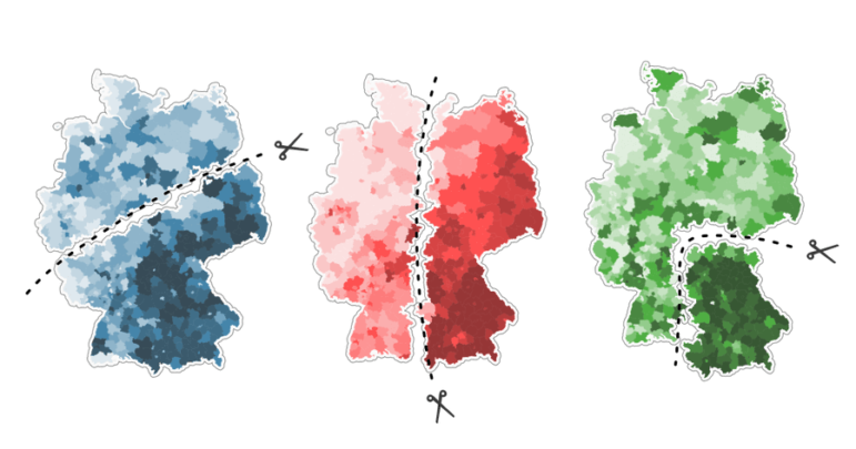
Have you ever noticed how your Google search results now appear with boxes of information extracted from the websites by the search engine? Our NodeXL #ddj mapping from November 9 to 15 found The Markup’s new “Simple Search” browser extension, which allows you to view the best results in the “traditional” Google search format. We also discovered a visualization of the connection between members of the ruling British Conservative Party and COVID-19 contracts, InfoAmazonia’s investigation into mining requests in protected Indigenous land in the Amazon, and German daily Der Tagesspiegel showing that the American private equity group Blackstone is a major private property owner in the German capital, Berlin.