Data Journalism
Data Journalism Top 10: Russia’s Achilles’ Heel, Baby Names, Bike Shortage, Dataviz Color Guide
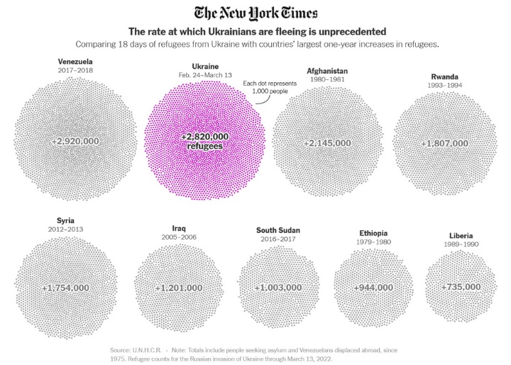
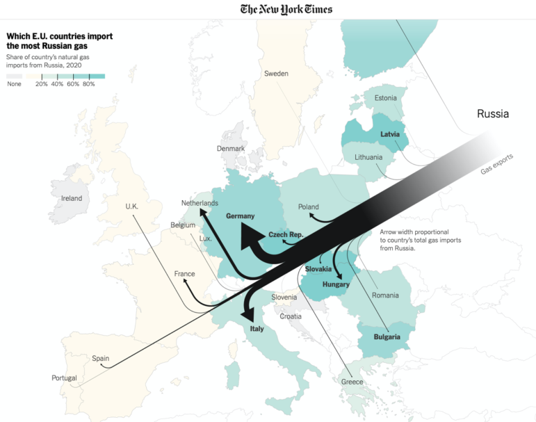
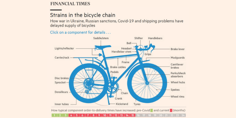
Our weekly look at some of the most popular data journalism stories on Twitter examines the logistical Achilles’ heel of the Russian invasion, ongoing gaps in the sanctions of Russian oligarchs, Europe’s selective support for refugees, a historical analysis of Scottish baby names, and a deep dive into how organizations should choose their data visualization color palettes.