Accessibility Settings

color options

monochrome muted color dark

reading tools

isolation ruler

Tag

coronavirus

88 posts

Data Journalism

Data Journalism Top 10: Tracking Police Accountability; Racism and Housing; China’s Hidden Prison Camps

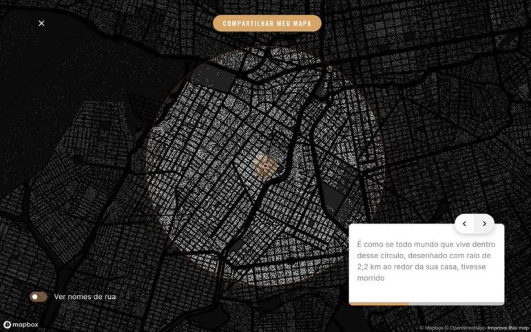
The police shooting of Jacob Blake, a 29-year-old African American man, in the United States has reignited national unrest just months after the death of George Floyd. Our NodeXL #ddj mapping from August 24 to 30 finds ProPublica documenting police violence against Black Lives Matter protesters and tracking police accountability. The New York Times shows how the process of redlining, or denying mortgage finance to predominantly Black neighborhoods from the 1930s onwards, has resulted in heat disparities among cities, and BuzzFeed News uncovers scores of new internment camps in Xinjiang, China, by analyzing satellite data.

Data Journalism

Data Journalism Top 10: North Korea Ghost Ships, Trolls Attack WHO, Al Pacino’s Wardrobe, COVID Air Travel

Satellite imagery has become increasingly useful in establishing evidence of human rights abuses and in shining a light on dubious activities being conducted in secretive parts of the world. Our NodeXL #ddj mapping from August 17 to 23 finds NBC News utilizing satellite data to solve a long-standing mystery about North Korean “ghost boats” washing up on Japanese shores, The New York Times analyzing footfall data to determine how the coronavirus pandemic has influenced consumer spending, and Bellingcat revealing a coordinated network of attacks on Twitter against the director general of the World Health Organization (WHO).

Data Journalism

Data Journalism Top 10: Herd Immunity Calculator, Post-COVID Offices, Back-to-School Jitters

How many people need to get infected or die of the coronavirus before we reach a herd immunity threshold? Our NodeXL #ddj mapping from August 3 to 9 finds that The Washington Post created a herd immunity calculator to estimate this. Also in the Data Journalism Top 10 this week: BBC’s Visual and Data Journalism team illustrates the future of work environments post-COVID-19, The New York Times shares projections of the potential number of children who may carry the virus back to school in the fall according to county, and Oregon Public Broadcasting discovers a surprising reason for the low incidence of coronavirus transmission in bars and restaurants in the US state of Oregon. 

Data Journalism

Data Journalism Top 10: Climate Migrants, COVID Testing Disparities, Outbreak Epicenters, Brazil’s Military

In the midst of the pandemic, some newsrooms haven’t forgotten about the issue of climate change. Our NodeXL #ddj mapping from July 20 to 26 found ProPublica partnering with The New York Times Magazine to examine climate migration and where climate refugees are moving to. On the COVID-19 front, FiveThirtyEight revealed the disparities in the availability of testing sites between Black and Hispanic neighborhoods and white areas, broadcaster RBB highlighted that the risk of coronavirus was more keenly felt by low-income earners, and the Google News Initiative and Agência Lupa communicated the impact of the coronavirus by visually putting readers at the epicenter of an outbreak.

News & Analysis

What We’re Reading: Pakistani and Zimbabwean Journalists Detained, Race and the Newsroom, and Tips for Interviewing

In this week’s Friday 5, where we round up key reads from around the world in English, one journalist from Zimbabwe and another from Pakistan were abducted and detained, the Reuters Institute report on Race and Leadership in the News Media was released, and NPR’s Terry Gross and The New York Times’ Michael Barbaro offered up some tips on interviewing.

Data Journalism

Data Journalism Top 10: Measuring Mask Use, Parental Interruptions, Childbirth Woes, India’s Low Death Rate

How widespread is mask use in your country? Our NodeXL #ddj mapping from July 13 to 19 finds The New York Times mapping the odds of people encountering other mask wearers in the United States, two university professors quantifying the number of interruptions a parent suffers on average every hour while working from home, the Committee to Protect Journalists talking to data journalists about the struggles of reporting on COVID-19, and openDemocracy documenting cases of mistreatment of women in labor around the world since the pandemic started.

Data Journalism

Data Journalism Top 10: COVID-19 Racial Inequity, Cash for the Connected, Africa’s Silent Epidemic, Amazon Safety

The coronavirus pandemic has upended the lives of people around the world, but some communities are especially hard hit. Our NodeXL #ddj mapping from July 6 to 12 finds The New York Times analyzing data that reveals Black and Latino people have been disproportionately affected by COVID-19, The Washington Post highlighting that business relief funds for the pandemic have gone to the rich and well-connected, and Bloomberg looking at more than 120 US businesses that say the coronavirus helped force them into bankruptcy.

Data Journalism

Data Journalism Top 10: Pace of Global COVID-19 Deaths, Who Can Work from Home, Visualizations for the Colorblind, Skin Tone and Sports

It is hard to comprehend the true impact of COVID-19 around the world. Our NodeXL #ddj mapping from June 29 to July 5 finds Reuters trying to visualize the alarming rate of deaths related to the coronavirus pandemic, Datawrapper examining which employees can actually afford to work from home, and data journalist Carmen Aguilar García writing about using R programming language and automating repetitive data processes in order to keep up with the demand for pandemic news.

Data Journalism

Data Journalism Top 10: How US Infection Spread, Data Hires, Identity Theft, and Lightning Strikes vs. Lottery Wins

Our NodeXL #ddj mapping from June 22 to 28 finds The New York Times analyzing travel patterns and genetic data to show how the disease spread across the United States, and the impact it has had on nursing homes and elderly care facilities. The Washington Post is responding to the increasing importance of visual data communication by expanding its data and graphics team, and the Pulitzer Center is calling for data journalism story proposals.