
Data Journalism Top 10: Herd Immunity Calculator, Post-COVID Offices, Back-to-School Jitters
How many people need to get infected or die of the coronavirus before we reach a herd immunity threshold? Our NodeXL #ddj mapping from August 3 to 9 finds that The Washington Post creating a herd immunity calculator to estimate this. Also in this week’s Data Journalism Top 10: the BBC’s Visual and Data Journalism team illustrates the future of work environments post-COVID-19, The New York Times shares projections of the potential number of children who may carry the virus back to school in the fall, and Oregon Public Broadcasting discovers a surprising reason for the low incidence of coronavirus transmission in bars and restaurants in the US state of Oregon.
Herd Immunity Calculator
Washington Post graphics reporter Harry Stevens explains the essence of what disease experts call “herd immunity,” in which a spreading disease will slow and eventually stop once a certain share of the population becomes immune. He created a simulator to show how herd immunity works in a community and a calculator to estimate the herd immunity threshold — roughly how many people would need to die for the population to develop herd immunity. Stevens earlier produced a popular disease simulator showing how COVID-19 spreads in different social distancing scenarios.
COVID-19 & Future Work Environments
The coronavirus will one day subside, or even be eradicated if or when a vaccine is developed. But life may not return to exactly what it was prior to COVID-19. The BBC Visual and Data Journalism team created a beautifully illustrated piece to show the possible future of home and workplace environments.
Does Germany’s COVID-19 Warning App Work?
The German government expected a lot from its Corona-Warn-App, a coronavirus app for tracking infections, but nobody really knows how many infections the program prevented, or whether it is even reaching the right people. German newspaper Frankfurter Allgemeine measured the app usage in Frankfurt and found flaws in the system.
Coronavirus in Schools
Millions of US parents face a tough decision this fall: whether to allow their children to attend classes in person if schools reopen. Researchers at the University of Texas made projections of the potential number of children who may carry the virus back to school, depending on the area and size of the school. Readers can find the estimated risk for their county using The New York Times’ interactive chart.
Lockdown Effective for Rich
We’ve seen stories by The New York Times and Reuters that highlight how being able to stay home and work during a lockdown is a luxury for higher income earners, or how the coronavirus disproportionately affects ethnic minorities. By analyzing an important dataset released by Toronto Public Health — a catalog of about 15,300 coronavirus cases reported in Toronto since late January — The Toronto Star showed how these patterns also hold true for the Canadian city. Richer, whiter neighborhoods are able to weather the pandemic better compared to those with lower socioeconomic status.
Is Indoor Dining Safe in Oregon?
When a state epidemiologist in Oregon, United States, said in July that there was no clear evidence of significant coronavirus transmission in bars or restaurants, science journalist Erin Ross did not take that statement at face value. She dug deeper and found out that there’s a simple reason Oregon has little data on restaurant transmission: It isn’t really being collected or quantified due to overtaxed contact tracers and case investigators. Ross elaborates on her story in a Twitter thread, here.
State of Coronavirus in UK
Are the number of COVID-19 cases in the United Kingdom rising? Or is the increase in case numbers a result of more testing? BBC health correspondent Nick Triggle writes a brief overview on the state of coronavirus in the country.
Telegram’s Infodemic
Where do Germans who don’t trust either journalists or their government get information about the coronavirus? It turns out that many of these people congregate in Telegram chat groups. Süddeutsche Zeitung looked at some of these chat groups, and found how constant skepticism, fear, and frustration can shape people’s perceptions.
Doing the Numbers with Trump
Many people have been tweeting about US President Donald Trump’s bewildering interview on Axios. There were many strange moments, but the clip below highlights Trump’s failure to coherently explain several charts on America’s coronavirus situation that he brought along to the interview. Read more about the infamous interview here, which some have compared to Veep, an American political satire comedy television series.
Dataharvest/EIJC Grants
There are 200 grants available for journalists from Central, Eastern, or Southeastern Europe to participant in the online Dataharvest/European Investigative Journalism Conference this year. Apply here by August 28. Here is what to expect from the program.
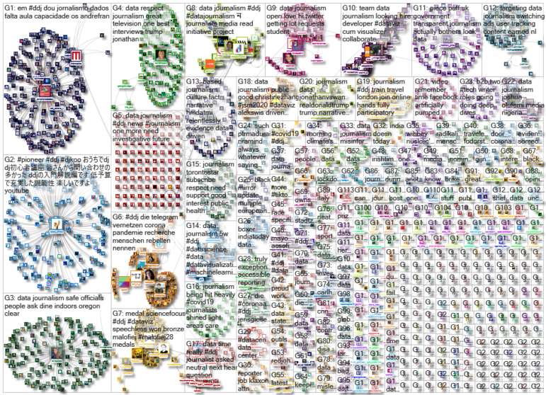
Thanks again to Marc Smith of Connected Action for gathering the links and graphing them. The Top Ten #ddj list is curated weekly.
 Eunice Au is GIJN’s program coordinator. Previously, she was a Malaysia correspondent for Singapore’s The Straits Times, and a journalist at the New Straits Times. She has also written for The Sun, Malaysian Today, and Madam Chair.


