This Week’s Top Ten in Data Journalism
What’s the global data journalism community tweeting about this week? Our NodeXL #ddj mapping from September 25 to October 1 has @FT mapping the route in a day of a London Uber driver, #NICAR18 registration opening up, @Lattif charting Africa’s internet shutdowns using @atlascharts and loads of German election data visualizations by @tagesspiegel, @SPIEGELONLINE, @NZZ, @morgenpost, @zeitonline and more.
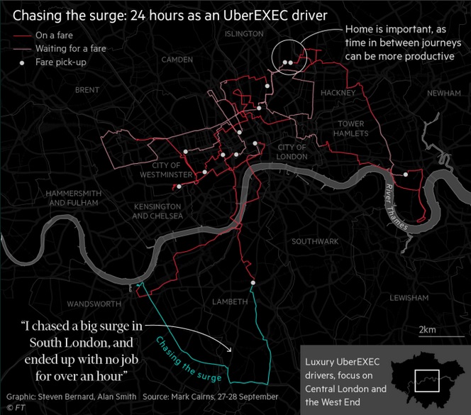
Mapping Uber London
Financial Times mapped an Uber driver’s day on the road in London. Driver Mark Cairns shared data on his shifts since the ride sharing company was threatened with a ban in the UK capital.
A day in the life of an UberEXEC driver, mapped with exclusive data. @FT https://t.co/SFToZbCjcJ #ddj #dataviz #uberlondon pic.twitter.com/aTgSjV6BHO
— Steven Bernard (@sdbernard) September 29, 2017
2018 NICAR Conference
#NICAR18 registration is now open! Register for this hands-on data journalism training in Chicago from March 8 to 11, 2018.
Registration for @IRE_NICAR 2018 is open! https://t.co/zHbUBHZmwf Best #ddj conference. And we’ll have a @SND-sponsored design track again! pic.twitter.com/yVVDhJ3UMW
— Alberto Cairo (@albertocairo) September 25, 2017
RAWGraphs Tutorial & More
Data visualization expert Alberto Cairo updated the tutorials and resources section on his blog with a RAWGraphs tutorial. Check out the rest of the tutorials on data cleaning, wrangling data, styling charts and more.
Updated Tutorials & Resources section: https://t.co/fyodgKI9t9 #dataviz #BigData #DataScience #MachineLearning pic.twitter.com/Plyvt61VWq
— JL Micó (@jlmico) September 30, 2017
Africa’s Internet Shutdowns
Quartz reporter Abdi Latif Dahir created this graphic, using data from The Collaboration on International ICT Policy for East and Southern Africa to show the extent of the problem of internet shutdowns in Africa.
Get the #data: Internet shutdowns are becoming a mainstay in #Africa https://t.co/42D9iFTrJX #ddj pic.twitter.com/Q84S5HFNGU
— GIJN Africa (@gijnAfrica) October 1, 2017
StoryLab Academy Opportunities
Sign up here to receive alerts about the next StoryLab Academy webinars, newsroom-based workshops and meetups in partnership with local Hacks/Hackers chapters.
Don’t be left behind. Update your digital journalism skills with free courses. Apply here: https://t.co/NdY6UQU7lx #StoryLabAcademy #ddj pic.twitter.com/uvSUS6AeIh
— Code For Africa (@Code4Africa) September 29, 2017
Sparkline Font Tutorial
After the Flood’s AtF Spark font which turns numbers into sparklines has created a buzz among the #ddj community. Paul Bradshaw wrote this tutorial on how to use the font if you’re not already familiar with web fonts and other technicalities of web design.
How to: use the AtF Spark font to create charts with just text https://t.co/Ltpvkx8chK via @wordpressdotcom
— Andrew Matranga ? (@andrewmatranga) September 30, 2017
German Election Dataviz Recap
This post lists the colourful scope of projects Moritz Klack and Christopher Möller did in collaboration with the interactive team of the Berliner Morgenpost, as well as stories from other newsrooms that visualize the election results.
From last week: Collection of #BTW17 #dataviz – great insights into results, changes and voter choices via @webk1d https://t.co/8TxGDzWcjb pic.twitter.com/wmJSozDtKn
— DW Innovation (@dw_innovation) October 2, 2017
German Election Deciders
Where was the government most unpopular? Which constituencies have made the AfD and FDP parties so strong? These maps, built by Spiegel Online with MapboxGL, show which regions where the election was decided.
Where the election was decided. Map based #storytelling by @PatrickStotz and @chrTitz #BTW17 https://t.co/HAkMNqsqQr pic.twitter.com/dEhtwTCF21
— Christina Elmer (@ChElm) September 25, 2017
Correlations of German Election
This year’s German election has brought about many surprising results, which sparked a discussion on Twitter as to whether election results can be explained by sociodemographic factors. Here are the 50 strongest correlations of election results and structural features in Germany’s 299 constituencies.
?https://t.co/OJqdS9woOg ranks Twitter’s most shared #dataviz content. Great stuff like this: https://t.co/3q8Oa1URzu
— Andres Varela ? (@andresvarela) October 2, 2017
German Coalition Scenarios
Spiegel Online evaluates the possibility of coalitions forming in different regions of Germany across 299 constituencies and displays it in six maps.
This is pretty good: re-drawing maps of Germany where a coalition has majority. #Jamaica is basically West Germany. https://t.co/KDMOAs0E9S pic.twitter.com/74RPxDeC3F
— Christian Odendahl (@COdendahl) September 25, 2017
Thanks, once again, to Marc Smith of Connected Action for gathering the links and graphing them.
For a look at Marc Smith’s mapping on #ddj on Twitter, check out this map.

Guide to Mapping Analysis Using QGIS

Free, Game-Changing Data Extraction Tools that Require No Coding Skills

Basic Data Journalism Tips for Editors

My Favorite Tools: Venezuela’s Lisseth Boon on Design and Data Visualization

Mexico Scrapped Its Transparency Agency — Journalists Are Still Investigating Corruption

Data Cleaning Tools and Techniques for Non-Coders

From NICAR25, Four Free Cutting Edge and Time-Saving Investigative Data Tools

Investigating India: How Smaller, Independent News Outlets Are Digging into Politics in a Key Election Year

This work is licensed under a Creative Commons Attribution-NoDerivatives 4.0 International License
Republish our articles for free, online or in print, under a Creative Commons license.
Republish this article
This work is licensed under a Creative Commons Attribution-NoDerivatives 4.0 International License
Read Next
Data Journalism
Mexico Scrapped Its Transparency Agency — Journalists Are Still Investigating Corruption
A year after Mexico dissolved the autonomous body that oversaw government transparency, journalists are still finding ways to access public documents and conduct data-based investigations.
Data Journalism
Data Cleaning Tools and Techniques for Non-Coders
Understanding, organizing, and validating data directly affects the accuracy of stories. New tools make cleaning accessible to journalists without coding.
Data Journalism Reporting Tools & Tips
From NICAR25, Four Free Cutting Edge and Time-Saving Investigative Data Tools
GIJN shares some of the no-cost, easy-to-use data tools that NICAR25 conference panelists described as surprisingly useful but unknown by investigative reporters.
Data Journalism Investigating Institutions News & Analysis
Investigating India: How Smaller, Independent News Outlets Are Digging into Politics in a Key Election Year
Smaller investigative news outlets have been behind challenging and impactful accountability reporting leading up to the country’s elections.