Accessibility Settings

color options

monochrome muted color dark

reading tools

isolation ruler

Tag

Alberto Cairo

12 posts

Data Journalism

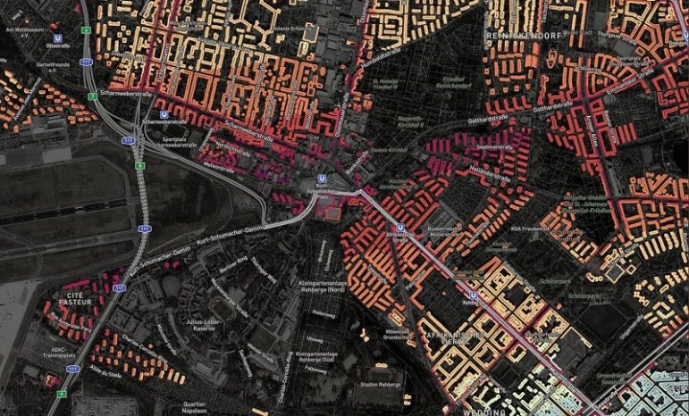
How We Built the Data Visualization That Brought Brazil’s COVID Deaths Close to Home

When the COVID-19 pandemic first hit Brazil, a team of data journalists set out to illustrate what the death toll looked like by creating a data visualization that presented something beyond the numbers. The team considered various ways of displaying the story. Here’s a behind-the-scenes look at how they created At the Epicenter.

Data Journalism

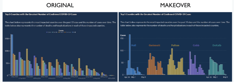
10 Tips for Visualizing COVID-19 Data

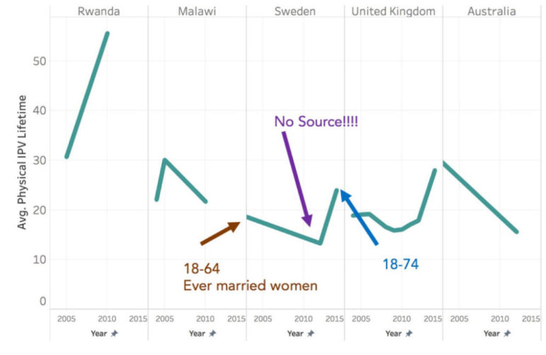
In the latest webinar in the GIJN series on Investigating the Pandemic, an investigative reporter, a health data expert, and a world-renowned visualization professor shared insights on what newsrooms should consider when presenting COVID-19 information visually. An online audience of journalists from 46 countries heard that clear explanation and transparency were critical for all graphic formats.

Data Journalism

GIJN’s Data Journalism Top 10 in 2018: Visual Vocabulary, Eclectic Visualization, Google Dataset Search, Laughing in Parliament

It’s been a great year for data journalism and visualizations. GIJN’s Top 10 #ddj series captured snapshots of what’s popular on Twitter among the global data journalism community for 46 weeks in 2018. For this edition, we asked NodeXL to map 2018’s most popular #ddj tweets from January 1 to December 11 and the results are in. This year’s most popular tweets include @FinancialTimes’ ever-popular Visual Vocabulary chart, @Google’s Dataset Search, @hnrklndbrg’s eclectic visualizations, and @SZ’s analysis of Germany’s parliamentarians using laughter as a debate weapon.

Data Journalism

This Week’s Top Ten in Data Journalism

What’s the global data journalism community tweeting about this week? Our NodeXL #ddj mapping from September 25 to October 1 has @FT mapping the route in a day of a London Uber driver, #NICAR18 registration opening up, @Lattif charting Africa’s internet shutdowns using @atlascharts and loads of German election data visualizations.

Data Journalism

Top Ten #ddj: The Week’s Most Popular Data Journalism Links

Here are top data journalism tweets for May 8-14, per our NodeXL mapping: race against fastest marathoner (@alastairotter); mapping the ransomware attacks (@nytimes); French election data dive (@DataspotTLG and @ftdata); Alberto Cairo interview (@chytomo); and more.

Data Journalism

Top Ten #ddj: The Week’s Most Popular Data Journalism Links

Here are top data journalism tweets for May 1-7, per our NodeXL mapping: delayed cherry blossoms (@TheEconomist); dataviz how-to (@albertocairo); 20 million starving (@washingtonpost); Munich route planner code (@Munichrocker); FB German filter bubble (@SZ); Open Data Index (@pinardag); and more.

Data Journalism

Data Biographies: Getting to Know Your Data

Too often, inexperienced data users accept the data they receive at face value. Data scientist Heather Krause cautions that data should be treated similar to a human source. Just as you’d do a background check on a human source before publishing what they told you, you need to understand your data.

Data Journalism

Top Ten #ddj: The Week’s Most Popular Data Journalism Links

Here are the top data journalism tweets for Feb 27-Mar 5, per our NodeXL mapping: #NICAR17 readings (@albertocairo); fake news guide collaboration (@jwyg); US visa restrictions (@ddjournalism); statistics’ interactive viz (@BrownUniversity); Guardian’s 10-point guide to ddj (@smfrogers); & more.

Data Journalism

Top Ten #ddj: The Week’s Most Popular Data Journalism Links

Here are the hottest data journalism tweets for Feb 6-12, per our NodeXL mapping: data tips (@pilhofer); Trump tweets (@DataRemixed); 165 years of Swiss Immigration (@duc_qn); Lisa Charlotte Rost’s data blog (@lisacrost); open corporate data (@ddjournalism); & more.