Accessibility Settings

color options

monochrome muted color dark

reading tools

isolation ruler

Tag

data visualisation

10 posts

News & Analysis

How The New York Times Visualized Global Trends in White Extremist Attacks

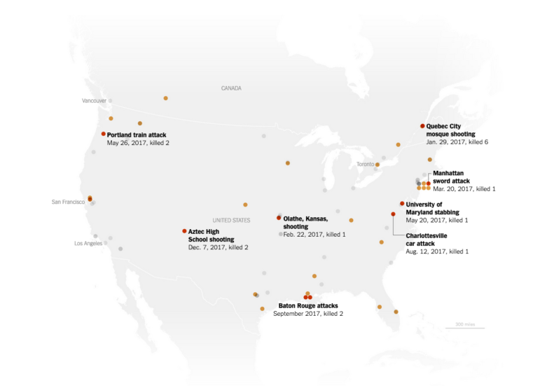
Last year The New York Times published an interactive article on white extremist killings from New Zealand to Norway to the United States. Using maps and a timeline to plot the data, the project revealed the troubling frequency and, in some cases, strange connections between the events. Here graphic designer Weiyi Cai explains how they obtained the data for project and the decisions they made about visualizing it.

Member Profiles

One Man’s Mission to Spread Data Journalism Across Southeast Asia

Despite increasing state-control, violence against journalists and other threats to press freedom, Southeast Asian journalists are increasingly delving into data journalism and other forms of innovative storytelling and creating a greater impact than ever before — thanks in no small part to Malaysian data journalist Kuang Keng Kuek Ser. GIJN in Chinese editor Siran Liang talked ho him about the rise of data journalism in the region.

Data Journalism

This Week’s Top 10 in Data Journalism

What’s the global data journalism community tweeting about this week? Our NodeXL #ddj mapping from January 29 to February 4 finds an @UpshotNYT analysis of the influence of Trump’s tweeting on Republicans’ attitudes towards the NFL, a new font typeface made out of human silhouettes created by @albertocairo and a fun Graphic Continuum card set by @jschwabish and @dataviz_catalog to use in the classroom.

Data Journalism

This Week’s Top 10 in Data Journalism

What’s the global data journalism community tweeting about this week? Our NodeXL #ddj mapping from January 8 to 14 finds free font-for-numbers by @InVisionApp, a William Playfair biography book review for @WSJBookReviews and @PublicDataLab’s just-released full version of its fake news field guide.

Data Journalism

Feast Your Eyes on 15 Stunning DataViz

Payman Taei’s round-up of 15 data visualizations that will not only blow your mind, they will give you a clearer understanding of what makes a great visualization. Feast your eyes on these beauties!

Reporting Tools & Tips

Beyond 800 Words: New Digital Story Formats

For the inception of a BBC’s R&D project to explore alternatives to conventional news formats, the BBC’s Tristan Ferne conducted a review of the landscape of digital news, looking for innovations in article and video formats online. Here’s the 12 categories he came up with — along with a few others that didn’t quite fit his model.

Data Journalism

This Week’s Top Ten in Data Journalism

What’s the global data journalism community tweeting about this week? Our NodeXL #ddj mapping from October 2 to 8 has @source’s overview of two years of mass shooting visualizations in the US, @merbroussard’s callout for information to future-proof data stories and @paulbradshaw shares his four favorite computational thinking examples from @DailyMirror, @puddingviz, @BuzzFeed and @washingtonpost.

Data Journalism

This Week’s Top Ten in Data Journalism

What’s the global data journalism community tweeting about this week? Our NodeXL #ddj mapping from September 25 to October 1 has @FT mapping the route in a day of a London Uber driver, #NICAR18 registration opening up, @Lattif charting Africa’s internet shutdowns using @atlascharts and loads of German election data visualizations.

Data Journalism

This Week’s Top Ten in Data Journalism

What’s the global data journalism community tweeting about this week? Our NodeXL #ddj mapping from Sept. 18 to 24 features Wikipedia of Data Visualization, the State of Data Journalism, Dear Data Postcard Kit, and German election data.